"The most beautiful makeup for a woman is passion, but cosmetics are easier to buy."
—Yves Saint Laurent
Announcements
If you're new to this blog, then read our guides to the basics: Skin (Part I), Skin (Part II), The Supernatural, Color Theory I, Color Theory II, Eyes, and Brushes.
Also, check out the blogsale.
Contents
Favored
Art Tattler
the glamourai
The Non-Blonde
Perfume Shrine
Lisa Eldridge
Garance Doré
Smitten Kitchen
Into The Gloss
Grain de Musc
Lacquerized
Res Pulchrae
Drivel About Frivol The Selfish Seamstress
Killer Colours
Bois de Jasmin Glossed In Translation
Jak and Jil
Toto Kaelo
Worship at the House of Blues
I Smell Therefore I Am
Food Wishes
The Natural Haven
Messy Wands
1000 Fragrances
Moving Image Source
Wondegondigo
The Emperor's Old Clothes
M. Guerlain
Colin's Beauty Pages
Barney's jewelry department
Parfümrien
loodie loodie loodie
The Straight Dope
Sea of Shoes
London Makeup Girl
Sakecat's Scent Project
Asian Models
Ratzilla Cosme
Smart Skincare
Illustrated Obscurity
A.V. Club
Tom & Lorenzo: Mad Style
Eiderdown Press
Beauty and the Bullshit
La Garçonne Flame Warriors Everyday Beauty
Fashion Gone Rogue
Now Smell This
Dempeaux
Fashionista
The Cut
A Fevered Dictation
Nathan Branch
101 Cookbooks

Can someone please explain all the recent J. Crew love for me? Oprah's recently interviewed creative director Jenna Lyons, Lucky raves over their clothes, and Fashionista regularly fawns over their offerings. I simply don't understand the gushing. Recent visits to J. Crew have only reinforced what I've always thought about the brand, which is that their clothes are uniformly boxy, cut large, and greatly overpriced given the quality of material and construction. So where does the love come from?
I have several theories:
-J. Crew is a major advertiser and source of revenue.
-Fashion editors are familiar with/fond of Jenna Lyons and trying to support their colleague.
-To improve their image, J. Crew have employed Gucci's-Tom-Ford-era media blitz approach to marketing, employing Lyons as a figurehead "personality" to head the brand and lend J. Crew the impression of fashion authority. Subsequently, fashion editors nationwide (and Oprah) have developed a major style crush on Lyons and are unconsciously working that out through gushing, imitation, and general overt crushing.
Of the three, I feel confident it's the last one that's proving true here. While J. Crew advertises widely, it does not advertise on the same level as giants like L'Oreal or the LVMH group. Any publication would hate to lose J. Crew's dollar, but many magazines could not afford to lose LVMH's. And while I'm sure nepotism still has a stronghold on the fashion industry, the above video offers a great example of the kind of blind gushing over Lyons and the brand that I see in an increasing number of media outlets. Just look at the way the video (and Lyons herself) presents her: smiley, friendly, unassuming and approachable, yet with a distinct point-of-view on fashion, with strong opinions, authority, and credibility. So you could have a drink with her and spend the whole time admiring her shoes. Laugh if you will, but by marketing figurehead Lyons as a sort of Everywoman's fashionista (she mixed J. Crew with Miu Miu!), her presence lends the idea of fashion to J. Crew.
And in fairness, the idea of fashion is there, if only as an idea. The store doesn't lack for on-trend military influences, ruffles, and easy layering pieces. The problem I have is the reality of fashion has yet to join up with its ideals. As many on-trend items as the store boasts, and as much as the marketing department bolsters the chain's fashion cred by placing Lyons as a fashion icon in leading, credible publications, the clothes still suck. The ruffles are droopy, the embellishments fade into the clothes rather than acting as visual relief, and the jackets lack enough structure to lay correctly on the body. What's on offer is the equivalent of handing an average teenager a box of pencils and a pad of paper and asking her to draw her dream wardrobe: all the ideas are there without any of the skill, knowledge, or craftsmanship to make those dreams a reality.
So, it's killing me: is all the gushing really over one woman's personality and hi-lo dress sense? Or do people really think they're investing in fashion at J. Crew? What do you think?
Labels: fashion notes, j crew, lucky
4/26/2010 [7]

When I saw this image in the December 2009 issue of Lucky, it created more excitement in me than I've felt about fashion in a long time. I have long loved tie-dye (I went to a hippie middle school), and I love the visual depth the t-shirt creates against the jacket. Being small both in stature and frame, visual depth isn't something that's always been easy for me to achieve. I've generally assumed depth to mean mixing textures in an outfit, leading to experiments with cable knits and tweeds that have inevitably ended in either adding bulk to my frame or drowning it. Either way, I was overheated and depth was not had. My confusion was compounded by endless viewings of What Not To Wear, in which Stacy and Clinton create visual interest through a mix of textures (satin, chiffon, various wools) and really girly accessories. It wasn't until I saw this look that something in my head clicked; I finally got that creating the look of depth in an outfit doesn't have to come from adding texture itself. Instead, it's more about literally creating visual interest by wearing something that draws the eye inward. In this look, specifically the middle picture, depth was created both by the tie-dye pattern and the mix of patterns in complimentary tones. The tie-dye itself shows variation in depth between brightness of color and tone which naturally draws the eye inward. In addition, the jacket brings its own depth with its mottled pattern while staying in the same color family. This is one of the quickest ways to introduce depth to an outfit: remain within a single color theme while incorporating variations in pattern, texture, or tonality.

This Calvin Klein shift gives an idea of how depth can be created through pattern alone. The ombre pattern literally draws the eye into the shift, creating dimension. Likewise, the texture of the dress (puckered cotton voile) creates further dimension. This is the difference between visual depth and adding a "pop" to an outfit, as would What Not To Wear. A pop is a statement that screams from an outfit, be it a bold color, accessory, or item of clothing. Visual depth actually draws the eye into the outfit, causing the viewer to look closer and become engaged in the outfit.

Visual depth can also be created through wearing black and leather together. Though this is typically done with black leather, the contrast of the almost burgandy tone of the brown, as well as the cage design, work together to create depth against the dark tones and tweeds of this Rodarte dress. The reason why leathers work so well to create depth is because they cause the eye to stop wandering and focus on them, creating contrast against the other elements of the outfit. This is particularly true in all-black outfits. Whether matte or patent, leather attracts both light and shadow, and anything that attracts light will naturally contrast with matte black, which absorbs it. This contrast creates the illusion of depth, the effect being heightened in all-black outfits, in which the total look is the interplay of light and shadow - in effect, the definition of depth.

One of my favorite ways to achieve depth is to take one main color - here it's black - and work with tones that compliment it. Despite the difference in colors themselves, the reds, blues, and yellows of this Dries van Noten blouse are similar in tone (they are all colors that have had black added to darken them). When paired with black itself, the contrast is quite striking, and the eye is drawn into the top. This is probably the easiest way to achieve visual depth, as we all have basic, neutral tones in our wardrobes to work with. I also find this look the easiest on the eye (coat excepted); it requires the least thought, and all the tones work so well together that the outfit flows nicely, especially when contrasted with the more aggressive look of the jackets and t-shirts at the top.
Labels: calvin klein, dries van noten, fashion notes, lucky, proenza schouler, rodarte
12/30/2009 [1]

I grew up reading fashion magazines -- as, I expect, did many if not most women. As I've mentioned before, I'm fascinated by the way people write about fashion and beauty, how we conceptualize it, how we imagine it fitting into our lives. Also, I like to bitch about writing. Hence, a new series.
Lucky is put down as a "magalog", something less worthy than the ordinary run of women's magazines, but honestly, all women's magazines push product after product, they are beholden to advertisers after all, and I don't want to read much of what's in the ordinary run of women's magazines. I don't want to learn about new parts of my body that need "sculpting". I don't want to read sex tips aimed at barely post-virginal 18-year-olds (guess what, you can do it in more than one position!), learn what 21-year-old Mike from Oklahoma thinks about jealousy, or take quizzes for which the "correct" answers are both painfully obvious and stiflingly normative. More fashion-oriented magazines, like Vogue, have more appeal, but I tend to want to read about clothes I might actually, conceivably wear, they occasionally seem to fetishize the extremely long, lean bodies of their models, and the pretentiousness can get wearing; trends that last all of six months are not art nor do they signal major shifts in cultural consciousness.
No, when I buy a fashion magazine I want to look at pretty things I can't afford but might conceivably want, and Lucky provides that. To me, Lucky is the magazine equivalent of "fun" makeup lines like Tarte, Too Faced, BeneFit, and even MAC -- it presents fashion and beauty as pleasures, without the focus on shaming and correction that comes with more "traditional" lines and magazines. (My mother has and has always had beautiful skin, but decades ago a cosmetics saleswoman reduced her to tears by corralling her and pointing out "flaws" and "aging" she didn't know she had. I am pretty confident that this will never happen to me, and thank goodness.)
And I will say, if you like the Lucky aesthetic, the magazine does a very good job.
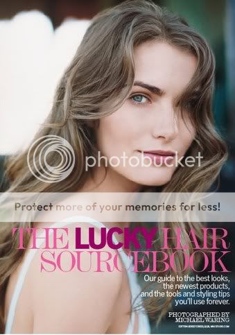
Above, from the May 2009 issue, an example of the Lucky beauty aesthetic. Lucky very seldom strays from this look: tousled hair, minimal or "natural" makeup. Even when promoting bright colours, Lucky sticks to its script. From the April issue: "Since full-throttle red [lipstick] is best on a practically bare face, you can skip other makeup almost entirely."
Fine, but this is not the only way to wear red lipstick, not to mention that red lipstick tends to necessitate at least some concealer and brow definition.
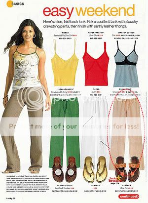
Leaving aside the mild absurdity of explaining how to wear drawstring pants and flip-flops (oh no, am I doing it wrong?), I do like the way Lucky lays out their fashion spreads; it's tremendously appealing eye candy. I don't want to look at models, I want to look at clothes, and it appears a lot of women feel the same way. The Lucky fashion aesthetic, however, is somewhat frustrating. The magazine tends to promote very loose, baggy clothing, often bizarrely layered; as Erin at Dress A Day once put it, "their stylists are colorblind pranksters hellbent on playing 'exquisite corpse,' only with innocent clothes." The Lucky editors flock to anything oversized, especially if it's unflattering. I'm sorry, no adult woman should wear a romper, and I refuse to pretend that clothes that obscure the waist or radically enlarge the hips -- harem pants, giant blousons, oversized shift dresses -- are anything but awful on the vast majority of us.

What I get from this is that for $48 USD, you get a tiny amount of product so unremarkable that she couldn't even be bothered to mention anything but the packaging. Great. Also, the reason I don't tend to reapply sunscreen as often as I should has nothing to do with the absence of "fabulous" packaging and everything to do with the fact that I don't relish the idea of walking around with multiple layers of grease and powder on my face, nor do I want to re-do my makeup in the middle of the day. In conclusion, what the hell.
And yet I continue to buy the magazine, when I buy fashion magazines at all, which these days is pretty rare. I think it's because of what I noted above; I might not like the Lucky aesthetic or vocabulary, but I like the basic attitude, and it's rare that I can say that about a mainstream fashion magazine.
4/06/2009 [11]
Subscribe to
Posts [Atom]. Or
follow on bloglovin'. If
you'd like to contact Dain,
feel free to email me.
I'm also on Pinterest.
The Mnemonic Sense
Most Wanted
The Beauty Primer
Lookbook
Bestsellers
Consumer Diaries
Closet Confidential
On The Label
Beauty Notebook
The Hit List
Color Me In
The Makeup Artist
Wedding Bells
Globe Trotter
Desert Island
perfume notes
beauty notes
fashion notes
culture notes
minimalism
chypre arc
floral arc
fresh arc
masculines arc
gourmands
& orientals arc
Archives
August 2008
September 2008
October 2008
November 2008
December 2008
January 2009
February 2009
March 2009
April 2009
May 2009
June 2009
July 2009
August 2009
September 2009
October 2009
November 2009
December 2009
January 2010
February 2010
March 2010
April 2010
May 2010
August 2010
November 2010
December 2010
January 2011
March 2011
August 2011
September 2011
October 2011
November 2011
December 2011
January 2012
February 2012
June 2012
July 2012
August 2012
September 2012
October 2012
December 2012
January 2013
February 2013
March 2013
June 2013
July 2013
Images
Photobucket