"The most beautiful makeup for a woman is passion, but cosmetics are easier to buy."
—Yves Saint Laurent
Announcements
If you're new to this blog, then read our guides to the basics: Skin (Part I), Skin (Part II), The Supernatural, Color Theory I, Color Theory II, Eyes, and Brushes.
Also, check out the blogsale.
Contents
Favored
Art Tattler
the glamourai
The Non-Blonde
Perfume Shrine
Lisa Eldridge
Garance Doré
Smitten Kitchen
Into The Gloss
Grain de Musc
Lacquerized
Res Pulchrae
Drivel About Frivol The Selfish Seamstress
Killer Colours
Bois de Jasmin Glossed In Translation
Jak and Jil
Toto Kaelo
Worship at the House of Blues
I Smell Therefore I Am
Food Wishes
The Natural Haven
Messy Wands
1000 Fragrances
Moving Image Source
Wondegondigo
The Emperor's Old Clothes
M. Guerlain
Colin's Beauty Pages
Barney's jewelry department
Parfümrien
loodie loodie loodie
The Straight Dope
Sea of Shoes
London Makeup Girl
Sakecat's Scent Project
Asian Models
Ratzilla Cosme
Smart Skincare
Illustrated Obscurity
A.V. Club
Tom & Lorenzo: Mad Style
Eiderdown Press
Beauty and the Bullshit
La Garçonne Flame Warriors Everyday Beauty
Fashion Gone Rogue
Now Smell This
Dempeaux
Fashionista
The Cut
A Fevered Dictation
Nathan Branch
101 Cookbooks

A couple of jobs ago, one of my new coworkers told me that, from the way I dressed, she assumed I was "an actor. No offense." She then backpedeled to tell me it was just that I "dressed very dramatically" and then, hopelessly, gave up.
At this same job, a different coworker at an unrelated time that I reminded her of "Denise Huxtable. No offense." Again, she mentioned that I dressed very dramatically, etc.
I am unsure what is so offensive about thespians in general and Lisa Bonet in particular, but whatever. When I'm over being baffled by the statements themselves, I look back at what I wore then and think, "How did they ever get 'dramatic' from that?" I wore black, flowy skirts (this was the neo-boho phase of 2004-2005), flats, and sweatshirts, sometimes all together. The other alternate was jeans with a t-shirt that had an owl on the front and read "Night Owl." I simply don't see what the drama in that could be. Did I walk regally? Did I drape scarfs around me just so? I don't know.

To their credit, they clearly picked up on something, because the first time I saw this jewelry, I knew it was something I'd wear. From Alexander McQueen's Fall 2008 show, these headdresses are the only jewelry I've ever seen that stopped me in my tracks and made me stare. As with handbags, I don't pay a lot of attention to jewelry on the runway or, really, anywhere else. These pieces transfixed me, though, both because they are obviously beautiful and because I can't think of any better way to wear jewelry than to ornament and frame one's face.

Though I'm generally uninterested in jewelry, I am particularly uninterested in its overreliance on femininity and good taste (or, conversely, bad taste) as its selling points. I'm uncomfortable in overtly feminine or "nice" dress and ultimately feel more comfortable encased in "drama" than in kitten heels. It may be armor, but it is no less armor than Vera Bradley bags and a sunny disposition.

While I loved all the jewelry in this show, my favorite pieces were undoubtedly the red ones. The color really pops and brings nice contrast to the gold, and I love no jewel more than red one.
Labels: alexander mcqueen, fashion notes
6/30/2009 [5]

I have incredibly oily eyelids, enough so that I basically gave up on wearing shadow washes several months ago. I simply couldn't find any product that would keep shadow on all day, much less past a few hours. MAC Paint was alright, but unreliable. I found it bulletproof maybe 50% of the time, and the thick formalation made it difficult to disperse and spread an even layer on each lid. Urban Decay Primer Potion was even less reliable, creasing within 4-6 hours.
Trying Too Faced Shadow Insurance as a last resort, I was very, very surprised to find that it worked for me. It keeps shadow from creasing for twelve hours (probably even longer on normal-to-dry lids), and the formula is thin enough that it spreads easily and evenly without effort. It's a very easy, intuitive product to use, and I appreciate that, unless you really try to, it's impossible to glob too much on. I also like that this doesn't have much of a tint. If you're Caucasion or light-skinned Asian, this is nearly flesh-colored and, as you only need a small amount, won't provide enough coverage to correct or cover your lid color. Unfortunately, the color is light enough that it would stand out on deeper skin tones.
As good as this product is, I've found that I still have to be careful with which eye shadow formulation I use. I can really only wear very dry shadows. Shadows that have a finely milled texture (NARS) simply don't last on my lids, along with shadows with a creamy or satiny texture. Obviously, cream shadows are out. The most enduring shadows I've found have been Stila, hands down, whether in the old or new formulation (honestly, I think the new formulation lasts even better than the old one). Certain drier MAC formulations, such as their Vellux shadows, also work well.
A last note: when capping the product, do so firmly. Once Shadow Insurance starts to dry out, the product becomes much thicker and more difficult to use. It doesn't layer evenly without effort, it's difficult to get out of the tube, and the thickened formula doesn't prevent creasing as well.
Labels: beauty notes, too faced
6/27/2009 [2]
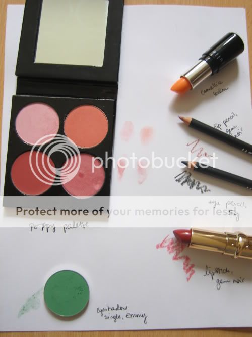
Julie Hewett is a Hollywood makeup artist, best remembered, in my mind, for doing the gorgeous makeup in 2001's Pearl Harbor and setting off waves of envy in every makeup junkie who spotted Kate Beckinsale's lipstick. Hewett's makeup line is arguably best known for its lip products: the Noir line is well known among red lipstick fans, the Icon of Beauty lipsticks are named after individual Hollywood actresses, and the Camellia lip balm gets frequent mentions in magazines.
Up until doing this Beauty Notebook, I had only tried Julie Hewett's full-pigment Noir lipsticks, which are so superb that I was eager to explore more offerings from the brand.
(For a larger version of the above image, click here.
Julie Hewett's Noir lipsticks and Camellia Balm are probably the best known of their products. The Camellia balm deserves all the accolades it gets: it has little scent or taste, is light and comfortable on the lips, but is significantly more emollient than similarly textured balms like Nivea's. Since I have the balm in lipstick-tube form, I tested it only as a lip balm, but it is also available in a pot for use on face, hands, etc.

I tend to shy away from pink makeup, but though the cream colours in Julie Hewett's Poppy palette (Jami, a rose-toned cream blush/lip gloss, and Mimi, a shimmery sugarplum/lavender gloss) are on the cool side for me, I love the powder shadow/blush shades: Flora is a soft, slightly shimmery, lavender-inflected pink that works surprisingly well with green eyes, and Clementine a bright matte peach that is a near-perfect dupe for Stila Blush.* Both are smooth and well pigmented. Above, Flora and Clementine on lids, Clementine on cheeks, Jami and Mimi on lips. There's little drama here, but it's a pretty look, and well worth trying if you're pale with fairly neutral colouring; I could have punched it up with eyeliner, but I enjoyed the delicacy of mascara alone.
Below, a more colourful look: Flora and Emmy shadows on lids, Fig eye pencil to line, Clementine on cheeks, Gem Noir lipstick and liner.

Julie Hewett has recently released eyeshadow singles, which can be purchased individually or loaded into a custom palette. The shades, alas, are only visible on the order page, and then only in rather tiny computer-generated swatches without accompanying descriptions. The shades included in the Poppy palette are of very high quality, and the prices are quite reasonable ($10 per shadow or $48 for a palette containing four), but for customers without a Julie Hewett counter nearby, online swatches and descriptions are the only way to figure out what a shadow looks like, and these aren't that helpful.
 The Emmy shadow is an object lesson in choosing the right tools. A true, matte kelly green, it appealed to me immediately, but alas, its pigmentation and staying power are not the best, which is surprising given the excellent consistency of Flora. It requires primer (I used Urban Decay Primer Potion) and a small, dense eyeshadow brush. With these accessories, it went on and blended well; this is not the shadow you should choose for full-on Hedwig and the Angry Inch pride parade makeup, but that doesn't appear to be Julie Hewett's aesthetic, anyway.
I expected Fig eye pencil to be dark green; it's more of a teal-inflected charcoal. It applies smoothly, smudges easily but not too easily, and makes a good anchor for shadow; alas, the staying power is only average.
As I mentioned, it was Julie Hewett's full-pigment, semi-matte Noir lipsticks that first drew me to the brand. These are exceptional lipsticks, in every way: creamy, highly pigmented, not prone to bleeding, with colours that stay remarkably true on lips (at least on mine, and I can turn almost anything fuchsia), pretty, retro-chic packaging, and no discernible scent. In particular, Coco Noir, a deep, dramatic brick red, is widely loved and flattering to many skintones (see The Non-Blonde's review for more details). Gem Noir is the first sheer Noir lipstick I've tried, and being sheer, it does not have the intensely creamy texture of the semi-mattes. Instead, it feels light and balmlike. The colour is described on the Julie Hewett website as "rosy cheeks in the snow", which, despite being a bit fanciful, is accurate. It is a sheer rose-red, slightly warm, a flush of colour rather than a Proper Lipstick. It is simply pretty. It should be noted that the matching liner (which, like the eye pencil, is smooth and of high quality) does not, in fact, match, but is a muted pink/red/brown in the same colour family as MAC Spice. The combination of lipstick and liner is consequently warmer-toned than the lipstick alone.
*Yes, Stila makes a blush in a shade called Blush. Oy.
Labels: beauty notebook, julie hewett
6/25/2009 [3]

Revlon ad, circa 1958.
If fuchsia lipstick harks back to the 1980s, coral and orange lips call us to the middle of the 20th century, roughly the 1940s through the 1960s. I would guess that coral's "old lady" associations are the result of too many women who grew accustomed to coral lipstick (often frosted) in the 1960s and continued to wear it long after the trend had passed.

Because of coral's "old lady" associations, it is important not to apply it too thickly; it looks especially modern as a matte stain or a sheer gloss. Conventional wisdom is that coral and orange lipstick looks best on tanned or deep skintones, and certainly orange shades glow against bronzed skin, but coral looks charmingly retro on a pale face. The combination of blue shadow and orangey lipstick is striking and, in its way, classic, but it is so intensely unnatural that it is probably best reserved for special occasions, and on most of us, a softened version (a deep blue smoky eye with peachy lipstick, for example) is easier to wear. Coral also combines beautifully with shadows in all forms of bronze and gold, lavenders, and soft greens.

Clockwise from top left: matte coral lipstick brings out lightly bronzed eyelids and cheeks; Gene Tierney with bronzed skin, orange lipstick and smoky eye makeup, in an early-1940s take on the exotic; Christina Hendricks in Mad Men, displaying the beauty of coral-rose shades against milky skin; soft peach-pink gloss in a Korean fashion ad; a juicy tangerine red emphasizes the bronze tones in Ashanti's skin; an ethereal look in softened secondary colours -- mauve, mint, coral -- in an ad for YSL's Spring 2009 makeup collection.
Labels: besame, cargo, christian dior, lipstick queen, lookbook, mac, nars
6/22/2009 [6]
Every decade has its designers. Armani, Donna Karen, and Claude Montana led the eighties. John Galliano, Miuccia Prada, and Versace ruled the nineties. This decade's designers will turn out to be Lanvin's Albert Elbaz, YSL's Stefano Pilati, and Balenciaga's Nicolas Ghesquiere.
Nicolas Ghesquiere consistently produces collections that challenge the viewer's perceptions of proportion and fashion, introducing the viewer to technical innovation in fabric, a strong sense of structure and sculpture, and concepts that are often difficult to appreciate at first glance. It can take a full season of looking at Ghesquiere's designs in print and as worn by real women before the eye shifts to accept their proportions, just in time for Ghesquiere to upset them again. Along with only a handful of other designers, Ghesquiere propels fashion forward, plucking it from its everyday tedium and placing it directly in the future.
Despite the wide array of references Ghesquiere includes in his work, he consistently returns to only a few themes, including futurism and neo-sci-fi; structure and sculpture; blackness; neo-bohemianism; retro; menswear; and sportswear. These themes are explored below.
FUTURISM/NEO-SCI-FI

This is an extreme example of what is admittedly one of the more difficult design concepts in Ghesquiere's oeuvre. Ghesquiere explores futurism through both literal interpretion, as in these bubble glasses and gold-plated C3PO leggings, and through more gestural nods, as in the curve and overall cut of this blazer. Futurism/neo-sci-fi is also interpreted through material innovation, as when Ghesquiere introduced top-stitched neoprene as a jacket material in his S/S 2008 collection.
This look also illustrates the principle shape Ghesquiere designs for, which as I imagine is a pole. Ghesquiere's designs are often cut for very thin people, emphasizing a narrow hip and generally lean physique upon which Ghesquiere wraps his layers and bases his sculptures.
STRUCTURE AND SCULPTURE

As the pole is the foundational shape for Ghesquiere's designs, this allows for a certain amount of solid, linear structure upon which to lay a structural frame, and Ghesquiere consistently does so, creating garments that can literally stand on their own. Beyond the mere surface interest of stiff fabric and self-standing garments, Ghesquiere also literally carves out a shape from these structures, creating garments with interest and curvature independent of their wearers.
Along with structure and sculpture comes a lot of volume, another Ghesquiere staple. As the pole is the foundational shape of Ghesquiere's designs, this allows for large amounts of volume uncompromised by the wearer's own shape and particular needs. Though Ghesquiere often has presented massive skirts and shoes in past collections, there is always the element of something whittled away. A skirt and jacket may be voluminous, but a waist will be chipped out of those lines. Oversized boots will be balanced by a delicate wrist. There is always an element of proportion in Ghesquiere's designs, though often not in the standard sense.
BLACKNESS

There are very few designers who can legitimately claim to explore the color black, though there are many who would claim that yes, of course black makes a statement. Differing from this approach is Balenciaga, who explores the properties of the color black itself, whether in the bottomless depths of this top's inky black or how light reflects off black surfaces to create structure within a structure. Ghesquiere's use particularly of latex blacks reveals how integral the color black is in design itself, as the reflection off the color highlights and reveals the garment's structure.
NEO-BOHEMIANISM

Though better known for his more structural clothes, Ghesquiere neatly tucks neo-bohemianism into his designs through pattern and styling. His hugely influential F/W 2007 show featured regional prints and a mix of scarves layered over dresses and blazers that still influences the daily ensembles of tastemakers and wannabes. Ghesquiere's version of neo-bohemianism can be seen in Balenciaga's sari-influenced dresses and patterns, paisleys, floral-print dresses, and the ubiquitous It Bag, the slouchy Lariat.
RETRO

We can blame Marc Jacobs all we want for the continued retro influence in fashion, but Nicolas Ghesquiere has to take some of the blame. Ghesquiere's frequently invokes the ideas and shapes of 60s skirt suits, 70s pant suits, and Balenciaga's own archive of sculptural shapes and innovations. Most recently, Ghesquiere took a departure from his usual retro influences and directly referenced the 80s in his F/W 2009 collection, a look from which is seen here. Reviews of this collection have been mixed: some say it's genius, some say it's bland. Possibly the most succinct, and certainly my favorite, review can be found here.
MENSWEAR

Ghesquiere takes the backbone of menswear - suiting fabrics, dowdy tweeds, and the principle of the matching suit - and repurposes them along razor-sharp lines, fashioning ultra-skinny pants, voluminous skirt suits, and slightly draped pants that recall Rick Owens. Never will you see Ghesquiere design menswear that's cut down for women or that even recalls the shape of proper menswear. There is always the something sharp to it: the sharp line of a narrowly cut pant, the crispness of the structural jacket above. Ghesquiere only rarely allows fluidity and ease into menswear.
SPORTSWEAR

As with menswear, sportswear is one of Ghesquiere's lesser themes, explored here through the literal racing stripe. Sportswear is usually more of an inspiration in fabric, as with Ghesquiere's use of neoprene, seen above in the second image. Ghesquiere's use of sportswear is also notable for its material absence, often more of an allusion than an actual design element, as seen in the above photos' wetsuit allusion and riding hat. The incorporation of sportswear maintains a certain youthfulness and vitality in Ghesquiere's designs, elevating the mood from intense conceptualism without giving in to gimmickry and cheap tricks.
REAL LIFE

Innovation in design is all well and good, but at the end of the day, a design can only be considered good if it can be used. Keeping that in mind, I've included this picture of Lauren Santo Domingo in a Balenciaga dress and jacket as proof that, yes, Nicholas Ghesquiere's designs can be worn to more than just a runway. Granted, Santo Domingo is very thin and, apparently, seven feet tall, but she doesn't look overdone or costumed, just like a lady in her favorite dress and jacket. The clothes do not overwhelm her. She looks more or less like herself who is ultimately wearing just a jacket and a t-shirt dress. Regardless of all the editorial fanfare, Ghesquiere's genius is in cutting very, very good basics that don't look it because, let's face it, a man cannot feed his family off of neoprene short suits alone.
Labels: balenciaga, designer index
6/17/2009 [0]
The other writers on this blog all approach the subject of perfumes with at least a year's worth of sniffing experience. I, however, am a complete newcomer to perfume appreciation. (To this end, I would like to thank Dain, who has made these experiences possible by allowing me access to her stash, as well as helping me get some samples of my own to try.)
That is not to say that I am new to the act of smelling. My life, like any other, has been full of smells that intermingle and forge unlikely alliances amongst themselves—as smells are wont to do—to create a strange tapestry: Korean fermented fish sauces and a tomato patch on a hot stuporous day share an undertone of nutrient-rich decay with the smell of the sea. And all of us have experienced the feeling of being suddenly transported into our memories, as if by a time machine, when encountering a familiar scent, even if we ourselves never consciously made any association between the two.
In fact, this is perhaps the most ironic feature of smell, that we often don't know what we are smelling but still manage to recognize it. Unlike sight and hearing, which are the two senses we mainly rely on for information about the outside world, scent is very much a gray area for us.

A "Sensory Homunculus": a model of how we would look if the size of each body part grew in proportion to the distribution of sensory nerves.
Scientists use the term "limbic system" to denote, as vaguely as possible, parts of the brain that govern functions thought to be related—such as long-term memory, spatial orientation, and motivation (including appetite and sex drive) along with smell. These "limbic" functions are considered more primitive and at the same time, more crucial to basic survival than the "higher functions" of consciousness and reasoning (governed by the neocortex). Most limbic structures are therefore cushioned off in the core of the brain, away from potential external threats, and along with memory, scent is one of the last senses to be lost in the events of brain damage. (There is one exception: degeneration disorders like Parkinson's and dementia that affect memory seem to take away the sense of smell first.) And of course, this also means that animals have proportionally larger limbic systems compared to humans, in whom the cerebral cortex makes up the bulk of the brain.
This means that animal brains are, generally speaking, much more simple: all the machinery is completely formed by birth, which is how new calves and foals are able to not only walk, but run to keep up with the herd just hours after birth. This is not possible with the human brain, which is so complicated that if human infants were to likewise be able to walk and function as members of society from birth, the gestation period would stretch to years, and infant heads would grow so large that childbirth would literally become a death sentence for both mother and child. Instead, humans must rely on the knowledge provided by experience, recalled through memory, and organized through reasoning to make for our underdeveloped instincts. A marvellous system in its own right, possibly, but one that complicates relatively simple acts, like smelling.

Perhaps this is why smell is not of such all-consuming importance for us as it is for most other mammals, many of for which smell is the main sense through which they "see" their world. Quite simply, they are born knowing quite unambiguously what smells like what, without the cognitive cartwheels a human brain has to go through before identifying a scent or isolating a single component from it. Of course, the difference may lie in the nose itself, but and more because we are cognitively detached from our senses, relying on our brains to imbue our perceptions with meaning. Such conscious thought is focused and therefore necessarily narrow in scope, which dramatically—and tragically—pares away much of the full sensory reality available to us.
This flaw in our brain structure, more than any defect in the way our noses are structured, is why we often have so much trouble identifying notes and breaking down a perfume into its component parts... but it is also what drives us to create this game around the sense of smell, and wax poetic over perfumes (without the aid of a poetic imagination, a smell is just a smell, after all). It was the heavily purpled (and sometimes self-contradictory) babble of perfume reviews that first drew me in to perfume appreciation, but most of the reviews left me completely unprepared for the actual experience of smelling what was described. Instead of "the poignancy of violet and iris petals weighed down by raindrops," I got a candy shop and dawn lifting to the sound of reed flutes (jump to 8:08 below) from Après L'Ondée, and instead of the "quirky yet dreamlike mixture of smoke and leather and circus animals and woody cinnamon sweetness" I expected from Dzing!, I got absolutely nothing.*
Our experience-built brains are also the reason why we can never agree on the analysis of a particular scent. Smells are inextricably bound up with memory in the learning process. Since every life history is different, each brain is likewise totally unique... and therefore, each person will break down a scent a different way in his mind. Those familiar with the scent of strawberries** will consider it a single coherent scent element: in actuality, the scent of strawberries is comprised of a whole ensemble of chemicals ranging from the obvious choice of ethyl methylphenylglycidate (better known as "strawberry aldehyde") to the less intuitive choice of skatole (which, on its own, smells just as its name implies) to accentuate the feeling of ripeness. Conversely, the scent of a single specific molecule can register as a scent of dizzying complexity when minds attempt to make sense of a totally new stimulus by feebly grasping around in their banks for analogies by which to arrive at an approximation: even Luca Turin must use analogy to describe the smell of the compound oxane as "a shimmering mixture of sweat and tropical fruit, with a 'green' marijuana-like note." A beautiful description, but surely an injustice to oxane—considering its chemical identity, it should be a "note" in its own right.
Most of the individual notes that I have learned to distinguish recently are base notes, used for their ability to blend well with skin and with other scents, unifying the brash, opinionated, eccentric character of many top and heart notes into a seamless whole: for this reason, they are often difficult to distinguish each on their own. And when the perfume is ambiguous, seemingly not conforming to any one genre, the kind of base notes used will often provide a clue as to the fragrance's final classification: vetiver, for instance, while used in many green or fresh perfumes, is not often found in an oriental composition, while the reverse is true for ambers.


Vetiver is derived from the roots of a perennial grass, native to India, where it is often used in woven mats hung at the entrances of a house for a cooling effect, and to purify drinking water. Its odor is often described as green, balsamic, woody, smoky, or "bug spray," and lends the musty smell of a forest floor to "earth" flightier compositions. I personally love the tranquility that vetiver imbues to the composition—though it can indeed take on the virulent quality of bug spray when not used thoughtfully—and it loves me back: this stuff lasts well beyond twenty-four hours on my skin, regardless of what composition it's used in.

Musks and aldehydes are like twin brother and sister, two facets of the same coin, polar opposites that nevertheless share the same genetic makeup and origins. Aldehydes create a cloud that projects high into the stratosphere and obscures the contours of the landscape like a morning fog, without actually alerting us to their presence: generally, the best clue is a sort of soapiness or powderiness, identifiable from a distance but impossible to pin down for closer observation. Where aldehydes are diffuse and extroverted—social butterflies—musks are homebodies that cling to the skin, but they are similarly elusive. It doesn't seem so much a scent as a kind of lingering presence: the feeling of being close to warm skin that almost always escapes our notice except in retrospect. And clean or dirty, musks and aldehydes both share a certain brittleness: aldehydes that of fine threadlike crystals of asbestos, musks that of the bitter astringency that any sort of powder leaves in the mouth, like chalk dust.

Woods and incense inhabit a sort of intermediate territory in between the forest-aroma of vetiver and the denseness of a musk. Whereas vetiver is an extract of the fresh root and therefore a decent recreation of the living essence of the plant, wood and resin scents are more of an abstraction: though wood takes something of their essence from the tree itself, its smell is also created through aging (time) and mingling with the open air, which gives a musty quality to what was once a live, breathing thing. Wood scents (and incense notes, which are often derived from wood or the resins from wood) are the scents of a tree seen through memory.
Obviously this is only a partial list of base notes, definitely biased toward the scents I personally favor: I've left out oakmoss (which I haven't been able to sniff in great quantities, as of yet), leather, amber, and other animalics like civet and castoreum (not used very much in modern perfumery in any case). There is also iris (another favorite of mine), which is traditionally classified as a heart note, but often acts as a bridge between heart and base notes due to its density.
In any case, as the title states, this is simply the beginning. I expect many more changes of direction, disappointments, and revelations are in store for the future.
* The “descriptions” here aren’t sampled from any one review in particular, but cobbled together out of bits and pieces sampled from various reviews across the perfume blogosphere. It's a tendency that's easy to make fun of, but due to our low sense of specificity when it comes to smelling, it's also a very easy trap to fall into, as I just proved by turning around in the same breath and coming up with my own purple prose.
** Incidentally, I've always sensed a note reminiscent of strawberries in ripe sweat... or is it that I detected ripe sweat in strawberries? I've not heard anyone else speak of such an association, but then again, I've also tasted banana and coconut in overbroiled mackerel. I'm interested in hearing about other people making mental connections between two scents that seemingly should have nothing to do with each other.
Labels: giuseppe penone, rene magritte, the mnemonic sense
6/15/2009 [2]

 I recently visited one of those overstyled stores featuring "modern" furniture and home decorations. It presented a very unwittingly American view of European furniture. Still, I liked most of its offerings, finding them spare and well-designed. My favorite was a dining sofa and table similar to this set, the difference being the store featured a proper, low-sitting dining table with its sofa. Kitchens are invariably my favorite rooms, being warm, inviting, peopled, and stocked with food. Add a TV and I'm done. Add a dining sofa and I have a place to sleep.
The store also inevitably had a collection of Taschen art and design books. Although I appreciate Taschen's philosophy - provide quality books at affordable prices - I don't like the books themselves. The writing is boring, and I don't find the books well-designed. The best is left for the cover, and the design is more reliant on current design trends than on its own voice (ironic, considering the house's design series). Instead, I prefer Vogue Paris. Every issue is a lesson in design, from the typography to the styling and editing. All the elements work together. Nothing is superfluous or haphazard.

Mies van der Rohe's Barcelona Pavilion remains one of the most moving buildings I've ever visited. Despite its extreme minimalism, it is warm and serene and brilliantly designed. This is an example of great architecture, which is not a manipulation or domination of space so much as it is working and moving within it. I also appreciate that whoever took this picture titled it "Barcelona Pavilion Money Shot."
6/10/2009 [1]
You can always find some way to justify absolutely anything.

DORKY GAMES
I'm competent at most things, the lone exception being perhaps video games. I play most of them like suicide missions, the only exception being Pokémon and Oregon Trail. Part of it has to do with horrible eye-virtual-hand coordination, another part of it has to do with getting freaked out about getting my characters killed (I refused to play Word Munchers as a kid because I found the process of maneuvering the little muncher guy around all those murderous troggles much too stressful). And I flat-out refuse to be in the same room when a zombie game is being played. I always tell myself that time spent playing video games is time wasted (like I don't waste time as it is!), which is true to a degree, though there is a distinct reek of sour grapes here.
The only games I'm able to play are the really simple ones, the ones that don't involve the deaths of humanoid figures or cute little creatures. I recently got over an addiction to Minesweeper and Tetris. I've now moved onto Spider Solitaire: it's so repetitive and very soothing in a mind-numbing sort of way... I'm sure that if it weren't for that little arachnid icon on my desktop tempting every time I turn on the computer, I would have better grades.

WIKIPEDIA
I've been something of an information junkie all my life, and one of my favorite things to do was to sit in the library digging through the encyclopedia. Now, in the internet age, Wikipedia provides all the access to (often esoteric) information that so thrills me, but in a clickable computerized format without any of the difficulty one encounters with bound volumes. You're reading an article about Byron, then you click a series of links that somehow incorporates Alan Turing and Monty Python, and ended up with the motif of harmful sensation (I've actually clicked on these exact links in this same order, though I've omitted some of the articles I passed by on the way... bonus points to anyone who can figure out which ones fit in the blank spaces)... you could follow these rabbit trails of associative thought forever, and it gobbles up my time like nothing. It's all there: biographies of famous people whose personal lives I really have no business being so interested in, pseudoscientific theories, and even an extensive section about um... unorthodox sexual practices.
Besides having wasted more time than I care to admit, I must also confess to having done much of my research for papers on Wikipedia (though only as a starting point; I make a point of filling the bibliography with "legitimate" sources which I usually haven't read as fully as I should have), which everyone in the academic community sneers at because of its open-source format. This strikes me as a somewhat prejudiced and unfair assumption to make: enough visitors look at the sites each day so that vandalism, mistaken reporting, and even factual errors are usually corrected pretty promptly. And most of the content is actually quite accurate and free of errors, as the articles are usually written by geeks who make it their personal business to be knowledgeable.

WASTING HOT WATER
I love hot showers and baths. I love to just stand there, for no reason at all, and feel the hot water pour over my head, which is why I always take so long in the bathroom (once my mom actually came in to check if I hadn't drowned). I waste a lot of water this way.
SHOUJO MANGA / ANIME
I don't mind being pegged as a nerd, which is why I don't consider my affection for Slayers, Inu-Yasha, and Evangelion to be "guilty pleasures." However, there's something about "shoujo" (aimed at a female audience) manga that makes me shy away from reading the stuff in public. Unlike the relentlessly cheerful, consumerism-thinly-disguised-as-feminist, simultaneously earnest and brain-dead chick-lit churned out for the American market, shoujo manga seem to incorporate considerable doses of masochism with their fluff: feminist statements, you will not find here. Homosexuality both male and female (the former as a female version of male fantasies about lesbians, the latter usually portrayed with codependent intensity), incest, situations that may be construed as bondage, and relationships between young girls and suspiciously older men, and cross-dressing are all common elements of the genre. It's not the sexual content that's disturbing however—it's rarely more than hinted at, nothing explicit occurs—but the use of inequality and violence as the basis for sexual identity. To a feminist's mind, it's somewhat dangerous material... which you can't tear your eyes away from.
My personal favorite of the manga/anime genre is Shoujo Kakumei Utena, a mind-fuck dressed in candy-coated rose petals, twisted sexual politics disguised as an archetypical fairy tale disguised as a gothic romance disguised as an innocent schoolgirl genre story. The eponymous character, who as a little girl was so impressed by the kindness of a young prince she met that she is determined follow in his footsteps and become a prince rather than a princess, is drawn into a series of surreal duels for the hand of a classmate, the "princess" of the story. What makes Utena so disturbing and yet so profound is its own awareness of the politics behind its sexual content: few others in the "shoujo" genre seem to be made with a conscious thought to any deeper meaning behind their histrionics.


Photo of "Coney Island Whitefish" by David Goldes.*
DISPOSABLE PLASTICS
It's recently become "cool" to be "green." Yet, for all the hype environmentalist movements today get (as young as I am, I still remember the days when "global warming" was considered an urban myth), few people think about its deeper ramifications any more than they did ten, twenty years ago. Yes, ethanol burns cleaner, but the effort involved in producing it generates more pollution than burning it saves, and the resulting increase in demand for grains will drive up basic food prices high enough to provoke effective famines worldwide. Easy solutions to immediate problems will not do: eventually, we must confront the hard truth and acknowledge that our civilization is not sustainable as it is and we must either become extinct as a race or suffer a sea change to occur in our mode of living. Petroleum, in particular, is not only used to fuel cars: plastics are derived from petroleum, and as any scientist will tell you, technology and medicine in their current forms cannot exist without abundant access to plastics, the versatility of which cannot be matched by any natural material.
Predictably, this also means that we find plenty of frivolous ways to abuse this increasingly precious resource in our everyday lives. Like popping bubble wrap. (For that matter, making bubble wrap in the first place.)
*Yeah, I know they're usually made from latex, but it's actually increasingly common to make them from polyurethane these days, in order to accommodate (pun intended) those with latex allergies.
And how do I know this?
Wikipedia.
Labels: animation, culture notes, environmentalism, shoujo kakumei utena
6/06/2009 [6]
CANADIAN CONTENT
The Canadian government requires that a certain portion of radio and TV broadcasts be given over to Canadian content, which means that over the years Canadians have had to listen to a lot of Avril Lavigne, Sarah McLachlan, Feist, Barenaked Ladies, etc. And then there are the less, um, internationally viable Canadian acts:
I hear this song and I'm instantly seven again. (It is still playing in drugstore aisles and waiting rooms across the country, by the way.) I think this might actually be the worst music video I've ever seen, but perhaps I'm just overwhelmed by the mullets.
It's tough to determine which Canadian content is truly a "guilty pleasure", by the way. The original Degrassi Junior High (I have not seen the remake, it looks far too clean and zit-free) was ever so earnest and kitschy, but if Kevin Smith vouches for it, can it really be "guilty"? Probably not.
WHINY BRITPOP
How about some puppy dog eyes and vaguely yearning lyrics? You know you want it.
Seriously, how douchey is this? And yet.
CHICK FLICKS
I admit, I am a sucker for any movie with a makeover in it.
My current favourite in the girly fluff genre is Enchanted. Liking Enchanted isn't such a sin against taste; it's cute, if wildly illogical, and Amy Adams is superb in it — hers is one of those performances that turn a one-star movie into a three-star movie. No, what makes this a guilty pleasure is the ball of mush I turn into when watching this scene:
What can I say? The inner twelve-year-old dies hard. I swear, that kind of over-orchestrated, synth-heavy Disney music is designed to produce a Pavlovian response in women my age. Or, um, maybe just me.
JUNK FOOD
 I don't drink pop (soda, Coke, whatever you call it) because I find it far too sweet, but other than that, bring it on. I have a special fondness for things involving cheese: poutine, pizza, garlic fingers (imagine a plain cheese pizza with garlic butter in place of tomato sauce), Kraft Dinner. Oh, Kraft Dinner.
During exams I pretty much subsisted on Twizzlers and gummi bears. It helps to gnaw on something.
KARAOKE

Including, oh yes, Rock Band. (Guitar Hero is also acceptable, but in my opinion, Rock Band is a better game.) I recently figured out how to handle the little orange button on the toy guitar: I think this gave me only slightly less pleasure than graduating from law school. I was in an auditioned children's choir when I was a kid and never quite got over it, mentally or vocally (I still sing like a little girl). I get very excited when I score over 95% on Expert vocals.
Toronto has karaoke boxes (noree-bang?) in its Korean neighbourhoods; a former boyfriend and I have spent numerous hours embarrassing ourselves in them.
TAROT

Reading tarot cards (which I do rarely, and not well) invariably tells us what we already know, but sometimes this is helpful. Also, the images are beautiful.
OWNING WAY TOO MUCH LIPSTICK
Self-explanatory.
Labels: culture notes, music, rock band
6/05/2009 [7]
VALLEY GIRL

I once told a co-worker I had Britney Spear's greatest hits CD. She told me that's something I probably shouldn't tell a lot of people. Therein is the truth of the phrase "guilty pleasures" - they're pleasures other people think you should feel guilty for. As for me, I feel no guilt about enjoying Britney Spears's bubble-gum pop or anything else on this list, although I have to admit it's kind of embarrassing looking up Britney Spears picture on your work break.
TRUSTAFARIAN
I went out with a guy once who showed up thirty minutes late and ten minutes in told me that he and I were like thesis and anti-thesis, and that basically, he didn't have to ask me any more questions about me because he already knew the answer would be the opposite of whatever he said. He's still single.
Among the other pearls of wisdom he gifted me with that night, he told me he could "just kind of tell" I was a hippie kid "because I was wearing Chucks." I don't know what Converse has to do with peace and recycling, but hippie kid pegged. One of the few holdovers left from my progressive middle school experience is an enduring love of reggae, and this particular blend of reggae and hip-hop is right up my alley. Plus, I used to fly through Schipol frequently when I lived in Scandinavia, so the video helps reduce homesickness.
TWEAKER

What Not To Wear is not a highly innovative show, either in terms of the makeover format or in terms of individual episodes. Once you've seen one episode, you've seen them all. Also, I am not sure that all the "tough love" doled out by Clinton and Stacey is so much constructive as it is their abuse of their public forum to passive-aggressively bitch. However, there has not been one episode that the end didn't (mostly) justify the means. I get real pleasure from seeing the light come on in the makeover victim's eyes as he (or she) finally gets it - that his cartoonish style has really just been a front, that the sartorial buffoonery has been less a stylistic choice and more a diversion or a hiding place, and that it is actually okay to come out of that shell and look good. I don't know how long these revelations stick with these people. I don't even know if they ever fully take root in them (or care). I am really just deeply and completely satisfied with that moment of "aha" and can more or less take the rest of the show just for that moment.
MEAN GIRL
I've never been a Michelle Trachtenburg fan, but I love her in Gossip Girl. She's the perfect villain - terrible to her victims, but you love to watch her strike. Ultimately, Gossip Girl's real pleasures are not really in the clothes or the styling, but in the perverse pleasure in seeing people dish it out, over and over again. Although the show started out chronicling the (now) good girl, Gossip Girl has become a celebration of mean kids, whether they're girls or boys, and the intelligence, pent-up anger, and lack of suitable releases that turns them into the monsters they are. It's just as thrilling to hear their witty, (sometimes) snappy dialogue as it is to see them assert themselves as King and Queen Bees and knock their opponents down. Most thrilling of all is enjoying the sense of vindication that comes with watching them unsuccessfully stalk their prey, finally reveal them to be the villains they are, and skillfully knock them down to the peg where they belong. These might not be cheerful or healthy role models, but watching the mechanics of how they operate is an enervating way to spend a Monday evening.
CHEER UP, EMO KID
Much as I enjoy Love Story as a kind of time machine, the great joy I get out of it is its sincerity. There is an earnestness in Love Story that isn't present in contemporary films, and dopey and sappy as the movie is, it's that uncomplicated earnestness that hits me like a knife in the gut at the movie's end. Unlike modern films, which insist on promoting "realism" by showing every little difficulty/PC "difference"/moment of self-consciousness in the characters' worlds, Love Story has two dilemmas. That's it. The rest of the movie is just about love, and as simple as that concept seems, try selling it right now. So even though there are cheesy snow angel sequences and one of the worst quotes of all time, in the end, I always end up crying because of the simple, pure truths behind the story: Death hurts. Make the most of your time, because it's all that you get with your loved ones. Love is worth it.
Labels: britney spears, culture notes, gossip girl, love story, music, what not to wear, ziggi
6/05/2009 [2]
Subscribe to
Posts [Atom]. Or
follow on bloglovin'. If
you'd like to contact Dain,
feel free to email me.
I'm also on Pinterest.
The Mnemonic Sense
Most Wanted
The Beauty Primer
Lookbook
Bestsellers
Consumer Diaries
Closet Confidential
On The Label
Beauty Notebook
The Hit List
Color Me In
The Makeup Artist
Wedding Bells
Globe Trotter
Desert Island
perfume notes
beauty notes
fashion notes
culture notes
minimalism
chypre arc
floral arc
fresh arc
masculines arc
gourmands
& orientals arc
Archives
August 2008
September 2008
October 2008
November 2008
December 2008
January 2009
February 2009
March 2009
April 2009
May 2009
June 2009
July 2009
August 2009
September 2009
October 2009
November 2009
December 2009
January 2010
February 2010
March 2010
April 2010
May 2010
August 2010
November 2010
December 2010
January 2011
March 2011
August 2011
September 2011
October 2011
November 2011
December 2011
January 2012
February 2012
June 2012
July 2012
August 2012
September 2012
October 2012
December 2012
January 2013
February 2013
March 2013
June 2013
July 2013
Images
Photobucket