"The most beautiful makeup for a woman is passion, but cosmetics are easier to buy."
—Yves Saint Laurent
Announcements
If you're new to this blog, then read our guides to the basics: Skin (Part I), Skin (Part II), The Supernatural, Color Theory I, Color Theory II, Eyes, and Brushes.
Also, check out the blogsale.
Contents
Favored
Art Tattler
the glamourai
The Non-Blonde
Perfume Shrine
Lisa Eldridge
Garance Doré
Smitten Kitchen
Into The Gloss
Grain de Musc
Lacquerized
Res Pulchrae
Drivel About Frivol The Selfish Seamstress
Killer Colours
Bois de Jasmin Glossed In Translation
Jak and Jil
Toto Kaelo
Worship at the House of Blues
I Smell Therefore I Am
Food Wishes
The Natural Haven
Messy Wands
1000 Fragrances
Moving Image Source
Wondegondigo
The Emperor's Old Clothes
M. Guerlain
Colin's Beauty Pages
Barney's jewelry department
Parfümrien
loodie loodie loodie
The Straight Dope
Sea of Shoes
London Makeup Girl
Sakecat's Scent Project
Asian Models
Ratzilla Cosme
Smart Skincare
Illustrated Obscurity
A.V. Club
Tom & Lorenzo: Mad Style
Eiderdown Press
Beauty and the Bullshit
La Garçonne Flame Warriors Everyday Beauty
Fashion Gone Rogue
Now Smell This
Dempeaux
Fashionista
The Cut
A Fevered Dictation
Nathan Branch
101 Cookbooks

As the birthplace of the China's modern textiles industry, the originating port of Chinese silks to the outside world, Shanghai has the reputation of being the country's fashion capital (barring Hong Kong, whose return from British rule belongs to recent memory).
So it is ironic that for decades in the latter half of the 20th century, Shanghai was reduced to low-cost processing for international clothing and footwear brands. Its tailors flocked overseas, many to HK, finding little native market for their handiwork during the austere years of the Cultural Revolution. Its mills and factories turned out workmanlike, unflattering garments indistinguishable from one another by the container-full.
Taste languished. And I fear, discernment, too. It was a sad, sad time for lovers of fashion.
But no more, it seems.
Whereas a mere decade ago, my parents and I would be hard pressed to find anything to wear in Shanghai that was both to our taste and not from a foreign brand, I have been delighted to discover in the last few years an increasing number of exciting, locally designed fashion labels.
Here are my top three favourite Chinese boutique brands, all of which combine beautiful natural fabrics with elegance, comfort, and youthfulness.

NuoMi is currently having its holiday sale, with clothing up to 50% off. So if you happen to be in Shanghai, think about checking it out at Xinle Lu, Biyun Lu, Wujiang Lu or Changning Lu.
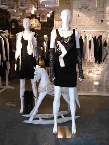
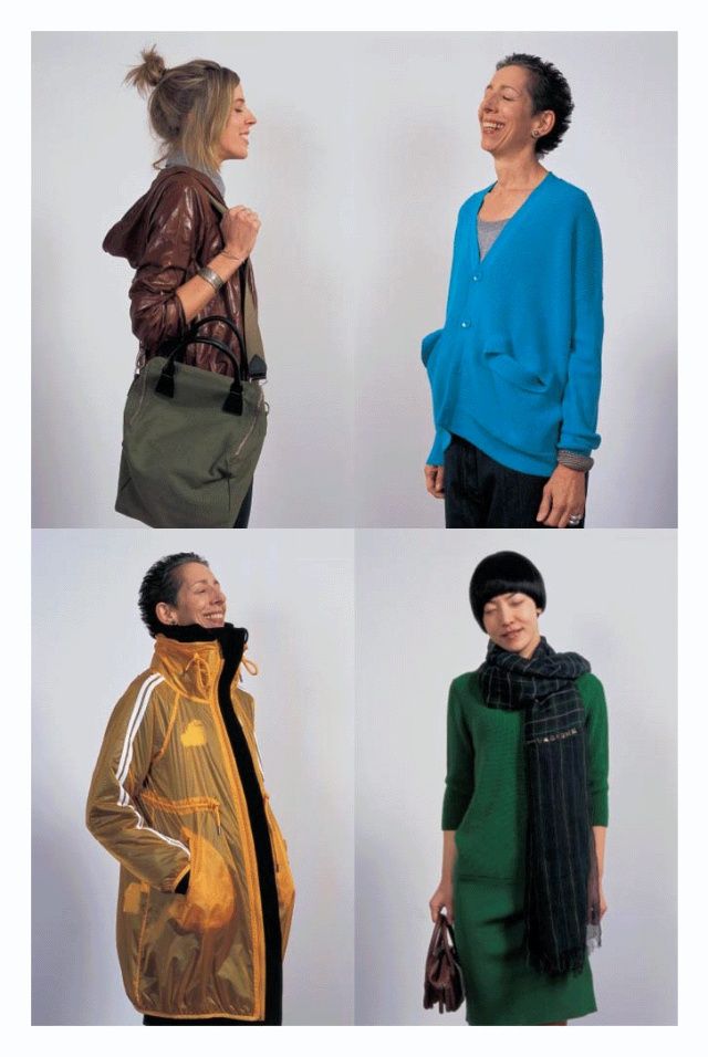
Noteworthy mention: Silk King, which carries on Shanghai's tradition of silk and garment trade. Its branches are ubiquitous across Shanghai, but I especially recommend its multi-story flagship store on Nanjing Road, which offers the widest range of products - including fabrics, bedding, scarves, readymade and tailored clothing, sleepwear, etc. - and the best service.
Labels: fashion notes, jade en plus, nuomi shanghai, shanghai, silk king, zuczug
12/21/2012 [4]

As far as inconvenient surprises go, I've never been as flummoxed as, when on a camping trip last winter, I woke up to find that one of the legs of my glasses had broken clean off the frame, presumably when I rolled over the cold-brittle frame in my sleep. Since then, I'd mostly been getting by on the power of scotch-tape, and as may be expected, had to deal with the frame constantly falling apart on me, as well as probably a lot of strange looks that I never noticed.
My tendencies toward procrastination, however, meant that I didn't get up off my ass and start looking for a replacement until August. Notwithstanding, this was an opportunity I'd been looking forward to for years.

You see, while my old glasses had been nice enough, their appearance could best be described as "nerdy". I looked like every stereotypical badly-dressed Asian kid holed in the library, managing the honor roll every quarter but with no social skills to speak of.
Which, there's nothing wrong with being that (and I was) but even apart from that, I found my old wire frames neither here nor there, as if trying too hard to be inconspicuous. This glaringly misses the point, because no matter how thin the frames are—or even nonexistent, a style that was popular in the early years of this millennium—no one was ever going to miss the fact that I was wearing glasses. And I thought, if my glasses were going to be the focal point of my face anyway, why not make them more assertive, more fashion-forward?

I was still apprehensive, though, and I worried I was just blindly following a trend, without regard for how it would actually suit me. Would not the thick frames close in on my eyes and make them look smaller? Would they dominate my face and swamp my features? Would I be doomed to wearing minimal makeup for as long as I wore them, for fear of all the colors overwhelming my face?
And yet, despite my misgivings, it was the bold frames—and in a claret red at that—that called out to me, and, surprisingly, the strong color and shape flattered my features better. As it turns out, the frames play surprisingly well with makeup, even the brighter red lipstick shown here. The clarity of my features (black-lashed and almond-shaped eyes, a defined nose, and full lips) has always been my strong point, and the frames did not draw attention away from them as I had feared they would, but reframed my face in terms of broad strokes, throwing my features into stronger relief. The poor texture of my skin is less apparent in this photograph, because they are simply less noticeable against the brightness of the frames.
.

The new frames also removed my image further from that of the uptight and plain intellectual, which is a change I like, though admittedly the effect is also more generic, more fashion-conscious, and perhaps less expressive of my actual personality. Still, it's not as if my identity has undergone a change: these are just another accoutrement, after all, and if it turns out to be a mistake, well then that's easily reversed by another camping trip. And when better to try on new personas and appearances than in (my rapidly dwindling) foolish and innocent youth?
Labels: fashion notes
10/12/2012 [2]
In his Theory of the Leisure Class (1899), Thorstein Veblen - one of my favourite economists, the Sir David Attenborough of the species Homo sapiens sapiens (breed: Capitalist), much beloved by the Institutionalists - wryly observed the inverse relationship between the practicality and comfort of footwear and the wearer's level of (implied) participation in conspicuous consumption:
"Our dress…in order to serve its purpose effectually, should not only be expensive, but it should also make plain to all observers that the wearer is not engaged in any kind of productive labor… A detailed examination of what passes in popular apprehension for elegant apparel will show that it is contrived at every point to convey the impression that the wearer does not habitually put forth any useful effort. […]
"The dress of women goes even farther than that of men in the way of demonstrating the wearer's abstinence from productive employment. It needs no argument to enforce the generalization that the more elegant styles of feminine bonnets go even farther towards making work impossible than does the man's high hat. The woman's shoe adds the so-called French heel to the evidence of enforced leisure afforded by its polish; because this high heel obviously makes any, even the simplest and most necessary manual work extremely difficult. […]
"But the woman's apparel not only goes beyond that of the modern man in the degree in which it argues exemption from labor; it also adds a peculiar and highly characteristic feature which differs in kind from anything habitually practiced by the men. This feature is the class of contrivances of which the corset is the typical example. The corset is, in economic theory, substantially a mutilation, undergone for the purpose of lowering the subject's vitality and rendering her permanently and obviously unfit for work. It is true, the corset impairs the personal attractions of the wearer, but the loss suffered on that score is offset by the gain in reputability which comes of her visibly increased expensiveness and infirmity. It may broadly be set down that the womanliness of woman's apparel resolves itself, in point of substantial fact, into the more effective hindrance to useful exertion offered by the garments peculiar to women" (emphases mine).For those unfamiliar with Veblen's sharp tongue, here it is in 21st century speak, with my own feminist slant added in:
- What is "fashionable" and "desirable" in a society conveys the impression that the wearer belongs to the "leisure class", i.e. can afford not to engage in something so distasteful as actual physical work
- Women in particular who aspire to fashion, by dint of the gender division of labour and women's station in life as symbolic extensions of their patriarchal figures, are expected to dress in a manner that actively impedes their range of movement, dexterity and stamina. Think Christian Louboutins, or the painful and crippling practice of foot-binding in dynastic China.
- The more frail, delicate, and obviously unfit for any kind of physical activity you are as a women, the better this reflects upon your social status, and more importantly, the social and economic status of your parents, boyfriend, or husband.
Thankfully, there have been some compromises for the modern-day woman. Flats are generally considered acceptance office wear (although in many industries, heels are still encourage for any engagements with clients). Unisex casual footwear (Converse, Vans, flip-flops) are not thorough objects of scorn and unwomanliness (although they will still get you kicked out of high-end restaurants). Shoemakers have cottoned onto the fact that women would prefer to have the height without sacrificing the ability to still walk (at least, get around a boardroom or a supermarket), and thus come up with such helpful innovations as the platform heel and wedges. Car designers have yet to discover a way for me to drive safely without having to remove my heels, but I expect they will eventually. ("Drives like a woman", oh, ha di-ha-hah.)
We live with these compromises every day. Live in them, literally, when it comes to fashion, every pair of shoes a consideration of the usual parameters: "Do they fit comfortably? What outfit will these go with?" But also some which are particular to women: "How far will I need to walk? Will I have to drive, or be driven? How long will I be able to stand up in them?"
And above all: "How much pain am I willing to tolerate, in this instance, for the sake of beauty?"
In my own personal case, the easy answer to the last is: Not much.
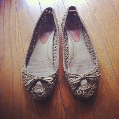
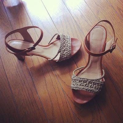
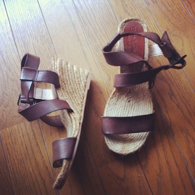
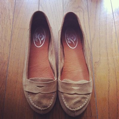
A look over my summer shoe collection here in China - leaving out my many, barely distinguishable pairs of black ballet flats which are worn to work on rotation - finds flats and mid-height heels in strong representation. What heels I do own, however, are all expressly chosen for their comfort. Seeing as I don't drive in China (and barely drive in Australia, either, to be honest), getting around mainly on foot, metro, or taxi, it is crucial that I be able to walk easily, even whilst carrying a handbag, a laptop bag, and a sack of heavy groceries, as it were. The condition of pedestrian spaces in Shanghai present further challenges: frequent roadwork, uneven pavements, slippery surfaces and poorly visible steps (accident liability being an underdeveloped arena in China).
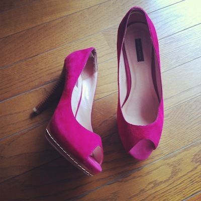
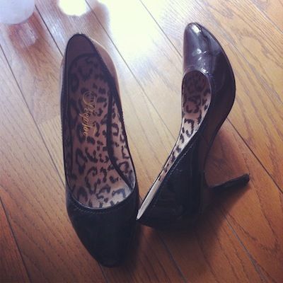
Even my evening and party heels (magenta suede platforms, goes-with-everything black patent pumps, Milana slingbacks) have been altered or selected to accommodate the environment: leather outersoles overlaid with hard rubber to prevent slips and provide some cushioning for the foot, and colours on which cement dust will not show too obviously. I would not go so far as to say that I could run in them, much less harvest a field or do much housework, but I could definitely walk a mile or three without needing a male arm to steady me.
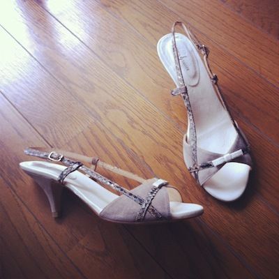
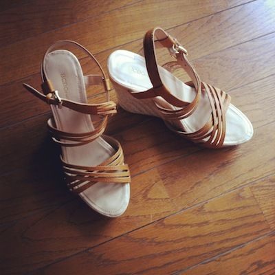
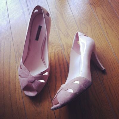
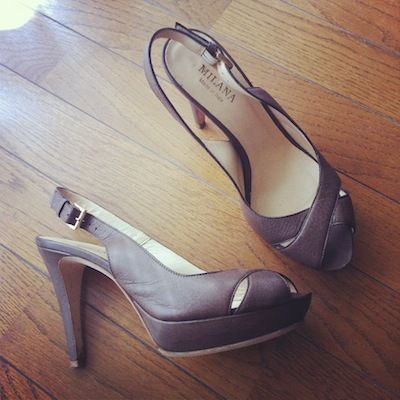
Sheme blush peeptoe heels // Milana for David Jones taupe platform slingbacks
Chloe Chen magenta suede peeptoe platforms // Peeptoe patent heels
Labels: bcbgeneration, chloe chen, fashion notes, gaimo, lottusse, milana, peeptoe, rebeca sanver, sheme, thorstein veblen
8/29/2012 [8]
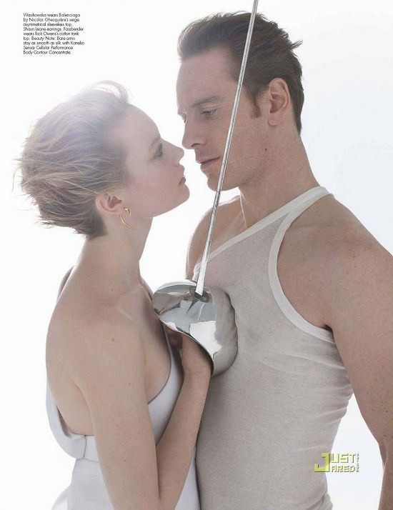
As expounded before in my Ole Lynggaard Sweet Drops post, my taste in jewellery leans toward the clean, minimalist, and versatile; organic shapes with a modern sensibility. All of those notes - with the possible exception of versatility - are hit upon by Shaun Leane's Hook Earrings and the smaller, less dramatic Talon Earrings. I first saw them on Mia Wasikowska in her W Magazine photoshoot with Jane Eyre co-star Michael Fassbender, where I was captivated by how - like the gleaming rapier in Wasikowska's hand, with its lush, curvaceous hand-guard, set against the deadly steel blade - the earrings brought into balance the opposites of sharp and delicate, masculine and feminine, warning and invitation. These are earrings with serious attitude, as declarative as a tattoo, but requiring a great deal less in long-term commitment.
Available in either yellow gold, rose gold or silver, the Hook Earrings and Talon Earrings are weighty and substantial in the hand; gently framing the face, they are striking, decidedly sculptural in their multidimensionality. I have worn mine in all seasons, but find that they cohere most effortlessly with simple outfits that are not too riotous in colour or heavily ornamented.

Shaun Leane Silver Talon Earrings from Little15 Jewellery, Shiseido Shimmering Cream Eye Colour in SV810 Tin and BL711 Angel, Shu Uemura RD198 and Cle de Peau R1 Black Baccara
Photo: JustJared
Labels: fashion notes, shaun leane
7/11/2012 [11]
 Bronzed goddess, Helena Christensen, in Ole Lynggaard Sweet Drops 2012 catalogue
While I tend to be easily distracted by the newest and shiniest in makeup, and as flighty and compulsive as a spring chick in acquiring updates to my wardrobe, when it comes to jewellery, my habits have always tended thus: find a signature piece that I love, elegant yet understated, flexible enough to hold its own with almost any outfit, and then wear it continuously (in the shower, if possible) until either loss or breakage necessitates the start of my search for a replacement.
My tastes in jewellery are not adventurous. In a purely aesthetic way, I can admire the sparkle of an ear lobe dripping with antique diamonds, the clink of bracelets stacked up the wrist like body armour, the goth-bohemian hardware of Abbey Lee - but they are not for me. All jewellery, in my case, is mostly sentimental, a physical anchor for me as I move through constantly shifting outward personas. Against the play of the ephemeral, my jewellery is something precious I wear next to my skin, like a secret. So it is a rare occasion that I start to daydream about a new addition.
I have been eying the Sweet Drops collection from the Danish jewellery house Ole Lynggaard for almost a year now. Customisable bracelets - the word "charm" is resolutely avoided, and indeed feels too slight to describe pieces with so much individual character - they combine the earthy minimalism of soft, exquisitely smooth calf leather with quietly lustrous drops of gold, silver, precious and semi-precious stones. The conceit is that there are no hard edges, no colours or shapes unfound in nature; the Sweet Drops take on the appearances of dew, pearls of caviar, sea-foam, and acorns. But they don't come cheap: a leather bracelet ($495 AUD) with two Sweet Drops can easily cost upward of $3000 AUD.
There are compromissory alternatives, of course. The Rapture collection from Najo, an Australian brand specialising in sterling silver jewellery, looks heavily modelled on Ole Lynggaard, and is a fraction of the price. But the addition of silver clasps, and their overwhelming "shininess", fail to capture the heart and the imagination the way the Sweet Drops do - the illusion that, like a creeping vine or a naked, fresh rose, they would be eternally graceful, and never out of place on any occasion.
Ole Lynggaard Sweet Drops are available from selected retailers around the world.
Labels: fashion notes, najo, ole lynggaard
1/24/2012 [2]
Growing up close to the textiles industry, I learned that fashion was short-lived, but that good fabric would last a lifetime. My parents bought yards of cloth for their coats and suits overseas (Italian wool woven from Australian merino), before having them tailored in Shanghai: the best of both worlds. I know grades of wool, silk, mohair, alpaca, linen, cashmere and cotton by feel, and I am very particular about what I will allow near my skin.
100% polyester? Not a chance.
90% cotton/10% cashmere? I will be needing second, third, fourth back-ups, in different colours, please.*
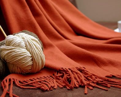
On my most recent trip to Shanghai, while scouting various boutiques in the French Concession for a suitable birthday gift for a discerning friend, I came across Shokay ("yak fiber" in Tibetan), a brand founded in 2006 by Marie So and Carol Chyau, former classmates at the Harvard Kennedy School’s MPA/ID program.
According to their website, Shokay is "the world’s first lifestyle brand focused on using yak fibers to provide maximum warmth, comfort, & style. Shokay prides itself not only in its classic and modern designs, but also in its social impact." Their scarves, shawls, throws and other products are made from hand-combed yak down sourced from Tibetan herders in Qinghai Province, and knitted in Chongming Island, off the eastern coast of China, before being sold in up-scale boutique stores in Shanghai, Beijing, abroad, and online.
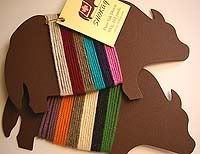 The business model is not new: sell to a niche market something that gives people in less developed areas (in this case, one of the poorest regions in China) a sustainable income. The Oxfam Store runs on the same basic principle. What is unique about Shokay is how it is almost single-handed creating a market for a product that most people outside of the region do not know anything about.
I am not entirely unfamiliar with yaks. On a trip last summer to Diqing Tibetan Autonomous Prefecture, also know as Shangri-La, in Yunnan Province, I had the opportunity to get pretty close to a number of those large, shaggy animals. But what I could not have anticipated from seeing them is just how truly luxurious their down was.
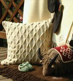 I own the plaid shawl ($105 USD) from Shokay in the colour pale green, made from a blend of 75% yak and 25% bamboo. (Bamboo!**) The fabric is superbly soft, breathable like linen, with the warmth and lightness of weight of cashmere. It is ideal during the warmer months, when the weather can turn chilly all of a sudden, or if you need a temporary shield for your bare skin against the over-zealous air conditioning.
I have since gone back to the store (Nuomi on Xinle Road, for the curious) for three more scarves from Shokay, in different sizes and colours. They are a great conversation gift, I find, and well-appreciated by people who like quality, but not showy, accessories. Also available at the online store are dyed yak yarns for knitters.
Ethical consumerism is very much in vogue right now, but despite largely good intentions, it systematically runs into the problem of turning into yet another product differentiation tool, used to sell over-priced items to the middle class. What's more, the outcomes of such projects as Fair Trade and Oxfam have often been mixed, and less positive than expected.
Cynic that I am, before buying too enthusiastically into the social entrepreneurial-ship aspect of the brand, I would need to know more about how money is divvied up between the various parties in the production and distribution chain, and perhaps hear what the Tibetan farmers have to say about the business.
The products, however, already speak for themselves.
Find your nearest stockist here.
*It's warm, comfortable, and machine-washable. What's not to like?
**Bamboo is a hardy, fast-growing plant that requires almost no pesticides, and that produces a silky organic fabric with a similar texture to cotton.
Labels: ethical consumerism, fashion notes, shokay
8/15/2011 [2]
I was browsing around on the net (though I should have been studying!!!) when I found this Korean magazine scan from 10 or 15 years ago. It's an excellent example of the late 90's Korean take on both grunge and hip-hop*: plainness to the point of conservativism, somber neutrals, and a tendency toward oversized fits and unisex styling.

This girl accessorizes with little more than her shoes, a necklace, a watch, and a basic shoulder bag. The lines are very clean, with colors limited to brown and white. It doesn't seem like much, but in fact this kind of look is very difficult to pull off. When the details are tuned down to this low a volume, the smallest irregularities suddenly reverberate glaringly and the smallest alterations can cast the whole effect in a different light.
In short, everything must be taken into account, which the girl in the photo has done well, from the effect of the shoulder strap crossing her chest to the necklace—a delicately chunky silver that picks up on the oft-ignored decorative effect of the logo, white lettering against brown—to the doc martens—suitably muted in color and generic in design but with a distinctive shape that keeps the lower half of the outfit from degenerating into sloppy formlessness. The sleeves have been pushed up to show the slenderness of the arms, accentuated again by the watch encircling the wrist: if not for this last step, the overall silhouette would appear much bulkier.
Each element has an impact that would leave something lacking, were it to be taken away, yet none of them steal the stage for its own. This kind of synergy is easy to miss, all the more because you can't quite pinpoint a single piece that makes or breaks the effect. It's this kind of laid-back equilibrium that's also the most difficult to master, and which I think is the single most significant distinction separating the truly well-dressed from the average magpie connoisseur of fashion "items".
* The two aesthetics seem to be somewhat confused in this, but the Koreans and the Japanese are expert at a sort of post-modernist mishmash of foreign trends in total defiance—or rather, disregard—of their origins, to varying effect: there's a whole world of difference between T-shirts emblazoned with "Engrish" phrases and Samurai Champloo.
Labels: 90's, fashion notes
12/17/2010 [0]
Despite ragging on J. Crew in last week's post, I found this interview with J. Crew CEO Miller Drexler, Narciso Rodriguez, Elle editor-in-chief Robbie Myers, and The New York Times's Cathy Horyn interesting and informative, with 90% of my interest being in Drexler and his observations on the business of fashion. Really, in a group featuring Cathy Horyn, Robbie Myers, and Narciso Rodriguez, who would have thought the CEO of J. Crew would be the most interesting person there? That said, his insights on fashion as a business, and a heavily industrial one at that, are what kept me tuned in for forty minutes.

At an hour long, this interview with Vogue's Sally Singer* left me with a lot to think about, not all of it satisfactory. It's clear the audience is not heavily invested in fashion or has any real knowledge of the industry, only of the perception of it. As such, the questions raised are highly judgmental, and Singer ends up speaking to judgmental presumptions as much as to the questions themselves. I'm not sure she's entirely successful on either point. As someone who checks fashion news sites the way some people check baseball scores, I know who she's talking about when she mentions Thakoon. I know the context of the comment that a $700 dress is reasonable. The audience is unfamiliar with these ideas, however, and without providing the proper context for them, I doubt Singer made fashion seem any more accessible, reasonable, or even related in any way to the audience's worldview. That said, it is still interesting to watch, particularly when Singer discusses her own road to Vogue. I was surprised at how normal and down-to-earth Singer is, given the penchant to promote Vogue contributors as somehow otherworldly. It seems Singer is still strongly connected to her younger self's understanding of fashion as fantasy, a sort of playground for identity. I wonder if that's what keeps her from making more compelling points in this interview; she can't step outside of that paradigm well enough to speak "fashion" to the masses.
Finally, for those truly interested in the business of fashion, you may be well pleased to check out this website of the same name. The website features original content focused on business strategies, deals, and international news, and compiles fashion business news from a host of other sites. The website's original content and point of view are what keep me coming back. Extending beyond the typical soundbites from Marc Jacobs and Miuccia Prada, the website features incisive analyses of business strategies and aggregates behind-the-scenes information and interviews unseen on other sites.
*Sorry-for the life of me, I can't figure out how to embed this video.
Labels: fashion notes, vogue
5/04/2010 [0]
Can someone please explain all the recent J. Crew love for me? Oprah's recently interviewed creative director Jenna Lyons, Lucky raves over their clothes, and Fashionista regularly fawns over their offerings. I simply don't understand the gushing. Recent visits to J. Crew have only reinforced what I've always thought about the brand, which is that their clothes are uniformly boxy, cut large, and greatly overpriced given the quality of material and construction. So where does the love come from?
I have several theories:
-J. Crew is a major advertiser and source of revenue.
-Fashion editors are familiar with/fond of Jenna Lyons and trying to support their colleague.
-To improve their image, J. Crew have employed Gucci's-Tom-Ford-era media blitz approach to marketing, employing Lyons as a figurehead "personality" to head the brand and lend J. Crew the impression of fashion authority. Subsequently, fashion editors nationwide (and Oprah) have developed a major style crush on Lyons and are unconsciously working that out through gushing, imitation, and general overt crushing.
Of the three, I feel confident it's the last one that's proving true here. While J. Crew advertises widely, it does not advertise on the same level as giants like L'Oreal or the LVMH group. Any publication would hate to lose J. Crew's dollar, but many magazines could not afford to lose LVMH's. And while I'm sure nepotism still has a stronghold on the fashion industry, the above video offers a great example of the kind of blind gushing over Lyons and the brand that I see in an increasing number of media outlets. Just look at the way the video (and Lyons herself) presents her: smiley, friendly, unassuming and approachable, yet with a distinct point-of-view on fashion, with strong opinions, authority, and credibility. So you could have a drink with her and spend the whole time admiring her shoes. Laugh if you will, but by marketing figurehead Lyons as a sort of Everywoman's fashionista (she mixed J. Crew with Miu Miu!), her presence lends the idea of fashion to J. Crew.
And in fairness, the idea of fashion is there, if only as an idea. The store doesn't lack for on-trend military influences, ruffles, and easy layering pieces. The problem I have is the reality of fashion has yet to join up with its ideals. As many on-trend items as the store boasts, and as much as the marketing department bolsters the chain's fashion cred by placing Lyons as a fashion icon in leading, credible publications, the clothes still suck. The ruffles are droopy, the embellishments fade into the clothes rather than acting as visual relief, and the jackets lack enough structure to lay correctly on the body. What's on offer is the equivalent of handing an average teenager a box of pencils and a pad of paper and asking her to draw her dream wardrobe: all the ideas are there without any of the skill, knowledge, or craftsmanship to make those dreams a reality.
So, it's killing me: is all the gushing really over one woman's personality and hi-lo dress sense? Or do people really think they're investing in fashion at J. Crew? What do you think?
Labels: fashion notes, j crew, lucky
4/26/2010 [7]

As with most other fashion rules - no white after Labor Day, always wear hose with dresses and skirts, no shorts after summer - the rule against wearing black with brown has been thrown out the window. The pairing of black and brown can create a very rich look. The trick is to choose a brown that has some depth. Flat, matte true browns without depth cannot create a contrast against black, causing the colors to clash. Browns with depth, meaning those that feature an undertone color, create the illusion of depth and contrast with black, allowing the colors to work in concert. There are no particular undertones that must be paired with black, though I find medium-to-deep browns with warm undertones work best as they provide the most contrast. Should you wear a couple of brown items with black, there is no need to match the browns. The more depth, the better. Rather than getting hung up on specific shades, though, it's more important to focus on the visual depth you're creating. If the outfit has depth, you're on your way. If the brown and black you're wearing seem to clash, you probably need to find a more complex brown.
Labels: fashion notes, garance dore, sartorialist
3/02/2010 [0]

Among the many issues recycled in women's magazines is the issue of color, specifically, how to incorporate color into a mostly black or neutral wardrobe. The answer, like the question, is usually recycled and both less thoughtful and more complicated than necessary, reciting the old line that the easiest way to incorporate color is through bright accessories that lend a pop of color. Really, it doesn't have to be so complicated. The idea of a pop of color is exactly that - taking a mostly neutral palette and letting one colored item stand out against it. Color will naturally stand out against neutrals, so it's unnecessary to specifically go out looking for bright accessories, not to mention potentially unwise. Some of them can be awfully bright. Likewise, a pop of color doesn't have to be reserved exclusively for accessories. A gold top against an otherwise black outfit will serve the same effect as a gold bag.
That said, I really like this look on Betty, who's incorporated a bright color to great effect against blacks and greys. Betty's chosen well, wearing a hue that's bright, not obnoxious, and pairing it with a spectrum of neutrals rather than just black. The spectrum of greys creates depth that juxtaposes nicely with the vibrancy of the scarf and shoes. What I particularly like about this outfit is I don't get the impression that these are Betty's "bright clothes." All too often in women's magazines, products specifically get promoted for adding a pop of color, and it's easy to see why. They're mostly obnoxiously bright to the point that no one could miss them. This is the fallacy in most magazines' promotion of a pop of color. What works well in editorials rarely translates to real life. It's better to take that bit of color you do have and work it in rather than try to apply editorial styling to real life.
Labels: fashion notes
2/23/2010 [0]
I love browsing books on style. I've read a lot of them, although I usually only borrow them from the library -- how often is one really worth keeping? In my experience, the advice in style books doesn't really vary that much: buy quality, buy classics, buy pencil skirts.

I wonder about giving voice to my irritation with this book: it's a charming, fluffy, frivolous thing, obviously gimmicky (exactly one hundred essentials!) with adorable illustrations. Subtitle aside, it's clearly not meant to be a style bible, even for people who adore Nina Garcia. Complaining about this is like saying that America's Next Top Model is unrealistic about the fashion industry. Duh. But since being churlish is what I'm good at, I'm going to complain anyway.
Garcia herself writes that this is not meant to be a definitive list of garments every woman must own; this is a starting point, a guide to her personal style ("reading this book is...like walking you into my closet.") However, it's written as advice, probably because that's what her publisher wanted. I imagine Garcia and her publishers planning this as a quick follow-up to The Little Black Book Of Style, which I haven't read yet. The initial concept: an alphabet of fabulous pieces for fashionable women to own! Great, right? Except that at some point, they changed their minds -- maybe they realized no fashion essential starts with X, maybe The One Hundred sounded classier than The Alphabet of Style, who even knows (or cares) -- and they ended up with this padded-to-hell mishmash.
In my opinion, there simply aren't a hundred pieces "every stylish woman" must own. Garcia throws in some obvious choices (ballet flats, little black dress, cashmere sweater, jeans, red lipstick, pencil skirt), some nice things I'd hardly consider essential (real or fake fur, leather pants, Missoni knits, cape), some things I can't imagine ever wanting (caftan, Wayfarers, Havaianas) and some things that aren't clothing or accessories at all (iPod, BlackBerry).
A few more thoughts:
- Does anyone really need ankle booties, knee-high boots, Frye harness boots and cowboy boots? If you really love boots, sure. Otherwise this seems like overkill, especially the last two.
- I don't think the A-line dress is the universal flatterer Garcia seems to think it is. Perhaps this is the case if it's very well cut and made from good fabric. However, I am a size-0, just-this-side-of-petite woman with a flat chest, a small waist and curvy hips, and the A-line dresses I've tried on obscured my best features and made me look like a little girl. A pear-shaped little girl.
- Actually, while I'm navel-gazing, a lot of the advice in here is just inapplicable to a woman my size. Maybe if I read "Man's White Shirt" as "Little Boy's White Shirt"?
- M is for Mad Money, Q is for Quality Champagne (heaven forbid you should drink prosecco!), and V is for Valid Passport. (You know, just in case some aspiring fashionistas are walking around flashing invalid passports.) Sometimes you just gotta say ferchrissakes.
- On nail polish: "Go for either the vamp red or a light, light pink. Maybe black satin if you feel like being goth or punk rock. But do not dip into a middle-ground palette. Corals and fuchsias are just asking for trouble." What kind of trouble? I'm assuming she's thinking that "middle-ground" shades look unpleasantly old-lady, but I don't think this is universally true.
- On perfume: Garcia recommends the signature scent, which, fine, but she also suggests wearing "any man's cologne." Oh no no no. I love wearing masculines -- I just bought a full bottle of Chanel Pour Monsieur -- but you do not want to wear just any man's cologne. Sheesh.
- On choosing red lipstick: "For fair skin, go for a red that has blue undertones." Nina, this pale orange woman is frowning at you.
I'm not sure it's possible to write a definitive guide to style, which is so much about individual preferences and associations anyway. Certainly, I've yet to read one. This book is charming, but I wouldn't recommend it as anything more than eye candy.
Labels: books, fashion notes, nina garcia
2/10/2010 [2]
BEST USE OF LACE

3.1 Phillip Lim wins this category hands down. Lace has been an occasional trend in fashion recently, spurred by Prada's Fall 2008/2009 all-lace show, and Phillip Lim shows a very approachable, wearable version of it here. Devoid of the more stuffy, starched, high fashion elements of late, this lacework is girly, youthful, and exceedingly pretty. As with the majority of Lim's work, these are pieces that can easily, almost intuitively, be incorporated into the rest of your wardrobe, adding that punch you lacked before without disrupting the flow of your ensemble.
BEST SKIRTS

Again, 3.1 Phillip Lim knocked it out of the park. Between his beautiful lacework and the fluidity in his tulip skirts, Lim has almost made a skirt believer out of me. His tulip skirts were what really sold me on his collection. Beautifully draped out of light, soft fabrics, these skirts provide an approachable, American form of elegance that will neither alienate nor intimidate those around you (or, for that matter, the wearer herself). In addition to tulip skirts, Lim featured both lace and cotton straight-cut skirts that lend instant youthfulness and cool, all of which were wearable and provided just enough fashion to keep things interesting.
BEST FOUNDATIONAL DRESS

Surprise, surprise - 3.1 Phillip Lim again (up until I saw Lanvin's collection, Phillip Lim was my pick for best collection). Foundational pieces are really the hardest to find, at least for me. They need enough interest in and of themselves that they can stand on their own (the draped waist, three-quarter sleeves), yet be quiet enough to blend into the background (neutral color, simple design). This dress achieves that rare task of being both neutral and interesting, maintaining the idea of the shift dress without drifting into a sartorial snooze. An additional plus - how often do you find a dress that looks dressed up, even complete, with the simple addition of a workaday brown belt?
BEST CUT DRESS

I cannot see how this dress would fail to flatter most figures. From the Yves Saint Laurent collection, this dress features enough flare at the bottom, width at the top, and definition at the waist to even out and flatter most figures (a feat that used to be what dresses were all about). In addition to beautiful figure flattery, the dress hits at just the right point, hovering around the knee. Between where this dress hits on the body and how it skims over it, this is an ideal cut for a dress.
BEST DRESS OVERALL

I absolutely love this dress. Also from YSL, this dress has the most beautiful racerback cut to flatter the shoulders. I also love the pattern, which came as a surprise to me. I'm not generally big on anything that hints at animal print, but the reddish tone to these browns, as well as the vertical print, got me. Overall, this dress achieves something the two before it cannot. While both of the previous dresses, and all the previous looks, have interesting details, this is the only look that actively draws your focus, but it still avoids ostentation and an obnoxious monopoly on your attention. It is the neutral for those who do not wear neutrals.
Labels: 3.1 philip lim, fashion notes, proenza schouler, ysl
2/09/2010 [0]
It was easy to pick the best show from the resort collections. There were many great clothes shown in the collections - easy to wear, ready to transition from the store to your own wardrobe - but there was only one presentation that really breathed life, though, and that was Lanvin. Between the humor (which is rapidly evaporating from the world), the movement and youthfulness of the clothes, and the liveliness of the presentation itself (featuring a backdrop of fashion-obsessed spectators), both the presentation and the clothing had vitality, wit, and a sense of festivity that made me want to join that world. Besides being the most joyful presentation, the clothing revealed a side to Alber Elbaz's talent that I really appreciate. Despite his ability to cut beautiful clothing, there is something about Elbaz's work that has always struck me as being old. Maybe it's the 40s references or his insistent presentation of ladylike silhouettes - regardless, I've never quite jived with it. Here, though, all thoughts of old ladies and past decades were done away with as Elbaz presented brilliant shots of color, youthful cuts, and the most beautifully flowing clothes seen in all the resort collections. Here are a few of his show's key points.
TRENCHCOATS

In this collection, Elbaz adopted the current fervor for jackets by widely useing trenchcoats to formalize the youthfulness of the clothes, as well as to provide that finishing polish to the more sophisticated outfits, as seen here. Without the trench, this would be a nice dress, but the overall look would be a bit undone. Add the trench and suddenly the outfit seems finished, though no small part of that finished effect is derived from the beautiful cut and fabric of the trench.
In an unrelated sidenote, what initially piqued my interest in this collection were the Cuban heels, in particular, and the footwear at large. True, some of this footwear is dowdy, but all of it is wearable. None of it will elevate you into a human crane, nor does any of it require a whole new wardrobe just to match the shoes. I dearly, dearly hope this is a trend designers keep up, because it is nearly impossible to find good shoes these days.
VOLUME

Volume is a central theme for Elbaz, who has previously shown parachute dresses, puffy sleeves, and the ridiculously high heels aforementioned. In this collection, volume takes on a more youthful, festive feel in the form of circle skirts. There is a far more casual feel to the volume in these skirts than in previous collections, making them appropriate and wearable for day. It is almost as if the stuffy formality of previous formality has literally been ripped away from these skirts, leaving only a kind of casual looseness and informality perfect for wasting away the days aimlessly on vacation.
YOUTH

This is easily the most youthful presentation I've ever seen from Lanvin. Between the jolts of color, the styling, and the clothes themselves (jumpsuits, harem pants, hi-tops), this collection very easily and successfully combined the fluidity and luxury of Lanvin's cuts and fabrics with the playfulness and experimentation of youth. It's easy to see how the models were so able to get into character - these clothes are fun. What's more, they are so elegant in design that they may be both dressed up and played down, proving truly versatile and functional. Both the top and the trousers of this outfit are of a highly sophisticated cut and fabric, and either may be used in conjuction with more neutral foundational pieces to provide a punch of color and liveliness to the standard wardrobe. To my mind, though, this outfit is right as it is. I couldn't wear it, lime green and harem pants not being my most flattering looks, but I appreciate the playfulness of the color and the willingness to dress down multi-thousand dollar Lanvin with hi-tops (if there's anything I love, it's the unexpected).
COLOR

I cannot say it enough - this is the most colorful Lanvin presentation I've ever seen. Elbaz has used color before, but this intense saturation of neons, acid hues, and primary colors is something new. It can be particularly difficult to make a very bright, tonal look like this look sophisticated, but Elbaz achieved this through luxurious fabrics and a mature approach. Though bright, the trenchcoat keeps the outfit elegant and adult, leaving all eccentric touches to the accessories rather than the clothes themselves.
EVENING

Lanvin easily presented resort's most beautiful evening clothes. Full-length, fluid, and highly romantic, these are evening clothes that seem light enough, both in weight and mood, to carry into the day. These are beautiful, beautiful dresses, the best part of them being that they highlight the wearer than themselves. Though not usually a fan of prints for evening, I particularly like this dress. The print is muted enough that it maintains dignity, and it hasn't been so widely advertised as to immediately date itself. This is a dress that you could easily pull out of your closet for years to come.
Labels: fashion notes, lanvin
2/04/2010 [2]

While flipping through a preview of Harper's Bazaar Fabulous at Every Age recently, I ran across an interesting point. Under the section for evening dressing, there was a picture of Lou Doillon as above, dressed for the Costume Institute Gala in 2008. Doillon's picture was used as an example of "rebel" dressing, and the accompanying soundbite urged readers to stay true to their style, even when dressing for night. This rang true for me. I know what it's like to try to dress for evening when all the styles for sale are ultra-feminine, super-girly, or just sexy-unto-skanky. It is hell. There is very little out there that is suitable for someone who doesn't want to dress like a cookie cutter image of a starlet, a porn star, or even a style blogger. Unlike regular people, who take their style inspirations from Sex and the City, starlets, and their morals and who only look upon Balenciaga and Givenchy as freaky aspirational wear (you know, the sane), I don't have the option of running to the store and finding something to wear. In order to stay true to my own look, I have to improvise and come up with something that is entirely my own. Though the eccentrics are small in number, we are not alone. Here are a few evening looks that I consider ideal.

I have loved this outfit on Daria Werbowy since I saw first saw it two or three years ago. She could have easily tarted up this Versace dress (it is not exactly quiet or modest). It's the addition of the jacket and the tights that take this from tacky to wearable, at least as defined by my scale of relativity. It's these personal touches that also transform this from a showstopper dress into an outfit. This outfit is an example of what can be done with evening wear and clothing in general - make it your own, add your own touch of what you think is right, and you look like an original, and it's this original approach that makes Daria stand out more in this dress than would JLo, Beyonce, and whoever else would place their more literal stamp on it.

This is another outfit burned into my brain. Worn to the 2000 Oscars, I was totally and completely taken with this Jean-Paul Gaultier look worn by Cate Blanchett. This is the ideal evening look for me: dramatic, minimal (just a plain black dress with a train), with jewelry acting as integral accessories to the look rather than show pieces in themselves. This look offers the showstopping, look-at-me qualities seen in other red carpet looks without the swagger of, say, a more blinged-out Versace number (see above). Despite the drama, the dress doesn't scream at you, and with the front kept plain, it still draws attention to the wearer rather than itself. I secretly hope to have an opportunity to wear this someday.

I can see how this Mary-Kate Olsen ensemble (front) could be considered obnoxious, but I get this on a very deep level. Nothing about this outfit goes together, not the black belt with the brown fur, not the transparency of the dress with the formality, and certainly not the hose with the wedge heel sandals. Somehow, though, where this would fall apart under other hands, these combinations seem to work together and flow under Mary-Kate's supervision. This is her specific vision of what she likes and how she thinks things go together, and it can be equally applied to both day and night. This is what separates the individual and particular from the merely pretty or conventional.
What I love most about this outfit, even more than the synthesis of its disparate Gothic elements, are the hose with the shoes. This is such a singularly eccentric element and looks so much like something I would wear myself.
Labels: cate blanchett, daria werbowy, fashion notes, mary-kate olsen
1/11/2010 [1]

When I saw this image in the December 2009 issue of Lucky, it created more excitement in me than I've felt about fashion in a long time. I have long loved tie-dye (I went to a hippie middle school), and I love the visual depth the t-shirt creates against the jacket. Being small both in stature and frame, visual depth isn't something that's always been easy for me to achieve. I've generally assumed depth to mean mixing textures in an outfit, leading to experiments with cable knits and tweeds that have inevitably ended in either adding bulk to my frame or drowning it. Either way, I was overheated and depth was not had. My confusion was compounded by endless viewings of What Not To Wear, in which Stacy and Clinton create visual interest through a mix of textures (satin, chiffon, various wools) and really girly accessories. It wasn't until I saw this look that something in my head clicked; I finally got that creating the look of depth in an outfit doesn't have to come from adding texture itself. Instead, it's more about literally creating visual interest by wearing something that draws the eye inward. In this look, specifically the middle picture, depth was created both by the tie-dye pattern and the mix of patterns in complimentary tones. The tie-dye itself shows variation in depth between brightness of color and tone which naturally draws the eye inward. In addition, the jacket brings its own depth with its mottled pattern while staying in the same color family. This is one of the quickest ways to introduce depth to an outfit: remain within a single color theme while incorporating variations in pattern, texture, or tonality.

This Calvin Klein shift gives an idea of how depth can be created through pattern alone. The ombre pattern literally draws the eye into the shift, creating dimension. Likewise, the texture of the dress (puckered cotton voile) creates further dimension. This is the difference between visual depth and adding a "pop" to an outfit, as would What Not To Wear. A pop is a statement that screams from an outfit, be it a bold color, accessory, or item of clothing. Visual depth actually draws the eye into the outfit, causing the viewer to look closer and become engaged in the outfit.

Visual depth can also be created through wearing black and leather together. Though this is typically done with black leather, the contrast of the almost burgandy tone of the brown, as well as the cage design, work together to create depth against the dark tones and tweeds of this Rodarte dress. The reason why leathers work so well to create depth is because they cause the eye to stop wandering and focus on them, creating contrast against the other elements of the outfit. This is particularly true in all-black outfits. Whether matte or patent, leather attracts both light and shadow, and anything that attracts light will naturally contrast with matte black, which absorbs it. This contrast creates the illusion of depth, the effect being heightened in all-black outfits, in which the total look is the interplay of light and shadow - in effect, the definition of depth.

One of my favorite ways to achieve depth is to take one main color - here it's black - and work with tones that compliment it. Despite the difference in colors themselves, the reds, blues, and yellows of this Dries van Noten blouse are similar in tone (they are all colors that have had black added to darken them). When paired with black itself, the contrast is quite striking, and the eye is drawn into the top. This is probably the easiest way to achieve visual depth, as we all have basic, neutral tones in our wardrobes to work with. I also find this look the easiest on the eye (coat excepted); it requires the least thought, and all the tones work so well together that the outfit flows nicely, especially when contrasted with the more aggressive look of the jackets and t-shirts at the top.
Labels: calvin klein, dries van noten, fashion notes, lucky, proenza schouler, rodarte
12/30/2009 [1]

I am not a jewelry person, but I just love this twig ring by Elizabeth and James ($395.00). Of the jewelry I like, I'm partial to band rings and designs inspired by nature, and I especially like the dimension the mixed metals lend the ring. But would I buy it? No, and here's why:
- It's a very cool ring, and "cool" has a shelf life of two years.
- For $395, I would expect to wear a ring for ten years, not just two.
- Were I to see a knockoff of this ring at, say, Kmart, I wouldn't buy it. It would be ugly and cheap, and I wouldn't think twice about it. Were it at Kmart and distributed by one of Mary-Kate and Ashley Olsen's umpteen brands, though, I might be tempted to buy it just to sport it for a couple of years. I'd at least think about it.
Labels: elizabeth and james, fashion notes, mary-kate olsen
12/22/2009 [2]
BEST ACCESSORY

I am not a jewelry person, but from Balenciaga's fall show, this cuff is the one thing I responded to. I just find the curvature of it so beautiful. Not only does it emphasize the graceful curve between a woman's arm and hand, it also reflects on the curves of women themselves. This is just the perfect thing to place at the end of a very long, very lean sleeve.
BEST FUR

I love this punch of fur and tweed from Miu Miu. Fashion is besieged with couture embellishments right now, and this serves as an antidote to that. Though dramatic, there is something very haphazard and undone about simply draping an embellishment over your clothes, and the intermix of grey and white really plays up the coat's inky black. Plus, I just love the shoes.
BEST WEARABLE COAT

This has to be one of the prettiest coats I've ever seen. Feminine, girly, and slightly retro, this Miu Miu coat is something I would have exclaimed over when I was in my early 20s and going through the phase of thinking the only style icon was Audrey Hepburn and clothing had to be tasteful. I have evolved since then, but I still think this is one of the most easily and enjoyably wearable coats I can remember.
BEST FASHION COAT

As much as I love the above, this Miu Miu outfit is the one I'd actually wear. The open top speaks to my need for dramatic clothing and face-framing necklines, and the vest's slim bottom keeps everything fitted and cool. This vest is something I could easily wear years from now, as it's in keeping with my general style, and is not likely to easily date.
BEST LOOK OVERALL

While reviewing the fall shows, this appearance by Miuccia Prada from the end of Prada's show was easily my "eureka" moment. I love everything about this look: the sequins, the slim fit of the dress, the cardigan over the dress, the socks with sandals, how everything goes together, the general frumpiness of the outfit that Miuccia morphs into hip grandma. Essentially, this is what modern fashion is meant to be - taking the clothes and making them your own. Easy to say, hard to do, harder even to do now that we've replaced culture with advertising and can't get away from the hard sell. Despite it all, this outfit tells me a lot about Miuccia Prada herself, as well as about the brand. From this outfit, I can glean that Miuccia Prada is an individual, she should style and model in her ad campaigns, and that Prada is meant to be worn, not venerated, idolized, or scorned. This ended up being my favorite picture from the fall shows, and I think it serves as a better advertisement than all the fall ad campaigns I've seen.
Labels: balenciaga, fashion notes, miu miu, prada
12/08/2009 [2]
Subscribe to
Posts [Atom]. Or
follow on bloglovin'. If
you'd like to contact Dain,
feel free to email me.
I'm also on Pinterest.
The Mnemonic Sense
Most Wanted
The Beauty Primer
Lookbook
Bestsellers
Consumer Diaries
Closet Confidential
On The Label
Beauty Notebook
The Hit List
Color Me In
The Makeup Artist
Wedding Bells
Globe Trotter
Desert Island
perfume notes
beauty notes
fashion notes
culture notes
minimalism
chypre arc
floral arc
fresh arc
masculines arc
gourmands
& orientals arc
Archives
August 2008
September 2008
October 2008
November 2008
December 2008
January 2009
February 2009
March 2009
April 2009
May 2009
June 2009
July 2009
August 2009
September 2009
October 2009
November 2009
December 2009
January 2010
February 2010
March 2010
April 2010
May 2010
August 2010
November 2010
December 2010
January 2011
March 2011
August 2011
September 2011
October 2011
November 2011
December 2011
January 2012
February 2012
June 2012
July 2012
August 2012
September 2012
October 2012
December 2012
January 2013
February 2013
March 2013
June 2013
July 2013
Images
Photobucket