"The most beautiful makeup for a woman is passion, but cosmetics are easier to buy."
—Yves Saint Laurent
Announcements
If you're new to this blog, then read our guides to the basics: Skin (Part I), Skin (Part II), The Supernatural, Color Theory I, Color Theory II, Eyes, and Brushes.
Also, check out the blogsale.
Contents
Favored
Art Tattler
the glamourai
The Non-Blonde
Perfume Shrine
Lisa Eldridge
Garance Doré
Smitten Kitchen
Into The Gloss
Grain de Musc
Lacquerized
Res Pulchrae
Drivel About Frivol The Selfish Seamstress
Killer Colours
Bois de Jasmin Glossed In Translation
Jak and Jil
Toto Kaelo
Worship at the House of Blues
I Smell Therefore I Am
Food Wishes
The Natural Haven
Messy Wands
1000 Fragrances
Moving Image Source
Wondegondigo
The Emperor's Old Clothes
M. Guerlain
Colin's Beauty Pages
Barney's jewelry department
Parfümrien
loodie loodie loodie
The Straight Dope
Sea of Shoes
London Makeup Girl
Sakecat's Scent Project
Asian Models
Ratzilla Cosme
Smart Skincare
Illustrated Obscurity
A.V. Club
Tom & Lorenzo: Mad Style
Eiderdown Press
Beauty and the Bullshit
La Garçonne Flame Warriors Everyday Beauty
Fashion Gone Rogue
Now Smell This
Dempeaux
Fashionista
The Cut
A Fevered Dictation
Nathan Branch
101 Cookbooks
As much as I enjoyed the spring collections, so many beautiful clothes blend together. The following are a compilation of the specific S/S 09 looks that resonated with me.
BEST WEARABLE MAKEUP

It's actually very rare that I notice the makeup at fashion shows. I take a cursory glance while looking over the clothes, but I'm mainly interested in seeing the designs rather than taking in the show as a whole. In the case of the Yves Saint Laurent show, though, I was equally excited by the clothes and makeup. From a distance, it looks as though the models are wearing the perfect dash of eyeliner, just thin enough to define the eyes without overwhelming while adding the end flip to widen and further open them up. The rest of the face is an emphasis on natural beauty - defined eyebrows, cheekbones with just a dusting of light blush, and nude lips, the definition of picking one feature to concentrate on. It's only up close that you realize the "eyeliner" is actually a row of false lashes glued to the upper eyelid. Though the particulars aren't to be copied, it's a look that could feasibly be worn.
BEST THEATRICAL MAKEUP

Anne Valerie Hash's makeup echoed the themes at YSL, with an emphasis on the eyes, defined brows, and light blush and lips. Hash's look replaced eyeliner with iridescence, placing a frosty green pigment over reddened brown. I was surprised by how beautifully the colors complement each other, almost like a NARS duo, leaving the look light and ethereal. Certainly not a daytime look, but it could be fun for night, leaving out the shadow to the temples.
SEXIEST DRESS

This Roberto Cavalli dress is a sartorial paradox, being trashy and elegant, beautifully cut and poorly constructed all at once. This is a direct throwback the Tom Ford era of Gucci, with his slashed evening dresses and camp sex appeal, and the part of me that so loves minimalism heartily responds to this aesthetic. This dress is slightly more subdued than that, with its delicate, sheer layers softening the hardened exposure of skin. Despite the aggressive slashes, this is actually a more demure look than the servings of legs and breasts we usually see, and the shape more closely resembles an early Chanel dress than sex kitten evening dress.
BEST AD CAMPAIGN

Probably the most stunning fashion images I've seen for the season have been part of the YSL campaign. Set against the Hollywood sign, these images evoke the power and simplicity of previous fashion eras. I was so pleased to see moving, stunning fashion photography. That used to be the norm in the era of Peter Lindbergh. Now everything is very fast, disposable, and cool only until replaced. Were it not for the current pace of fashion, I could easily see these images becoming iconic. A sidenote: the photography of this campaign is so stunning, it took almost two months and an explicit mention of the fact before I realized the model is Claudia Schiffer.
Labels: anne valerie hash, fashion notes, roberto cavalli, yves saint laurent
4/27/2009 [1]
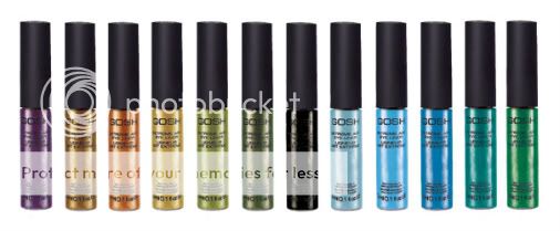
For some reason, I seem to be very prone to smudging my makeup. To date, I've found only two mascaras that don't smudge on me (Lancôme Définicils and Kanebo Kate Dollish Long, if you're curious), and even MAC's generally excellent Fluidlines migrate after a couple of hours.
So I'm incredibly impressed with Gosh's Extreme Art; this stuff truly does not budge. I've applied it to my wrist and it's remained unsmudged through showers and hand-washing, for days. It comes off fairly easily with DHC Deep Cleansing Oil. I'm not sure how other makeup removers would perform. As liquid liners go, it's also fairly easy to apply; the brush it comes with is very fine, which helps.
I own it in black. From my point of view, it's a pity they don't offer it in a larger selection of subdued colours; the purple and copper shades look fairly wearable, but bright green metallic eyeliner is not really my thing.
Labels: beauty notes, gosh cosmetics
4/25/2009 [3]
Now that spring is officially here, I wanted to share what stood out to me during the spring collections. I liked quite a lot of the shows for the season, but the Yves Saint Laurent show stood out for having exceptional design. These are clothes that women routinely wear - shifts, sundresses, suits, spring coats - in shapes that flatter a variety of figures without compromising a specific point-of-view. One could say yes, that's what fashion design should be, but in reality it very rarely is. That fact is what makes designers such as YSL's Stefano Pilati stand out from the crowd: it's the elevation of standard, workhorse clothing into more remarkable pieces that separates this collection from all the rest. The way he incorporated sumptuous textures, colors, and fluidity into the clothes elevated the clothes into much more elegant versions of themselves. It's almost trickery of the eye - the quality of design and fabric is so high that it requires taking a step back to realize that's not just a great dress, it's really just a shift dress that's been taken to the next level. All that, and the clothes never overpower their wearers, either. All things considered, these women look elegantly dressed, not "outfitted," styled, or like they're dressing to impress. In fact, the design details fade into the background until all the viewer is left with is the impression of a great dress, a great suit, and an elegant woman. This is the mark of great design - it must never overshadow its subject. That said, here are my favorite looks from this show.

This was my single favorite look from the spring collections. It's such a classic look: very rarely will nice tops and black jackets and skirts go out of style. As such, it's also a look that can easily be updated, though I'm particularly fond of the medium-rise of the skirt.

I was actually surprised that a YSL show ended up being my favorite. I generally either don't like Piloti's designs or could never wear them, as he often highlights the hips. Though a classic Piloti cut - narrow on top, billowing from the hips - this is a much more controlled volume than he normally cuts. I feel like I could potentially wear this.

This is such a beautifully cut outfit. Though two pieces, it has the ease of a shift dress while making a playful nod at finding those beautiful dresses and shirts that fit...except in the bust. It's elegantly sensual, as well, with that peek of staid green, a kind of industrial bra, and sheer fabric that keeps the overall outfit from looking like a badly built bodysuit.

I could never wear that much volume around my shoulders, but what a fabulously essential shift dress. The details of the zipper and shoulders are beautiful and subtle and entirely incorporated into the design. Another facet of great design: the details are so subtle as to be unseen, even as you're looking right at them. Though both the shoulders and zipper are strong accents, they don't stand out as such, but as essential to the function of the dress.

And finally, a great suit. What actually got me excited about this show was a combination of the suit at the top and all of the iterations of the pants in this suit. They'd be a bitch to walk in, but they leave a beautiful line, and in this cut they don't resemble the ubiquitous haram pants that'll fall off the fashion radar in about two years. Besides that, this is an utterly beautiful evening suit in an elegant and timeless silhouette.
Labels: fashion notes, yves saint laurent
4/24/2009 [1]

I recently caught a link to this series by Lee Gainer, in which she collected images of engagement rings at various price points, representing two months' salary (or wages) for a variety of occupations. Two months' salary, as you probably know, is the amount a man is "supposed" to spend on an engagement ring, for fear of being thought stingy and unloving. According to Gainer's research, this rule was invented and proclaimed by DeBeers in 1947.
It occurs to me that aside from being extravagant, this "rule", if followed, renders engagement rings rather vulgar; it's a well-established rule of etiquette that it's impolite to talk about money in public, and allowing a ring to do the talking for you -- "I'm marrying a man who makes this much!" -- isn't much better. Gainer's statement on the series refers to derogatory comments made about men who buy insufficiently expensive rings -- "he tried his best but it wasn't good enough", "very nice for a friendship ring", that sort of thing.
A shame, because I think several of the "cheap" (still not actually cheap) rings here are rather pretty. Of course the entire engagement ring phenomenon is a bit lost on me. My mother didn't have one, I'm pretty sure my grandmothers didn't either, I rarely wear rings, and while I admire individual pieces of diamond jewellery, diamonds in general don't suit my personality (absent-minded), my colouring, my politics or my budget.
Gainer is obviously very critical of the engagement ring "tradition". Her reasoning makes sense to me, but I remain a little more agnostic. I have a number of friends who cherish their engagement rings and I would never criticize them for this; even so, I can't say the practice holds much appeal for me.
What do you think?
Labels: culture notes, lee gainer
4/22/2009 [16]

Mansfield Park is probably the least liked of Jane Austen's novels and the one most likely to disappoint fans of the "light and bright and sparkling" Pride and Prejudice. (Let us not speak of the film adaptations and flash-in-the-pan "chick lit" that posit Austen as a purveyor of Regency bodice-rippers. Ugh.) Fanny Price, its heroine, is fragile, sickly, diffident to a fault; as one writer on AUSTEN-L once put it, she "kisses the whip." Raised from childhood to remember that she is the poor relation, housed at Mansfield Park, her uncle's house, on sufferance alone, she tolerates all manner of slights. Her one overt act of rebellion against the patriarchal authority represented by Sir Thomas is to refuse Henry Crawford, the wealthy rake her uncle wishes her to marry. Modern readers may have trouble understanding what a radical act this would be for a teenage girl in Fanny's position in 1812, despite the harshness of her uncle's response, and despite the uncharacteristic sharpness of her objection: "I think it ought not to be set down as certain that a man must be acceptable to every woman he may happen to like himself." In the meantime, for nearly the full length of the novel, Edmund -- Fanny's first cousin and the secret object of her affections -- is uninterested in Fanny, and a bit of a tedious prig to boot.
In other words, as a love story, Mansfield Park is a disappointment. But most of Austen's novels are not truly or primarily love stories. Mansfield Park is a Cinderella story, in which idealism triumphs over cynicism, pure motives over mercenary ones, and the low are brought high. Austen skilfully renders the pain of low self-esteem, neglect, bullying, and unrequited love, but ultimately she raises Fanny to her rightful place in the family hierarchy, properly appreciated by her uncle, clear of her vicious Aunt Norris (perhaps the nastiest character Jane Austen ever wrote), and allowed, at last, to marry the man she loves.

The extremely high-waisted gowns women wore in Austen's era tended to puff out at both front and back, making their wearers look pregnant and hunchbacked to modern eyes. For simple white dresses (Fanny Price would not be highly ornamented), let us turn instead to this high-waisted summer dress from Comrags: girlish and sweet, but actually wearable.

Never mind the chunky sandals contrasted with the Comrags dress; there's precious little about Fanny Price that's playful or robust. These Maloles flats are all fragile femininity, almost too spun-sugar to be real, and I can only imagine how easy they would be to wreck. On the other hand, how absurdly pretty are they?

Like Pride and Prejudice and Persuasion, Mansfield Park includes glimpses of the military, in the person of Fanny's rather one-dimensional brother William. Above, nodding to both the peacoat and the spencer, a sober yet feminine cropped design from Smythe.

Jewellery figures in a minor subplot in Mansfield Park, although Freudian critics have had a field day with its image of two gold chains, one too thick, one "just right." Both rustic and delicate, Cathy Waterman's tree pendant brings to mind Fanny's (and Austen's) Romantic influences, her rare rhapsodies about nature, her identification with the country.

A while back, Now Smell This hosted a silly but entertaining discussion about what fragrances Austen's heroines would wear: Diorissimo for Elizabeth Bennet, Après l'Ondée for Anne Elliot. No one mentioned Fanny Price, but the moment I smelled En Passant, I knew this was Fanny's fragrance: lilac blossoms, heavy with rain.
Labels: cathy waterman, comrags, frederic malle, jane austen, maloles, most wanted, olivia giacobetti, smythe
4/20/2009 [7]
Now that professional grade cameras and equipment are cheaper and more accessible than ever before, the internet is experiencing an explosion of amateur film, video, and photography at a fairly high production quality. Add to that the accessibility of avant-garde and high end publications, both through the ubiquity of chains like Borders and through online communities such as The Fashion Spot, and everyone can study and more or less copy the work of professional photographers such as Terry Richardson. It's all exciting, this level of access and possibility, but I frankly see the great majority of innovation going into technology itself. Photography and film as art forms haven't progressed greatly with these innovations. Quality is far clearer, and it's easier to work with less light, but these aren't the only contributing factors to a good, much less iconic, piece of work. Namely, I can scroll numerous fashion and photography blogs and see artfully designed, high quality photos of teacups, food, and studded boots. Only less than 10% of the time do I see something that stands out. There's a lot of good work out there, both technically and artistically, but very, very little that stands on its own as having an interesting, unique, well-defined point of view. It's no longer enough to be "good." Cameras do the work for us now, to the point that we're able to hold one out and almost be guaranteed a good shot. Likewise, edgy or naive subject matter can only hold out appeal for as long as those trends last, at which point we'll hold a snapshots of waffles, curios, and Anthropologie doorknobs in our hands and think, "What the hell do I do with these?" It's now increasingly important to develop a distinct point of view that doesn't rely on cultural props and inexpensive technology to make its point.
The video below, Kirsten Lepore's "Sweet Dreams," offers a well-animated characterization of a world of sweets that intrigues and provides a much-needed antidote to hipster ubiquity and girly-girl shots of pastilles and polka dots. Her use of food is impressive and surprising, to say the least, and her craftsmanship is superb. Of all the videos I've seen in the past two years, this is the single one that I can remember.
"Sweet Dreams" from Kirsten Lepore on Vimeo.
Labels: culture notes
4/14/2009 [3]
When I cancelled my cable subscription several years ago, I was most upset to have to lose MTV and music videos (this was pre-YouTube). Though there's plenty of drivel out there, music videos can be a great way to see what's next in filmmaking - the ideas, technical innovations, and themes that will be driving the next film and videography movements, as well as cultural conversations. The best among them also serve as lessons in film conception and realization. That said, here's a handful of well-conceived and brilliantly realized videos that have stood out as great examples of music video art.
BAT FOR LASHES, "WHAT'S A GIRL TO DO"
I love the simplicity of this music video. It's basically a straight shot for three minutes, and yet it tells a complete story. The choreography and cinematography are impeccable, as well, the cinematography particularly. This video is a bit like The Hills, in that the photography and lighting serve as pivotal to the storytelling. Plus, you can't knock the Donnie Darko reference.
THE PRESETS, "GIRL AND THE SEA"
This video is an utter heartbreaker and a great example of translating music into a visual medium. The story is visually narrated without obviousness, and I'm impressed with the choice that even the animation should resemble something broken-down and thrown out, like a very bad, poorly preserved late 60s versions of a Hans Christian Anderson tale.
BLUR, "COFFEE AND TV"
This is probably my favorite music video of all time. It takes a truly creative mind to take this song and make it into the odyssey of a milk carton. I appreciate how the carton is characterized in such a way that it's just cute enough without veering into corniness. And let's face it: Blur and the song itself are almost irrelevant when you have such an endearing, watchable character as this.
Labels: bat for lashes, blur, culture notes, music, the presets
4/11/2009 [3]

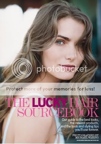
I grew up reading fashion magazines -- as, I expect, did many if not most women. As I've mentioned before, I'm fascinated by the way people write about fashion and beauty, how we conceptualize it, how we imagine it fitting into our lives. Also, I like to bitch about writing. Hence, a new series.
Lucky is put down as a "magalog", something less worthy than the ordinary run of women's magazines, but honestly, all women's magazines push product after product, they are beholden to advertisers after all, and I don't want to read much of what's in the ordinary run of women's magazines. I don't want to learn about new parts of my body that need "sculpting". I don't want to read sex tips aimed at barely post-virginal 18-year-olds (guess what, you can do it in more than one position!), learn what 21-year-old Mike from Oklahoma thinks about jealousy, or take quizzes for which the "correct" answers are both painfully obvious and stiflingly normative. More fashion-oriented magazines, like Vogue, have more appeal, but I tend to want to read about clothes I might actually, conceivably wear, they occasionally seem to fetishize the extremely long, lean bodies of their models, and the pretentiousness can get wearing; trends that last all of six months are not art nor do they signal major shifts in cultural consciousness.
No, when I buy a fashion magazine I want to look at pretty things I can't afford but might conceivably want, and Lucky provides that. To me, Lucky is the magazine equivalent of "fun" makeup lines like Tarte, Too Faced, BeneFit, and even MAC -- it presents fashion and beauty as pleasures, without the focus on shaming and correction that comes with more "traditional" lines and magazines. (My mother has and has always had beautiful skin, but decades ago a cosmetics saleswoman reduced her to tears by corralling her and pointing out "flaws" and "aging" she didn't know she had. I am pretty confident that this will never happen to me, and thank goodness.)
And I will say, if you like the Lucky aesthetic, the magazine does a very good job.
Above, from the May 2009 issue, an example of the Lucky beauty aesthetic. Lucky very seldom strays from this look: tousled hair, minimal or "natural" makeup. Even when promoting bright colours, Lucky sticks to its script. From the April issue: "Since full-throttle red [lipstick] is best on a practically bare face, you can skip other makeup almost entirely."
Fine, but this is not the only way to wear red lipstick, not to mention that red lipstick tends to necessitate at least some concealer and brow definition.
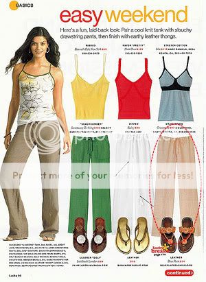
Leaving aside the mild absurdity of explaining how to wear drawstring pants and flip-flops (oh no, am I doing it wrong?), I do like the way Lucky lays out their fashion spreads; it's tremendously appealing eye candy. I don't want to look at models, I want to look at clothes, and it appears a lot of women feel the same way. The Lucky fashion aesthetic, however, is somewhat frustrating. The magazine tends to promote very loose, baggy clothing, often bizarrely layered; as Erin at Dress A Day once put it, "their stylists are colorblind pranksters hellbent on playing 'exquisite corpse,' only with innocent clothes." The Lucky editors flock to anything oversized, especially if it's unflattering. I'm sorry, no adult woman should wear a romper, and I refuse to pretend that clothes that obscure the waist or radically enlarge the hips -- harem pants, giant blousons, oversized shift dresses -- are anything but awful on the vast majority of us.

Writing about beauty can be really challenging, and must be especially so when one has advertisers to please and is therefore duty-bound to say something nice. But Jean Godfrey-June's flights of vaguely positive fancy are particularly transparent and therefore particularly annoying. For example, here's her mini-review of Chanel's UV Essentiel sunscreen, again, from the April 2009 issue:

What I get from this is that for $48 USD, you get a tiny amount of product so unremarkable that she couldn't even be bothered to mention anything but the packaging. Great. Also, the reason I don't tend to reapply sunscreen as often as I should has nothing to do with the absence of "fabulous" packaging and everything to do with the fact that I don't relish the idea of walking around with multiple layers of grease and powder on my face, nor do I want to re-do my makeup in the middle of the day. In conclusion, what the hell.
And yet I continue to buy the magazine, when I buy fashion magazines at all, which these days is pretty rare. I think it's because of what I noted above; I might not like the Lucky aesthetic or vocabulary, but I like the basic attitude, and it's rare that I can say that about a mainstream fashion magazine.
4/06/2009 [11]
Subscribe to
Posts [Atom]. Or
follow on bloglovin'. If
you'd like to contact Dain,
feel free to email me.
I'm also on Pinterest.
The Mnemonic Sense
Most Wanted
The Beauty Primer
Lookbook
Bestsellers
Consumer Diaries
Closet Confidential
On The Label
Beauty Notebook
The Hit List
Color Me In
The Makeup Artist
Wedding Bells
Globe Trotter
Desert Island
perfume notes
beauty notes
fashion notes
culture notes
minimalism
chypre arc
floral arc
fresh arc
masculines arc
gourmands
& orientals arc
Archives
August 2008
September 2008
October 2008
November 2008
December 2008
January 2009
February 2009
March 2009
April 2009
May 2009
June 2009
July 2009
August 2009
September 2009
October 2009
November 2009
December 2009
January 2010
February 2010
March 2010
April 2010
May 2010
August 2010
November 2010
December 2010
January 2011
March 2011
August 2011
September 2011
October 2011
November 2011
December 2011
January 2012
February 2012
June 2012
July 2012
August 2012
September 2012
October 2012
December 2012
January 2013
February 2013
March 2013
June 2013
July 2013
Images
Photobucket