"The most beautiful makeup for a woman is passion, but cosmetics are easier to buy."
—Yves Saint Laurent
Announcements
If you're new to this blog, then read our guides to the basics: Skin (Part I), Skin (Part II), The Supernatural, Color Theory I, Color Theory II, Eyes, and Brushes.
Also, check out the blogsale.
Contents
Favored
Art Tattler
the glamourai
The Non-Blonde
Perfume Shrine
Lisa Eldridge
Garance Doré
Smitten Kitchen
Into The Gloss
Grain de Musc
Lacquerized
Res Pulchrae
Drivel About Frivol The Selfish Seamstress
Killer Colours
Bois de Jasmin Glossed In Translation
Jak and Jil
Toto Kaelo
Worship at the House of Blues
I Smell Therefore I Am
Food Wishes
The Natural Haven
Messy Wands
1000 Fragrances
Moving Image Source
Wondegondigo
The Emperor's Old Clothes
M. Guerlain
Colin's Beauty Pages
Barney's jewelry department
Parfümrien
loodie loodie loodie
The Straight Dope
Sea of Shoes
London Makeup Girl
Sakecat's Scent Project
Asian Models
Ratzilla Cosme
Smart Skincare
Illustrated Obscurity
A.V. Club
Tom & Lorenzo: Mad Style
Eiderdown Press
Beauty and the Bullshit
La Garçonne Flame Warriors Everyday Beauty
Fashion Gone Rogue
Now Smell This
Dempeaux
Fashionista
The Cut
A Fevered Dictation
Nathan Branch
101 Cookbooks


I should feel bad about having lost my entire stash of makeup, especially considering how much money has literally gone up in smoke (or down the drain, take your pick of natural disasters) but I suspect I will instead feel secretly relieved.
I have always wanted to have a stash that can be wholly contained in one compact makeup bag, easily portable and tightly edited.There is a silver lining to every cloud, and such a catastrophe would be an excuse to finally cast off all those white elephants—that I couldn't bring myself to throw away but wouldn't miss if they were to be gone—as well as to acquire those few products I couldn't bring myself to buy, because I couldn't justify buying something that I already have in my stash, however superior in quality and utility.
Skincare

- I have and like DHC Cleansing Oil, good against bulletproof makeup, but it has a tendency to clog pores. Bioderma Créaline is kinder to pores, hydrating and soothing overheated, tired skin at the end of the day—especially in summer— while it cleanses away quotidian grime and makeup. It's not really a lightweight product, despite its gentleness; you might be surprised at what you can get off with it, and I highly suspect that I'll not need anything more heavy-duty, considering I don't wear spackle.
- I'm not really a skincare fanatic, I'm just happy to find cheap products that work. The Face Shop has the best skincare for value, in my opinion, of the Korean "road shop" brands, and despite its ridiculous gimmicky name, the Marine Stem Cell Toner pampers and cushions my perpetually dehydrated skin with its slippery texture rich in hyaluronic acids and other hydrating agents, so I'm sticking with it.
- Moisturizers are tricky, especially since one often needs different formulations for each season. I'm still looking, though I refuse to pay for anything higher-end than Kiehl's, which I am eyeing next but not completely decided on. If not, I'll default to matching moisturizer from TFS, which forms a reasonably good barrier to seal in the moisture provided by the toner.
- Kiehl's Ultimate Hand Salve looks and feels like a heavy-duty product, one that you might expect to instantly soften chapped, raw, unhappy hands... but might take you by surprise when it absorbs rapidly and completely, leaving behind no messy residue.
Thick, scentless and yellow, with a waxy consistency,
Face

- I would guess that Chanel Vitalumiere contains some unique blend of silicones that is especially adept at smoothing over uneven skin—my skin is fairly rough on a small scale—for a satiny finish. I might also guess that the formula works with the natural oils in my skin, rather than battling against them, transmogrifying unflattering shine into a dewy soft-focus glow, but that is just a guess. All I really know is that this product works such wonders on my skin, I am tempted to blame witchcraft rather than science for actually tempting me to fork over money for a Chanel foundation: horrifyingly expensive, not to mention I secretly dislike the interlocking C's.
- Vichy NormaTeint Anti-Imperfections is really a very matte-finish foundation (for acne-prone skin, if anyone is interested), but the sparse color selection, the fine powdery texture when blended out, and the lasting power like glue make it a better concealer in my opinion, especially in the yellower shades,for everything from undereye circles to ruddy acne scars.
- I admit I'm probably selling out here, as I concede that I prefer to keep my skin as light as possible—any darker, and my olive undertones ensure that I look muddy, or even ill—so sunscreen is a requirement. Shiseido Anessa fulfills all my requirements for a sunscreen—high SPF, broad-spectrum protection, and meaning it when it says "waterproof" on the label—in addition to serving as a mattifying base in summer that actually makes my skin look better by taking down a bit of the heated flush and oily shine that plague me around that time of year. In fact, I don't really need the excuse a natural disaster would provide to justify buying this product, since I have nothing comparably useful in my stash. This is an Asia-exclusive, but I am taking the liberty of including it, since it is quite easily available to me, at least.
- The point of a blush is to replicate a natural rush of blood to the cheeks: for this reason, it is crucial to properly match a blush to the color of the skin. On me, I've never met the color that performs like the bruised mauve of NARS Sin: my guess is that the purplish grey in it is good for neutralizing sallow olive tones, to leave behind only a faintly visible flush of rose. I've even got the hang of applying it with a finger, saving me the trouble of having to buy a brush.
- I actually really like Etude House's brow pencil: a tapering wedge-shaped twist-up crayon, with a hard texture and in a wide variety of shades (who knew that such a cheapie brand would give such seemingly humble considerations as brows the attention they really deserve). With a product like this, I honestly don't see the need to seek out something more expensive.
Eyes

- I scoff at the notion of high-end mascara (so overpriced, and you throw most of it away) but I would like to live with DiorShow for a little while: it's the only mascara I've ever liked, as opposed to "it gets the job done." I think the secret is in the fat brush with the blunt bristles spaced at extremely tight but regular intervals, coating lashes thickly enough to make an impact, yet separating each hair from each other carefully to avoid the spider effect. I would get a cheapie dupe if I could find that.
- L'Oreal Extra Intense Liquid Pencil liner goes on as smoothly as the name implies, like melted chocolate, but once it sets, turns into a waxy formula that stays on and does not smear or transfer, even through a torrential crying session (as I can attest from personal experience). In brown it imparts to my eyes the depth but not the harshness of black. To be honest I'm cheating a little here, as it's easily obtained in the United States, but is nowhere to be seen in Korea.
- Finally we have come to eyeshadow! Usually the eyeshadows comprise the largest proportion of a stash, not because they are the most frequently used, but because they are the collectible action figures of the makeup world, coming in infinite and infinitely attractive variations and serving little practical purpose whatsoever. (Though, don't take my word for it, I'm an Asian for whom eyeshadow doesn't do much and who is consequently bitter about the fact.) So when paring down a stash, it makes sense to cut away at the eyeshadow collection first. For now, I will only buy two: Laura Mercier Sandstone (a peachy fine bone in a satin finish that imparts an imperceptible glow to skin, not shown) and MAC Shale (an analogue of taupe hovering between silvery grey and sheer lavender, more flattering for my cool and light olive tones than a true brown-based taupe).
Lips

- Guerlain Kiss Kiss Essence de Gloss, in 421 Grenat for me, may be the classiest lip gloss that I know of. Now, if someone would please do something about that stupid bling packaging?
- I'd like a good everyday matte rose lipstick for professional settings... but what?
Labels: annick goutal, beauty notes, bioderma, chanel, christian dior, etude house, guerlain, hermes, kiehl's, l'occitane, l'oreal, laura mercier, mac, nars, shiseido, the face shop, vichy
3/03/2011 [0]
WATCHING
There has been exactly one season of America's Next Top Model that I've missed. Otherwise, there has not been one moment that I've missed, and the mayhem has gotten even better with the addition of Andre Leon Talley, who has become my New Favorite Thing.
READING

I've recently gotten back into reading American Vogue. It's something I fall in and out of touch with. The last couple of months have had more interesting articles and editorials to me than in the previous months. Plus, I think that step away made me appreciate it more. I get Vogue now. It's not meant to be taken seriously, really. It's meant to be some reportage of the real world of very privileged people saying very frivolous things and 90% fantasy, an exploration of what happens when you combine very fanciful, exquisite clothing with an Upper East Side sensibility. Because let's face it - even when Vogue does street, it's Lily and Serena van der Woodsen's* idea of "street," not Jenny's. Or even Vanessa's.
This image, sadly, is from Vogue Italia, which promotes captivating cover art, and not American Vogue, which does not.
DAUBING

Laura Mercier Metallic Creme Eye Colour in Burnished Copper ($22) has turned out to be a sleeper hit in my stash. I probably swatched this color for the first time a year or two ago and fell in love with its complexity, with hints of gold and orange suspended in shimmery red brown. I did not fall in love with the price or the likelihood of it's having very poor lasting power on my very oily lids. I finally caved on it a few months ago and find it's now one of my very favorite toys to reach for. I've found that using the smudger side of a cheap Sephora brush to thinly line my top and bottom lashes works beautifully to give a either a crisp, opaque line or a smudgier, sheer finish, depending on how I work the brush. I then either leave the line as is and tightline with black liner or add NYX's Eggplant or Red Bean Pie on top of Burnished Copper for a vibrant, shimmery pop of purple (the purple side of NARS Eurydice works well, too). The key to the look is Too Faced Shadow Insurance, which gives Burnished Copper lasting power and opacity (it's too sheer otherwise).
WEARING

I'm really not a fan of leggings as outerwear. I think they lend the wearer to laziness and are largely unflattering. However, I had to break down and buy some when my tights failed to keep me warm in an unreasonably cold, bleak winter. I ended up getting these brushed leggings from Gap ($19.50) in athletic grey and black on sale (which look like they've sold out, leaving only navy). I get it now; there is nothing more comfortable than wearing something formfitting, soft and soothing on the skin. I leave mine under clothes or for loungewear, though.
LISTENING
I have a job that requires me to sit in front of a computer eight hours a day. It is very tedious and very boring (and so are my coworkers). To get through it, I listen to YouTube videos all day long. My favorites are cosmetics reviews and Ricky Gervais podcasts/radio edits. This is one of my favorite Karl Pilkington stories. I just like how he takes something somewhat commonplace and normal - the discussion of cloning - and weaves it into this bizarrely fantastical tale that has its own sense of the commonplace and ordinary to it.
WISHLIST
This could take an age.

I knew I was in trouble when BleachBlack's Kristin posted this ring a couple of weeks ago. The site's coauthors have extended their collaboration with Urban Outfitters to include this ring. Though I typically don't wear jewelry, I think I could make an exception for something this stand-out and unusual, particularly as it is only $18 and I have a 10% UO code.

I've been excited about MAC's upcoming Art Supplies collection for a couple of months (US release date April 1; international release later in month). The collection features new Pearlglides and Pro Longwear Lipstain Markers, both of which I wanted to invest in heavily. I love Pearlglides; as I've discussed extensively with Dain, Dorothy, and Anne, my eyelids are too oily to keep on any gel pencil liners except these, which have the requisite grit to stay through the day. I was also excited to try the Lipstain Markers, having grown to prefer lip stains over gloss and lipstick. I'm a bit disappointed by the initial reviews, none of which are impressed with the color range of the Lipstain Markers, with some even saying they smell bad and taste weird. However, everyone's in agreement: the Pearlglides rock. I'm going to get mine on April 1 (I'll be damned if I miss out on these). The ones I'm particularly interested in are Undercurrent, a teal base with gold and green flecks, and Almost Noir, a browned-out plum.
While I'm at MAC, I'd also like a 208 Brow Brush ($19.50). I've never had a brush specifically made for the brow area, and let's be honest, some days it shows.
*In a total aside, perhaps Lily and Serena are the creepy Stepford, less cool, parallax universe version of Judy and Jane Aldridge?
Labels: america's next top model, consumer diaries, gap, gossip girl, laura mercier, mac, sea of shoes, urban outfitters, vogue
3/27/2010 [2]
I have a couple of common skin complaints - slightly oily skin, dark undereyes - but the main thrust of my skincare routine is preventing and soothing skin irritation. I have extremely sensitive skin that will not tolerate a good number of fairly common skincare and cosmetics ingredients. Here's a list of my current skin sensitivities:
- silica
- kaolin
- benzoyl peroxide
- sulfa products
- carmine (in certain eyeshadows)
- witch hazel
- fragrance
Additionally, my skin doesn't tolerate abrasives, heat, and extreme cold and, when I'm really stressed, gets irritated by exercise. Any of the above irritants can cause my skin to break out into a bright red, painful rash. Despite this, I generally enjoy good skin due to spending a lot of time and money to figure out what works and what doesn't. The following products work to help me maintain good skin and prevent painful irritation.
TREATMENT
The sensitivities I've listed are all classic symptoms of rosacea. Though I haven't been diagnosed with it, I've been told my skin is in a state of pre-rosacea (similar to being pre-diabetic - onset of disease can occur in the absence of preventative health measures). As such, I use Finacea to prevent the full onset of rosacea. Finacea works as an anti-inflammatory agent to keep skin calm and is only available by prescription.

Bizarrely enough, I can tolerate prescription-strength retinoids with ease. I've used Tazorac for years, and it is Tazorac - not Finacea - that I credit for my good skin. Tazorac gives my skin an even tone and texture, increases vibrancy, and inhibits some oil production. The effect it has is subtle. No bells, no whistles, simply good skin. If I go off it for a few days, I always see an immediate effect the next time I use it - my skin will be brighter, clearer, and have a more even texture.

I get puffy eyes if I don't get enough sleep or drink too much liquid right before bed. MAC Fast Response Eye Cream works fairly well to depuff the eyes, better than anything else I've tried. What I particularly like about the product is that it dries quickly - ten seconds and I can apply my makeup over it. It also deposits a really nice, smooth texture, making eye makeup application a snap.
PREVENTION

Having extremely fair skin, sunscreen isn't an option for me. This is really no problem. I'm so conscientious, I've worn sunscreen every day since I was fifteen. (Vain, too, but it's the conscientiousness that enabled such persistence.) Olay Complete Defense Daily UV Facial Moisturizer for Sensitive Skin, SPF 30 is hands down the best facial sunscreen I've tried. It's the single formula specifically formulated for skin that hasn't pilled on me, with or without makeup, and it's extemely gentle. It has such a smooth texture on the skin I've never had trouble applying makeup over it, although I generally use a primer anyway. A word of caution: Be sure to go for the sensitive skin formulation, as I've found that the regular version pills.

Although I mostly keep redness and irritation at bay, I find that using products containing squalene/squalane really work to help keep my skin calm. Derived from vegetable oils, including olive oil, squalene and squalane are very light, emollient oils that moisturize and sooth my skin. With squalane as one of the main ingredients, Boots Expert Anti-Redness Serum is one of the best products I've found to use. The squalane essentially works as a lightweight barrier for my skin, keeping the moisture in and harsh irritants out. As with Tazarac, should I go without this for a few days, I will see an immediate improvement in my skin's tone and clarity the next time I use it. This works well not only as a day-to-day product, but also on those occasions when my skin is aggravated. As soon as I use this product, my skin immediately feels calmer and less painful, and with the squalane barrier in place, heals much faster.

Never one to leave an inch of skin unprotected, my lip balm of choice is Banana Boat Sport Performance Sunscreen Lip Balm SPF 50. The texture of this lip balm is fairly standard - moderately emollient and sheer with a little bit of weight. I'm a fan of this particular lip balm because it blocks both UVA and UVB rays, a feat not often accomplished in a drugstore lip balm. I also appreciate how sheer it is, having found other comparable lip balms quite heavy and occlusive.
FUNDAMENTALS
Though it's the fundamentals that can make or break a good skincare routine, I am much more relaxed about them than I am other, more specific products. I've found that there are a variety of very good, basic skincare products that don't break the bank and generally work just as well as any of the others in the bunch.

More important than any particular cleanser is the method of cleaning. If you slap cleanser on just to immediately take it off, it's not going to do the job, regardless of whether you use Shu Uemura or Cetaphil. If, however, you take your time and spend a good thirty seconds minimum rubbing or scrubbing away, you will reap the benefits of judicious cleansing, regardless of cleanser (excepting the very worst). With that in mind, I usually have a couple of very basic, decent cleansers on hand, alternating out Juice Organics Brightening Cleanser and Neutrogena Fresh Foaming Cleanser . Both cleansers do the job, cleaning without stripping and leaving no makeup on my face, though sometimes I use a separate eye makeup remover for all the mascara I wear. Neither product has irritated my skin, and despite the claim of one to be "organic," I don't find the Juice Organics cleanser to be any gentler or less effective than the Neutrogena.

I am just as casual about moisturizers as I am cleansers. With all the very specific products I use, my treatment and prevention needs are fulfilled. All I really need moisturizers to do is moisturize without irritating. For that reason, I have the very gentle, very basic La Roche-Posay Toleriane Soothing Protective Care and Neutrogena Oil-Free Moisture, Sensitive Skin on rotation. In terms of hydration, the two are nearly identical products. Both deliver light, gentle hydration and, more than anything, serve as yet another barrier to protect my skin. The difference is in quality of formulation. The Neutrogena moisturizer very obviously contains more fillers than La Roche-Posay, feeling less substantive on the skin. Regardless, it's still a good, basic formulation for the summer, leaving Toleriane to provide slightly richer hydration and protection in the winter.
Labels: banana boat, beauty notes, boots, la roche-posay, mac, neutrogena, skin
10/21/2009 [1]

Comparisons were made, at one time.
My experiences with cosmetics have been largely determined by my "non-standard" colouring and facial features. I don't wish to overstate this: obviously, the North American beauty market caters to white women like me far, far more than it does to other women. However, I was a redhead as a child, and even though my hair has darkened, I still have freckles, green eyes, and a very pale, peach-toned complexion. The advice doled out in magazines often does not apply to me. I didn't find a red lipstick I could wear until I was 25, and that required going to a MAC counter and watching one sales associate's frustration mount as tester after tester turned fuchsia or purple on my skin. She finally handed me off to another SA, who tried another five or six before finding two that worked (Rage and Chili, if you're curious). I continue to spend much of my life avoiding the dreaded fuchsia.

Exciting to some, horrifying to others.
I am, in other words, not a blank canvas. I have fairly definite, high-contrast colouring and defined features: a high forehead, a long nose, high cheekbones, a slight figure, and wavy, cowlicky hair. I feel generally more comfortable with retro-influenced styles than wholly modern ones: anything blingy, beachy, sporty or vampy makes me look ridiculous.
SKIN

I distinctly remember being five years old, looking in the bathroom mirror and appreciating the pretty mauve colour of my undereye circles. They are permanent, hereditary fixtures on my face. I put on undereye concealer before applying any other makeup. I follow that up with eyebrow pencil; my eyebrows are naturally quite well shaped, but a bit sparse.
I don't own a foundation. I don't really know how to use one, and anyway, I don't think most women need it for every day. I do have very shiny skin, exacerbated by my near-daily application of sunscreen (it should be daily, but I get lazy), so I use translucent powder, which blurs the imperfections on my face without looking too much like paint.
I've grown to appreciate the value of bright (not sparkly!) blush, probably because my skin is less naturally rosy at 27 than it was at 17. Pink blush looks like rosacea on me; peaches and corals are much more flattering. I don't know how to contour, but then I don't particularly need to.
P.S. Sparkly blush looks stupid.
EYES
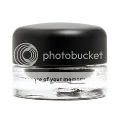
I'm in a bit of a rut, I admit, but I love the look of gel eyeliner; I'm also wary of heavy eye makeup, since nothing telegraphs PARTY TIME to the same extent. I usually stick to a wash of neutral shadow (my favourite is NARS Cairo, a taupe with a hint of rose) and gel liner in brown or plum.
Women with green eyes are frequently advised to wear purple shadow. This isn't foolproof; any colour that is too dark will look like a smudgy grey-black on my skin, and any colour with red in it has to be chosen carefully so I don't end up emphasizing my dark circles or giving myself the "pinkeye" look. I have to experiment. I find that I keep accumulating turquoise and green shadows, even though I generally don't wear them because I'm afraid of looking frivolous. (I am frivolous, but must everyone know?)
LIPSTICK

I am obsessed. It is kind of ridiculous, and clearly a left-over hangup from my adolescence, when I discovered that most "universal" shades, as touted by magazines, looked terrible on me. Pinks look sickly on me; "true" reds and berries turn neon fuchsia; even bright oranges, like Shiseido Day Lily, head straight for Day-Glo peach. I used to try to counteract this trend by buying drugstore lipstick that looked very, very orange or very, very brown in the tube; these days I tend to buy higher-quality lipstick that turns less dramatically.
I am picky about lip products: I usually want them full-coverage and nearly matte. I love red lipstick and would wear it every day if I had the guts. It saddens me that red lipstick is ever considered trampy or garish; when my grandmother was my age, this was not the case at all. I probably look best in deeper, browner shades -- MAC Chili, Lipstick Queen Rust, YSL Opium Red -- but I love intense, balls-out orangey reds: Besame Carmine, Julie Hewett Belle Noir, MAC Lady Danger.
I have a number of medium-toned and sheer lipsticks, but have yet to figure out how to wear nude. I have a feeling that with colouring as high-contrast as mine, truly nude lips will never quite work.

Above, fairly standard makeup for me: darkened brows, eyes lined on top lids only, minimal eyeshadow, bright lips.
Labels: beauty notes, besame, mac
7/12/2009 [3]
SKIN

Just as Dain has worked out her theory of coloring, I have a theory of facial structure, in that facial structure determines what type of makeup best suits women, as well as how to best wear it. Women with strong bone structure, such as Angelina Jolie, Ginnifer Goodwin, and Sarah Jessica Parker, look their best highlighting and defining what they have, in this case literally, using highlighters and contouring to bring out their features. Typically, women with strong features need to avoid wearing too much color, as this can easily make them look overdone, hard, or, in the vein of Angelina and Megan Fox, a mix of sexy and astoundingly beautiful to the point of aggressiveness.*
Conversely, women with weaker bone structure (think Nicole Richie, Britney Spears, and Drew Barrymore) can acheive a greater effect with blush than with simply highlighting and contouring, as their strength is in being able to work with (or change) their bone structure through color (and makeup in general) rather than light. These women can wear more color than those with stronger bone structure without overwhelming their features.
This is not to say that women with weaker bone structure can't contour and women with strong bone structure can't wear blush. This is simply a guide to maximize the effect of makeup. Women who have strong bone structure have more facial planes to play with light and shadow than women who don't. Likewise, women with weaker bone structure can play with more overall color without being overwhelmed by it than women with a stronger structure. Think of it this way: Gwen Stefani can wear a ton of makeup, basically carving her face structure out of it, and look great. Were Angelina Jolie to wear that much makeup, she would look very hard, overdone, and mannish. The more defined your features are, the more easily they can be overwhelmed. The less defined they are, the more room you have to use color and makeup in general to define them without overwhelming.
All this to say that I can go from zero to drag queen in a second. I really don't take makeup well beyond very minimal amounts. Too much foundation and I look like I'm wearing spackle, too much lipstick and you'd have to ask, "Who is she trying to fool?" I am definitely of the strong bone structure camp and rely on making the most of my good skin and bone structure rather than on color. When I wear foundation, I rely on powders rather over other formulas, specifically MAC Mineralize Skinfinish in Light. I like the sheer coverage, the hint of color, the lasting power, and best of all, that it only takes three swipes and ten seconds in the morning. This feature alone has kept me from returning to liquids. For highlighting, I either use Nars The Multiple in Copacabana or MAC Studio Stick Foundation in NC15 on cheekbones, the center of my forehead, my nose, and chin. Copacabana is more of a traditional highlighter, in that it has a bit of shimmer and brings light directly to where I apply it. Studio Stick acts like light itself radiating from my skin, adding radiance, brightness, and a softer light that looks like it comes from within. Both layer well under the Skinfinish. If I want to further contour, I use the lightest shade in Cover Girl's Trucheeks blush palette in number 1 (I think the color is Snow Plum). It's so light that it doesn't really add color, just shadow. On the rare occasions that I wear blush, the only color that consistently performs is the middle color in this palette, a mid-tone plummy pink. Every other blush color fails me: pinks are too pink and either look like a rash or too jarring against my yellow undertones, pinky-peaches look good until they oxidize and turn orange, and brown tones absolutely don't work.
EYES

As I have a mix of warm and cool undertones, as well as hazel eyes, it's perhaps no surprise that my eyes can take the warm tones that my skin can't. In fact, I prefer my eyes in warm tones, though they can take cool, as well. Again, I have to be careful with coloring. Anything too warm looks great against my eyes, but looks jarring against my skin, and anything too cool just looks awful overall. Generally, warm sunset colors (golds, oranges, reds, warm browns) best suit my eyes, so long as they aren't very bright, which is harsh against pale skin. On the cool end of the spectrum, violets such as MAC's Parfait Amour make my eyes green (which is a pity, because I hate violet). I can also wear both warm and cool blues, which again bring out their contrasting color, orange. I've had success wearing both MAC's Technakohl liner in Auto-de-Blu, a warm, bright blue, and MAC's Pearlglide liner in Black Russian, which is a deep cool blue with silvery highlights. Auto-de-Blu makes my eyes pop, bringing out the warmth and slightly blurring it with the other colors to create a slightly muddy, sultry intensity (sounds paradoxical, but really works). When sheered out slightly, the silver and light blue in Black Russian brings light to my eyes and makes their hazel hue stand out.
Generally, my eye routine consists of tightlining my eyes with either a warm brown (MAC Technakohl in Brownborder) or carbon black. The warm brown brings out the warm topaz in my eyes and brings soft definition to the shape, while black brings out the shape itself and brings intensity and light to my eyes. It can be a harsher color against my skin, but sultrier. Other than that, I wear liner on my top lid and mascara. Typically, I wear warm, red-based brown liners, such as Jane's Browny Points, Stila's Twig or NARS's Galapagos. These colors work well to further define and shape my eyes, as well as to bring out the orange and gold in them. Since my lashes are very long, occasionally I curl them to get more pop out of my eye makeup, but usually I'm too lazy and just swipe mascara on them as is. I'm not loyal to any particular mascara, although I really like Cover Girl Lash Blast Luxe (the brush deposits mascara perfectly). Were I to wear shadow washes, I'd exclusively wear Stila's Summer, an orangey-bronze, and Tarte's dusky golden shade in the Kalalua duo, as these both make my eye color warmer and more intense. I've given up shadow washes, though, because I think I look better just wearing liner.
LIPS

I absolutely rely on sheer colors on my lips. Opaque colors overpower them and make them look smaller, which creates an imbalance in the proportions of my face. I avoid dark colors for the same reasons, and brights are, again, too jarring against my skin. There are basically three colors I return to repeatedly: sheer plum, pinky-peach, and neutral. Sheer plum with a touch of pink (no red, no brown) is probably the best color for me. Not only is it the blush color I use, it adds a touch of depth and color to my makeup without being overwhelming, and the cool tone flatters my cool lips. Pinky-peach, when heavier on the pink side, also does a great job of flattering my skin by adding brightness and color, but I have to be careful of the peach tones. Too much peach turns orange against my skin.
Since my lips have a lot of pigment (depending on if I'm cold, if I've just eaten, etc., they're a cool light-to-medium cool pink), my best bet for an understated look is neutral lips. This is not the same as nude lips, which really only look good on women of medium skin tones. My version of neutral lips is to basically neutralize the coolness of them so that they're just pink. I can do this by using a gold gloss on top or by filling them in with a brown-based neutral liner and using a pale pink gloss on top. Either way, I maintain my essential lip shape and facial proportions.
I'm in a state of flux with my lip products. I had used MAC Tendertones exclusively as my gloss, but using them so much aggravated my fragrance allergy and I've had to discontinue their use. This isn't too much of a shame, because I'm mostly over the stickiness and general goopy mess of glosses. I loved Clinique's Colour Surge Bare Brilliance lipsticks in Waterviolet and Pink Beach for plum and peachy-pink lip colors, respectively, but they're now only offered in the more opaque, drying Butter Shine formula, which I hate. I'm going to have to shop around for lip products that suit my needs and will stay on the shelves more than two minutes.
*(I have often wondered to myself, If I were a man waking up next to either them, would it not be too much to see that day in, day out? I think rather than being a male sexual fantasy, it would be rather harsh and intimidating, a blunt beauty that's blatently, boldly there that leaves no room for gazing and slowly taking it all in. Really, that leaves no room at all for a relationship with it, because it the end, beauty is partly what we something we interact with and stake claim to ourselves, whether it's our beauty to claim or not.
I still haven't found an answer to the question in terms of being a woman waking up with them. Somehow, I think it would be easier to bear.)
Labels: beauty notes, cover girl, j.a.n.e., mac, nars
7/11/2009 [3]

Revlon ad, circa 1958.
If fuchsia lipstick harks back to the 1980s, coral and orange lips call us to the middle of the 20th century, roughly the 1940s through the 1960s. I would guess that coral's "old lady" associations are the result of too many women who grew accustomed to coral lipstick (often frosted) in the 1960s and continued to wear it long after the trend had passed.

Because of coral's "old lady" associations, it is important not to apply it too thickly; it looks especially modern as a matte stain or a sheer gloss. Conventional wisdom is that coral and orange lipstick looks best on tanned or deep skintones, and certainly orange shades glow against bronzed skin, but coral looks charmingly retro on a pale face. The combination of blue shadow and orangey lipstick is striking and, in its way, classic, but it is so intensely unnatural that it is probably best reserved for special occasions, and on most of us, a softened version (a deep blue smoky eye with peachy lipstick, for example) is easier to wear. Coral also combines beautifully with shadows in all forms of bronze and gold, lavenders, and soft greens.

Clockwise from top left: matte coral lipstick brings out lightly bronzed eyelids and cheeks; Gene Tierney with bronzed skin, orange lipstick and smoky eye makeup, in an early-1940s take on the exotic; Christina Hendricks in Mad Men, displaying the beauty of coral-rose shades against milky skin; soft peach-pink gloss in a Korean fashion ad; a juicy tangerine red emphasizes the bronze tones in Ashanti's skin; an ethereal look in softened secondary colours -- mauve, mint, coral -- in an ad for YSL's Spring 2009 makeup collection.
Labels: besame, cargo, christian dior, lipstick queen, lookbook, mac, nars
6/22/2009 [6]
O Brother Where Art Thou? was on tv last night. I watched a few minutes of it, inevitably thinking about the parallels between the Depression and now, and found it fitting to share a few simple, affordable pleasures I've been enjoying lately.
 Now that "affordable" often means "free," I am not stopping by the MAC counter to check out their new foundation formulation, even though it comes in my color (NC15) and seems widely acclaimed on Makeup Alley. Instead, I've been reaching into my stash to use MAC Mineralize Skinfinish Natural in Light as my foundation. Given the Natural formulation, there's no glitter or shimmer, just a luminosity on my cheekbones. It gives a good, even finish with medium coverage. It doesn't last all the way through to night, but I don't use it on days I want something permanent. It's more a quick way to get some coverage and get out the door.
 As an alternative to a t-shirt, I wear a green Pendleton sweater vest under sweaters and jackets. Despite being wool, this is actually a lightweight combination, keeping me warm without overheating. I paid $16 for mine at a consignment store. I was shocked when I saw the retail prices for Pendleton clothes. They're a bit much for unfussy basics. (The above is actually a Woolrich sweater. I couldn't find something close enough to what I own on the Pendleton site.)
Now is not the time to be buying $14 Clinique lipsticks. Instead, I paid $10 apiece for a couple of Colour Surge Bare Brilliance Waterviolet lipsticks at a Cosmetics Company Outlet. Just as well - Clinique's discontinued this color in the Bare Brilliance series.
Labels: cabaret, clinique, mac, notes, o brother where art thou?, pendleton
3/31/2009 [3]
 I cannot wear dark lip colors. I have tried and tried, and they invariably do not suit me. Anything more pigmented than a sheer lipstick is truly unflattering to my face, even jarring. The reason for this is that I have full lips, but not wide ones. They're the definition of pouty, with all the meat in the middle. As dark colors recede, the corners of my mouth look even smaller, resulting in a fish face. On top of this, when I gain weight, I tend to gain it in the lower part of my face. Having fish lips on a fuller lower face does not result in balance, and as any good makeup artist will tell you, good makeup equals balance.
To acheive balance, I go with the ubiquitous darker eye/lighter mouth. The colors I use tend to be sheer peach or sheer lilac-pink. Used with a pink lipstick as a base, peach colors brighten up my face, adding color without throwing the balance off, while lilac colors impart a slightly deeper hue of my natural lip color. I have to be careful with both colors, though. With my yellow undertones, most peaches turn orange on me, and lilacs often turn too deep and cool toned. I've found that MAC Tendertone Lip Balm works well for what I like. For the more lilac tone, I use the Tendertone in Softnote. Layered over lipstick, it makes the lipstick color pinker. Honey Bare looks peachy-orange in the pot (it's the orangest one in the picture) but layers beautifully with pink.
I used to use Clinique Colour Surge Bare Brilliance in Waterviolet for the base layer of my lips. It's a pinked-down violet that's almost the exact shade of my lips, just slightly deeper. It's now only available in the Butter Shine formula, which is denser and heavier on the lips. I'm not crazy about the change in formulation. It works well as a base but looks awful on its own. The varying pigments aren't blended well, so it looks like an inexpert application of multiple layers of lipstick, plus the gel texture dries out my lips. Thankfully, I found a couple of BB Waterviolets at a Cosmetics Company Outlet, but I'll need a replacement when these run out. Any dupe suggestions are welcome.
Credit: Face Candy
Labels: beauty notes, clinique, mac
2/16/2009 [1]

Labels: beauty notes, j.a.n.e., mac, nars
2/14/2009 [2]

Yeah, Anne Taintor is overexposed, but I couldn't resist.
2008: the year I learned to stop worrying and love being high maintenance. Seriously, while I'm absent-minded, untidy, don't wear foundation, avoid wearing a bra whenever I can, and can easily go a winter week in the same ratty jeans and flat boots, by the standards of those around me, I am pretty high maintenance; I love pretty, impractical things, proper perfumes, visible makeup, and clothes that have to be delicately handled. My hair is not wash-and-go. I have a skincare routine, albeit a fairly minimalist one. I have more pairs of shoes than I need.
It's been my observation that, fashion magazines to the contrary, this is not a great way to attract a man. Overall, men my age (27) seem to prefer that women look minimally made up, smell of soap or shampoo, and not make highly visible efforts at dressing and grooming, which is not to say that those of us with different preferences ought to change our habits; only that -- just as there is no perfume guaranteed to "drive a man wild" -- attracting a mate is no reason to put yourself to an effort you don't feel like making. Neither does there seem to be any other practical benefit to making that effort; the magazines aside, most women don't seem to suffer socially or professionally for not being beauty addicts.
But I get genuine pleasure out of my routines. While blogging about fashion, beauty, and perfume feels a bit odd -- we're at the intersection of intensely personal habits and a very impersonal market -- I can write about it because I enjoy it; as Naomi Wolf put it in The Beauty Myth -- hardly a pro-cosmetics screed -- there's genuine pleasure to be had in shapes, colours, the game of referencing that is fashion. Anyway, here are some of my staple items:
A good flat-iron. I have decided, for the new year, to be less reliant on the straightening iron; when I put aside neuroses carried over from high school, I know there's nothing wrong with my natural waves. But I have bangs, and if they haven't been straightened, they stick up in all sorts of funny directions. I recently had to go more than a week without my flat-iron due to a luggage mix-up, which confirmed my dependence on the thing. (Mine is a few years old, from Hot Styler, but Sedu flat irons have become something of a cult item in the meantime.) Handled correctly, this can straighten and curl; with a bit of styling creme (I like Kiehl's Creme with Silk Groom or Rusk Phyto-Marine Lusterizer) it makes hair shiny and smooth. I do recommend spending a bit more on flat-irons; the $20 ones from Conair will do in a pinch, but really they don't get hot enough.

Besame Souffle Foundation. Hard to imagine using this as a foundation, as it's rather thick and high coverage for my liking, but that's what makes it a fantastic concealer for my perennial dark circles: it's light, creamy, and stays put. Alas, Besame no longer offers this on their website and are noncommittal about when they will carry it again.
Pressed powder. I don't wear foundation, but I have very shiny skin. I've just finished a container of Besame's loose powder, but I am too messy to deal with loose powder. I'm partial to Physicians Formula's mineral-based powders; they aren't glamorous, but they work.
Eyebrow definition. I rarely have to tweeze my brows; I've received compliments on their natural shape. (I have to say the whole notion of a proper arch kind of escapes me; I get that they shouldn't look like tadpoles, beyond that it's a mystery.) The downside of this is that they are fairly sparse. For a long time I just used MAC eyeshadow in Charcoal Brown and an angle brush. I have Anastasia's pencil in Ash Blonde now, which works well (it has a small brush at the end to blur overly sharp pencil lines), but am not convinced it's worth the expense. Still, I've come to rely on having some definition; all that magazine pablum about framing your face is true.

MAC Fluidline in Macroviolet. I love the retro liquid-liner look, I love gel liners, and I especially love this one: it's easy to apply (I use an angle brush), dark enough to pass for black, but less harsh, and more flattering to green eyes. It can be sheered out for more colour.
NARS eyeshadow in Cairo. Looks boring in the pan, but on me, it's the perfect neutral eyeshadow: a softly shimmering taupe with a hint of rose.
Peachy blush. MAC Tenderling is my standby, NARS South Beach a bronzier alternative; I'm eager to get my hands on NARS Amour. I still have enough of a natural flush -- not to mention a natural concentration of freckles on my cheeks -- that I can go without blush, particularly when I plan to have a couple of drinks; still, a good blush makes one look healthier and better rested, instantly.

NARS lipstick in Niagara. An obsession, but this really is fantastic, applied lightly for a soft blush or full-on for 1950s good-girl pink. (This was apparently inspired by the film with Marilyn Monroe, but I don't recall Marilyn wearing anything but red lipstick in that film. Perhaps it was the colour of her femme-fatale dress -- but that looks like magenta, while Niagara is a bright coral-pink. Or perhaps it was inspired by the other female lead, the unmemorable one who almost dies going over the Falls?)
NARS Velvet Matte Lip Pencil in Forbidden Red. Yes, two lipsticks; I love lipstick. I especially love red lipsticks, I hate to commit to just one, but if I had to it'd be this one: intensely pigmented, stays on for hours, bright without being overpowering, wearable all year round.
DHC Deep Cleansing Oil. It has been said already, on this blog, today, even; this stuff is great. Cetaphil never quite feels rinsed off to me, and this does; it dissolves eye makeup; it's even reasonably priced, considering it takes me only one pump to wash my face. I haven't settled on a moisturizer yet; right now I'm using Complex 15, which is good and inexpensive, but not quite rich enough for me.
And lastly, something not so pleasurable, but necessary: sunscreen. Mind you, there's a lot of silly nonsense written about sunscreen: I recall a recent Lucky issue that informed us that even indoors with the curtains drawn, we are constantly being "bombarded" with terrible! aging! solar rays!...which strikes me as just a little phobic. I dislike sunscreen, always find it a little occlusive, rarely reapply, and often skip it in the winter, rationalizing that I won't be outside for very long -- but I see the difference when I do. I no longer have the bright orange hair I had as a small child, but I still have pale, freckled, easily sunburnt skin. Sunscreen has been part of my daily routine since I was 16, and I have no doubt that my skin is healthier -- and looks younger -- for it.
1/22/2009 [0]
Yesterday was Thanksgiving in Canada, which means that after more than a month in Small Maritime City You Haven't Heard Of, I had a long weekend in Toronto to eat turkey, drink wine and shop.
Being fairly short of both time and funds, I just went to the mall. Exotic, I know. I'll write a proper, non-grab bag post one of these days, but for the moment:

I covet fancy boutique-y clothes, but I don't live in them; they tend to require too much care. Since junior high, I've bought a lot -- perhaps most -- of my basics from Jacob, a Montreal-based Canadian chain whose prices and quality put it roughly in league with the Gap. (Jacob even has its own Old Navy-ish offshoot, Jacob Connexion.) Jacob only put up a website quite recently, and unfortunately, it's one of those annoying websites that display garments in outfits (often hidden by a big scarf or something; how useful!) and not individually. But perhaps this selection of outfits will give you an idea of the aesthetic, or at least of how Jacob differs from the Gap: slightly more urban, a little more dressed up (except for the Connexion mannequin on the right), with a lot (a LOT) of black, always.
Over the years, I've probably owned a dozen pieces in Jacob's never-varying red, a rich-looking and almost universally flattering deep cherry. It amused me to discover that Jacob's website refers to this colour as "perfect red". My latest acquisition is the plaid shirt from Jacob Connexion (in red), faintly seventies, surprisingly soft, perhaps a little baggy (story of my life) but not unacceptably so. For the price ($38 CAD) one doesn't expect great quality, but some things I've bought at Jacob have lasted me years.
Dain suggested I look for a plum-toned eyeliner or mascara, and I have found one: MAC Fluidline in Macroviolet. Like all Fluidlines, this looks much brighter and more shimmery in the pot than it does on my face; also like other Fluidlines, it is easy to work with and stays put. Macroviolet is dark enough not to look teenage or clubby, but plummy enough to bring out green eyes: perfect.
I went to Sephora to try Shalimar again; I felt I should know what it smelled like, and the last time I sprayed it on in a department store, my immediate response was "Oh my god, this is evil." I believe that bottle had turned, because the Shalimar I smelled this weekend was the deep, mysterious lemon-and-vanilla oriental I had been led to expect. I can see why Luca Turin describes Shalimar's sillage as "black"; it's dark and smoky and, unlike many modern vanilla scents, not particularly sweet. For a smoky dark fragrance, I think I prefer the Tabac Blond extrait I got from The Perfumed Court, but Shalimar is cheaper, more consistent (word is Tabac Blond is constantly being tampered with -- bah!), and easier to find.
I have Lolita Lempicka on my other wrist as I write this and cannot make up my mind about it. Is it a marvellous, autumnal mix of roasted apples, licorice and vanilla with a warm, musky drydown, or is it just an awful, boring, cloying thing like the hundreds of other awful, boring, cloying things on the market? It appears in different guises at different moments. I may have to get another sample.
Labels: guerlain, jacob, lolita lempicka, mac, notes
10/14/2008 [1]
I'm new to fashion and beauty blogging, and because I'm obsessive and undisciplined and almost everything I know of cosmetics is the product of my own explorations, I know a lot about the things that interest me and very little about other topics.
Red lipstick is definitely one of my obsessions. I think I might one day end up being one of those women who wear red lipstick all the time, although I'm too shy for that now. My experience supports Dain's contention that we are particularists in the shades we buy, acquiring multiple variations on the same colour. In my case it's really a spectrum, coral through warm red; I'm not nearly as interested in the nude or the tastefully understated.
My preferences are partly a function of having unusual colouring. I'll probably end up writing more about this because it's one of the major reasons for my interest in cosmetics. I don't understand the theory (or theories) of undertones all that well, but sometimes I think that's because nobody quite has it worked out. I've read that pale women of European descent invariably have cool pink undertones to their skin (um, no); I've been told my own skin is everything from "very pink" to "olive-y". It doesn't really signify, since the upshot is always the same: I can't wear most "universal" shades, they are either boring or flat-out awful on me. Blushes look sickly or too dark, lipsticks turn mauve or fuchsia, and "true, neutral reds" are not. I fairly easily found a blush that suits me (MAC Tenderling, a sort of washed-out terra cotta) and stuck with it, but I find lipsticks more interesting and more variable, and red lipsticks especially so.
I suppose I could go into detail about all the different kinds of red lipsticks I've tried, but I think that would get boring, so instead I'll just list my favourite warm reds in three categories: bright, true (but still warm), and dark.
Bright red: MAC Lady Danger ($14) is fantastically late-'40s, an uncompromisingly bright, matte orange-red that lights up pale warm-toned skin, although it can be a little overpowering -- but then, that's true to the era. The swatches on the MAC website are useless, and unfortunately I no longer own a tube, but I shall keep looking for photos. My cursory Google search turned up a good Flickr photo of a woman wearing it; her colouring is similar to mine.
Similar shades: MAC So Chaud (practically the same colour as Lady Danger, so I have no idea why they sell both), Julie Hewett Belle Noir (which is what I currently own). The brightest orange-red I've ever seen is NARS Heat Wave, but I think you need a tan and a serious attitude to pull that one off; on me it's hideous.

True-but-warm red: Ah, Guerlain. You've produced such beautiful, classic perfumes; whatever possessed you to name a line of lipsticks "KissKiss" and put them in this tastelessly bling-y packaging? (It doesn't look so bad in this photo, but bear in mind, it's large, and this is what it looks like with the cap on. Some people like it, but to me it's very LOOK AT MY EXPENSIVE MAKEUP.) Never mind. Sexy Tango ($29) is a beautiful, flattering red, not nearly as dark as it looks in the tube but not overpoweringly bright, with just enough orange, brown and rose to make it wearable for someone with warm undertones. The texture is balm-like, not dry, and the staying power is surprisingly good. I ordered mine from StrawberryNet, since Canadian retail prices are absurd.

If I had to pick one red to live with, it would be either this or MAC Chili, another matte lipstick in a beautiful bright brick red. Again, MAC's own swatches are crap, so here's a very unglamorous photo of my own tube.
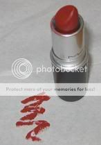
Similar shades: MAC Lady Bug, NARS Manhunt and Flamenco. All three of those shades are slightly cooler than Sexy Tango; I find them slightly too cool (yes!), but most women probably won't.

Dark red: I think Julie Hewett's Noir lipsticks ($22.50) are excellent, as highly pigmented as MAC's Mattes but smoother and less drying, and the tubes are gold-tone packaging done right, not too large or heavily ornamented. Coco Noir is as close to dark, gothic red as I care to go (which is to say, not very). The website sells it as a red for women who think they can't wear red, which I don't understand, because although it's fairly neutral, it's a strong colour, even on women with darker skintones than mine (see The Non-Blonde's review). If you think you can't wear red you should probably pick a more toned-down shade, something with a lot of rose or brown in it, and apply it lightly until you get used to the strength of the colour. Dain has recommended Bésame Red Velvet, which I can't try because I refuse to pay $18-$25 in shipping charges for one tiny lipstick(!?!?!), but I'd suggest experimenting with MAC or Lipstick Queen lipsticks; each line has a great number of variations on red, including several softer, more toned-down shades.
Incidentally, Julie Hewett's lipsticks are available in Canada through Essential Day Spa, and the prices are not stupidly marked up.
Similar shades: Sue Devitt's Great Australian Bight is very similar in tone to Coco Noir, but browner and not as heavily pigmented. NARS Velvet Matte lip pencil in Forbidden Red is described as "brick red," but it's more of a ruby on me, slightly more orange than Coco Noir and not as deep.
Labels: beauty notes, guerlain, julie hewett, mac
8/24/2008 [8]
Subscribe to
Posts [Atom]. Or
follow on bloglovin'. If
you'd like to contact Dain,
feel free to email me.
I'm also on Pinterest.
The Mnemonic Sense
Most Wanted
The Beauty Primer
Lookbook
Bestsellers
Consumer Diaries
Closet Confidential
On The Label
Beauty Notebook
The Hit List
Color Me In
The Makeup Artist
Wedding Bells
Globe Trotter
Desert Island
perfume notes
beauty notes
fashion notes
culture notes
minimalism
chypre arc
floral arc
fresh arc
masculines arc
gourmands
& orientals arc
Archives
August 2008
September 2008
October 2008
November 2008
December 2008
January 2009
February 2009
March 2009
April 2009
May 2009
June 2009
July 2009
August 2009
September 2009
October 2009
November 2009
December 2009
January 2010
February 2010
March 2010
April 2010
May 2010
August 2010
November 2010
December 2010
January 2011
March 2011
August 2011
September 2011
October 2011
November 2011
December 2011
January 2012
February 2012
June 2012
July 2012
August 2012
September 2012
October 2012
December 2012
January 2013
February 2013
March 2013
June 2013
July 2013
Images
Photobucket