"The most beautiful makeup for a woman is passion, but cosmetics are easier to buy."
—Yves Saint Laurent
Announcements
If you're new to this blog, then read our guides to the basics: Skin (Part I), Skin (Part II), The Supernatural, Color Theory I, Color Theory II, Eyes, and Brushes.
Also, check out the blogsale.
Contents
Favored
Art Tattler
the glamourai
The Non-Blonde
Perfume Shrine
Lisa Eldridge
Garance Doré
Smitten Kitchen
Into The Gloss
Grain de Musc
Lacquerized
Res Pulchrae
Drivel About Frivol The Selfish Seamstress
Killer Colours
Bois de Jasmin Glossed In Translation
Jak and Jil
Toto Kaelo
Worship at the House of Blues
I Smell Therefore I Am
Food Wishes
The Natural Haven
Messy Wands
1000 Fragrances
Moving Image Source
Wondegondigo
The Emperor's Old Clothes
M. Guerlain
Colin's Beauty Pages
Barney's jewelry department
Parfümrien
loodie loodie loodie
The Straight Dope
Sea of Shoes
London Makeup Girl
Sakecat's Scent Project
Asian Models
Ratzilla Cosme
Smart Skincare
Illustrated Obscurity
A.V. Club
Tom & Lorenzo: Mad Style
Eiderdown Press
Beauty and the Bullshit
La Garçonne Flame Warriors Everyday Beauty
Fashion Gone Rogue
Now Smell This
Dempeaux
Fashionista
The Cut
A Fevered Dictation
Nathan Branch
101 Cookbooks
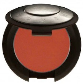 News confirmed just last week at the Becca counter in David Jones Pitts Street: Becca's award-winning Creme Blush and Lip & Cheek Creme are being discontinued.
Done. Finito. Au revoir.
The Becca rep I spoke to said that they have been phased out and replaced by the Beach Tints. This is a completely incomprehensible move to me, because Becca's cream blushes are one of the best of its kind, with many devotees in Australia and overseas; but even more because, as much as the Beach Tints are a unique and signature product for Becca, they do not perform in any way similarly to the cream blushes. When I use up my pans of Amaryllis and Tuberose, I'm going to be looking around for a cream blush from some other brand to take its place, not a Beach Tint. (Indeed, the day after I learned of the discontinuation, I went online and ordered two Kevyn Aucoin Creamy Glow blushes to try out.)
Alas, it doesn't look like we the customers are going to have any say in this decision, so all that remains to do is: stock-up. If you have an HG shade that you can't do without, I recommend you check the Becca online store, where the Creme Blush and Lip & Cheek Creme are all now 50% off (although some shades are already sold out). If you don't want to pay for international shipping, try a local online retailer. Just remember: when they're gone, they're gone.
Labels: beauty notes, becca
7/22/2013 [5]
How much we choose to spend on skincare is a very personal thing, as generally are the condition of the skin, irritations, environmental and dietary factors, and - let's be honest - subjective willingness to believe that a product is making a noticeable difference. The more overtly luxurious a skincare brand is, the less likely I am to mention it on the blog, lest I contribute to the hype that surrounds it with opinions that, by dint of the products' extravagance, must be taken with no small amount of reservation. In other words, above a certain price range, you are buying less and less a dermatological result, and more and more an image and a dream.
Some products - Helena Rubenstein Prodigy Powercell Youth Grafter, for instance - I might cautiously warn against after a bad personal experience, for reasons of sensitivity. But to go so far as a recommendation, a product has to do more than impress - it really has to knock my socks off.
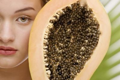
McArthur Natural Products is a range of natural skincare made in Australia. All their products contain pawpaw (papaya) extract, an ingredient known for its excellent exfoliating properties, effectiveness in stabilising oily skin, and high amounts of vitamins A, C, E, antioxidants and enzymes. In fact, the concentrations of pawpaw in McArthur Natural Products are higher than I've seen in any other brands. To make a comparison, the popular Lucas' Papaw Ointment contains only 3.9% fresh fermented papaya fruit, whereas McArthur products will be 25% (Hydrating Facial Cream), 30% (Scalp Care Shampoo), or 60% (Complete Skincare Cream) pawpaw extract.
Pawpaw extract itself is fantastic for treating wounds, sores, extremely dry or rough skin, and skin infections. From the customer testimonials on the website, the McArthur range appears to be popular among Australians living in dry/harsh environments, who suffer from skin conditions or sensitive skin, or who want a gentle product that can be used on small children.

The only product from the range I've tried, the McArthur Hydrating Facial Cream, contains 25% pawpaw extract (Carica papaya). It is a light, unscented cream that comes in an opaque pump bottle to prevent contamination and exposure to sunlight. I apply it to my face and neck last thing at night, an even layer over serum and facial oil. The texture is unlike a normal cream: instead of sinking into the epidermis, it will quickly settle and form a film over the skin, similar to a gel. I will only apply the cream in the mornings if I am staying home, because for the next couple of hours, the film it creates will cause pilling if you apply anything (like foundation) over it.
Ingredients: Aqua (Water), Carica papaya, Prunus amygdalus dulcis (Sweet Almond) Oil, Cetearyl Alcohol, Coco-Caprylate, Glycerin, Caprylic/Capric Triglyceride, Glyceryl Stearate, GlycerylStearate Citrate, Beeswax (Cera Alba), Gluconolactone, Tocopherol (Vitamin E), Xanthan Gum, StearicAcid, Glyceryl Caprylate, Magnesium Aluminium Silicate, Fragrance (Parfum), Citric Acid, Sodium Citrate, Sodium Benzoate
I have combination/oily skin, which tends to overproduce sebum at the best of times, and will breakout in pimples whenever I eat anything dairy. Achieving clear, unmarked skin for any prolonged period is therefore an ongoing battle for me, and I have experimented with all kinds of active ingredients and products over the years.
I started to use the Hydrating Facial Cream around the same time that I dramatically cut back on my smoking and increased my sleep hours, so when my complexion began to improve after a few weeks, I put it down to a combination of factors. Recently, however, I have noticed a great reduction in the oiliness of my t-zone in the morning. For as long as I can remember, I wake up from a night's sleep with build-up of sebum on my skin, a visible slickness on the nose and forehead that has to be washed thoroughly before I can apply any moisturiser or makeup.
That oiliness? All gone after 4 weeks of using McArthur Hydrating Facial Cream. I also haven't had a bad breakout in weeks, despite having eaten cheese and butter, but any other superficial improvements I've noticed in my skin aside, this dramatic reduction in my skin's sebum production would be sufficient for my glowing praise of this product. It made a difference where nothing else I've tried did. I'm very eager to try the McArthur Scalp Care Shampoo and Conditioner next, to see if pawpaw extract is equally effective at controlling my oily scalp.
McArthur Natural Products are not tested on animals, are made from all natural ingredients, and do not contain parabens, sodium lauryl sulphate or propylene glycol. I highly recommend the range for skin that is oily, sensitive, or damaged.
McArthur products are available at the McArthur online store, Pharmacy Online, and selected pharmacies in Australia.
Labels: beauty notes, mcarthur natural products, pawpaw extract
6/27/2013 [6]
That part at the end, when the chip breaks and the guy just scoops the whole thing up with his fingers... that kills me.
You may have noticed that we at Ars Aromatica are not ones to scoff at obsessive attention to detail. Both perfection and truth to life require it. But perfection I am skeptical of, because it implies a frozen state with room for neither entropy nor growth. What is more marvelous is the imperfection of the familiar, but cast in ever-changing lights to both lift us out of the dreariness of existence and awaken anew in us a love for the humble details that usually escape our notice.
In contrast to the finesse of many animated works today, "Fresh Guacamole" is clumsy, substituting materials for other materials that don't resemble each other at all. And yet the conceit not only works, but breathes, for no matter how gorgeous the execution*, it cannot approach the texture that comes from embracing imperfection—indeed, lovingly recreating it.
*I consider this movie overrated for this exact reason. I do not dislike all CG movies, as I consider Ratatouille the rare film that exhibits both soul and astonishing polish in its execution. You, dear reader, may have different opinions.
Labels: animation, culture notes, PES
3/11/2013 [5]

The earliest books I read in English were Mr. Men and Little Miss.* It was December 1992, and I had just moved from Shanghai to Sydney to live with my father. My command of English was basic; I had not yet started primary school. Every trip to the supermarket, I would pick up a couple of these plainly illustrated children's books at check-out (a dollar each), then cajole dad to read them aloud to me when we got home. Within a year, I'd graduated to Enid Blyton and C.S. Lewis; they were my window into how this Anglo society I was now living in functioned, my first measuring stick for the known world. I retain, to this day, a fondness for proper afternoon teas and sardines on toast.
Books are disarmingly like people**. Some are invaluable companions and guides. Others make you laugh, or feel less alone. Some books are charlatans, luring you in with false promises, only to try to fool you with lies and bad logic. Exposure to liars is useful, helping to develop reasoning and argumentation, but you don't want those liars near you for too long, even if they are popular. From those closest to you, you want to be moved. You want to be enlightened and challenged. You want to be surprised.
I went to an Anglican girls' school, where there was little room for history that wasn't the Reformation and the Tudor kings and queens, so the first time that I read The Lions of Al-Rassan, and learnt about Moorish Spain, it was like I had discovered a world that was previously unknown. Through the accounts of early 20th century European explorers who fell in love with Arabia (Freya Stark, Wilfred Thesiger), I too became smitten. I rebelled against Western-centric history and responded to my resentment over its brushing over of China by wanting to learn about the Others in their own words. Classical poetry - songs of the individual and the everyday - was one avenue.
I am not religious, or even remotely interested in mysticism in the conventional sense. The philosophical ideas of Daoism (or Taoism) came into my life when I was disillusioned with the binary thinking that characterised all the legal and political philosophy that I'd studied at university. All the while that my mind felt trapped and besieged, I was still thinking within a paradigm that didn't have the words to express my struggle, until I started to read Tao Te Ching and its commentaries. For a crash course on Daoism that doesn't reduce the philosophy to soft mysticism (as many comparative religion courses do in the West, I've discovered), I recommend Donna Quesada's lectures on the subject. Cybernetics (Gregory Bateson, Norbert Wiener) and systems theory (Ludwig von Bertalanffy, Varela and Maturana), interdisciplinary fields that constitute a post-Newtonian science, seemed to be logical progressions from that line of thought.
My interests are very broad, so I read from a lot of different subjects and genres. Romantic love and sex, and angst about the same, is a notable exception. It was in my late teens that I started to understand my own asexuality. Tom Ripley (as Highsmith wrote him, not as he was portrayed in the Minghella film), murderer and sociopath though he is, remains one of my literary heroes; the first character I came upon that I recognised, in sweet relief, that Yes, he is like me. Laurie R. King's heroine, in A Monstrous Regiment of Women, articulated another side of it: "For me, for always, the paramount organ of passion was the mind. Unnatural, unbalanced, perhaps, but it was true: Without intellect, there could be no love." My bookshelf is a microcosm of how I think and love.
Left: The Club Dumas, Arturo Perez-Reverte; The Structure of Scientific Revolutions, Thomas S. Kuhn; Steps to an Ecology of Mind, Gregory Bateson; The Talented Mr. Ripley, Patricia Highsmith; The Prince, Niccolo Machiavelli
Centre: Lucifer, Mike Carey and Peter Gross; The Beekeeper's Apprentice, Laurie R. King; The Lions of Al-Rassan, Guy Gavriel Kay; Collected Poems of C. P. Cavafy, translated by Daniel Mendelsohn; Spheres of Justice, Michael Walzer; Classical Chinese Poetry: An Anthology, translated by David Hinton
Right: Arabian Sands, Wilfred Thesiger; The Left Hand of Darkness, Ursula K. Le Guin; A Canticle for Leibowitz, Walter M. Miller Jr.; Tao Te Ching, translated by Stephen Addiss and Stanley Lombard; Poems of Arab Andalusia, translated by Cola Franzen; The Rubaiyat of Omar Khayyam, Edward Fitzgerald; The Collected Poems of Theodore Roethke
*This series is based on My Ideal Bookshelf, edited by Thessaly La Force and illustrated by Jane Mount.
**And books should be treated as such. While I stand vehemently against censorship in principle, I maintain that there is a vast gulf between "having the right to say something" and "saying something that is right".
Labels: desert island, guy gavriel kay, laurie r. king, patricia highsmith
2/02/2013 [13]
 Light: Installations by Bruce Munro at Longwood Gardens
For the last four decades, they have been makers of Alltagsmusik ("everyday music"), dedicated to expressing the "quotidian landscape of a Mass Culture age" (Frieze Magazine). The style which they pioneered -- electronic music -- spawned techno, disco, house, synth pop, drum and bass, hip hop, and myriad genres: folk music of the man-machine world. The inescapable auditory patterns forming the soundtrack of our digital present. More than any other band, according to Tom Ewing at Pitchfork, "they...catch in music what interaction with machines really feels like -- sometimes glorious, sometimes lonely and frightening, occasionally very funny."
One of their most popular singles is "Computer Love" (Computer World, 1981):
another lonely nightA tender and wistful love song between a lonely protagonist and the computer which he is dependent upon for a "data date", this track about human longing at the organic/technical interface, with its completely synthesised instrumentation and 8 bit samples of consumer electronics, gets reinterpreted through the wood-and-resin prism of violin, viola and cello by the Balanescu Quartet in their 1992 album Possessed.
stare at the tv screen
i don't know what to do
i need a rendezvous
The Balanescu Quartet, "Computer Love" (Possessed, 1992)
Stripped of the alienation of synthesisers, the elegance and lyricism of the song become highlighted in the string quartet version, whilst retained are the achingly beautiful melodies, the precision of its staccato rhythms and the complex, layered counterpoint that characterises minimalism. The lively tonality of strings replace the gleaming warm/chilly alchemical textures of the original (surging, pounding, beeping, dissolving), coming at the same organic/robotic divide from a different angle. Then, as the song gradually progresses, harmonies shifting in and out of phase, twisting and transmuting in an endless web of connectivity, there is the undeniable joy of hearing a violin mimicking a slide down an electronic keyboard or the rapid bleeps and pings of a calculator.
Passion is still muted, the humour no less dry, but agitation and effort, more easily expressed on a stringed instrument, are an audible presence. A duet between singer and electronic keyboard in the Kraftwerk version, an exchange as much about intangible connection as it is about loneliness, loses some of its whimsicalness by becoming a pas de deux of violin and viola, the two voices no longer separated by a real/analog divide, but reflections of each other.
Yet even as this breach is overcome, the stirrings of desire are sharper, more desperate. Perhaps it is as simple as the fact that everything seems sadder on the violin, just as the simple sounds of the early decades of personalised computing cannot help but convey a sense of hope and naivety.
"It's like a drug to human ears. It can cure, it can crush. It can raise someone up, it can send one crumbling to the ground. A note to stir any hidden feeling in the core of our being."
- Laura Teodora Radulescu on YouTube, comment to the Balanescu Quartet's "Computer Love"
In fact, to my ears, by removing one reflecting glass (or perhaps by adding one) between the robotic and the real, the Balanescu Quartet's "Computer Love" is even more terrifying lovely than the original. It is easy to see how this music - with its catchy melodies, pristine and calming - could be adapted to more ominous effect; the moments that flutter and swoop like silvery birdsong, appropriated to set a soft, nostalgic gloss over every conceivable product of postmodern life: test-tube crops, a sparklingly efficient and impersonal train network, the mechanical slaughter of farm animals, a Sony notepad or digital TV.
"Trust me", it says, like the soothing, almost (but not quite) human female voices speaking corporate slogans on television ads. Eerie, but mesmerising. "You already know me. You can trust me."
Where the Kraftwerk original is about the experience of technology displacing real, tangible interaction in daily life, the Balanescu Quartet's cover of "Computer Love" seems to capture something more disturbing: how deeply and fundamentally radical technology is woven into the fabric of our daily experience, so that even as we sometimes feel a tingle of wrongness, of something being a little "off", we are often unable to see through to their ultimately foreign nature. And this subterfuge is not "natural", not empty of human purposefulness. The anthropomorphising is not spontaneously done at the user end.
The means of production, the way objects are designed and packaged and marketed, are not devoid of consideration. There is a human hand on the strings, a human mind that directs it. If Kraftwerk's message is: "Machines are doing this to Us", the message of the Balancescu Quartet's "Computer Love" is: "We are doing this to ourselves."
Labels: balanescu quartet, culture notes, kraftwerk
1/08/2013 [6]
As the birthplace of the China's modern textiles industry, the originating port of Chinese silks to the outside world, Shanghai has the reputation of being the country's fashion capital (barring Hong Kong, whose return from British rule belongs to recent memory).
So it is ironic that for decades in the latter half of the 20th century, Shanghai was reduced to low-cost processing for international clothing and footwear brands. Its tailors flocked overseas, many to HK, finding little native market for their handiwork during the austere years of the Cultural Revolution. Its mills and factories turned out workmanlike, unflattering garments indistinguishable from one another by the container-full.
Taste languished. And I fear, discernment, too. It was a sad, sad time for lovers of fashion.
But no more, it seems.
Whereas a mere decade ago, my parents and I would be hard pressed to find anything to wear in Shanghai that was both to our taste and not from a foreign brand, I have been delighted to discover in the last few years an increasing number of exciting, locally designed fashion labels.
Here are my top three favourite Chinese boutique brands, all of which combine beautiful natural fabrics with elegance, comfort, and youthfulness.

NuoMi is currently having its holiday sale, with clothing up to 50% off. So if you happen to be in Shanghai, think about checking it out at Xinle Lu, Biyun Lu, Wujiang Lu or Changning Lu.
Noteworthy mention: Silk King, which carries on Shanghai's tradition of silk and garment trade. Its branches are ubiquitous across Shanghai, but I especially recommend its multi-story flagship store on Nanjing Road, which offers the widest range of products - including fabrics, bedding, scarves, readymade and tailored clothing, sleepwear, etc. - and the best service.
Labels: fashion notes, jade en plus, nuomi shanghai, shanghai, silk king, zuczug
12/21/2012 [4]

As far as inconvenient surprises go, I've never been as flummoxed as, when on a camping trip last winter, I woke up to find that one of the legs of my glasses had broken clean off the frame, presumably when I rolled over the cold-brittle frame in my sleep. Since then, I'd mostly been getting by on the power of scotch-tape, and as may be expected, had to deal with the frame constantly falling apart on me, as well as probably a lot of strange looks that I never noticed.
My tendencies toward procrastination, however, meant that I didn't get up off my ass and start looking for a replacement until August. Notwithstanding, this was an opportunity I'd been looking forward to for years.

You see, while my old glasses had been nice enough, their appearance could best be described as "nerdy". I looked like every stereotypical badly-dressed Asian kid holed in the library, managing the honor roll every quarter but with no social skills to speak of.
Which, there's nothing wrong with being that (and I was) but even apart from that, I found my old wire frames neither here nor there, as if trying too hard to be inconspicuous. This glaringly misses the point, because no matter how thin the frames are—or even nonexistent, a style that was popular in the early years of this millennium—no one was ever going to miss the fact that I was wearing glasses. And I thought, if my glasses were going to be the focal point of my face anyway, why not make them more assertive, more fashion-forward?

I was still apprehensive, though, and I worried I was just blindly following a trend, without regard for how it would actually suit me. Would not the thick frames close in on my eyes and make them look smaller? Would they dominate my face and swamp my features? Would I be doomed to wearing minimal makeup for as long as I wore them, for fear of all the colors overwhelming my face?
And yet, despite my misgivings, it was the bold frames—and in a claret red at that—that called out to me, and, surprisingly, the strong color and shape flattered my features better. As it turns out, the frames play surprisingly well with makeup, even the brighter red lipstick shown here. The clarity of my features (black-lashed and almond-shaped eyes, a defined nose, and full lips) has always been my strong point, and the frames did not draw attention away from them as I had feared they would, but reframed my face in terms of broad strokes, throwing my features into stronger relief. The poor texture of my skin is less apparent in this photograph, because they are simply less noticeable against the brightness of the frames.
.

The new frames also removed my image further from that of the uptight and plain intellectual, which is a change I like, though admittedly the effect is also more generic, more fashion-conscious, and perhaps less expressive of my actual personality. Still, it's not as if my identity has undergone a change: these are just another accoutrement, after all, and if it turns out to be a mistake, well then that's easily reversed by another camping trip. And when better to try on new personas and appearances than in (my rapidly dwindling) foolish and innocent youth?
Labels: fashion notes
10/12/2012 [2]
Labels: beauty notes
9/26/2012 [3]
In his Theory of the Leisure Class (1899), Thorstein Veblen - one of my favourite economists, the Sir David Attenborough of the species Homo sapiens sapiens (breed: Capitalist), much beloved by the Institutionalists - wryly observed the inverse relationship between the practicality and comfort of footwear and the wearer's level of (implied) participation in conspicuous consumption:
"Our dress…in order to serve its purpose effectually, should not only be expensive, but it should also make plain to all observers that the wearer is not engaged in any kind of productive labor… A detailed examination of what passes in popular apprehension for elegant apparel will show that it is contrived at every point to convey the impression that the wearer does not habitually put forth any useful effort. […]
"The dress of women goes even farther than that of men in the way of demonstrating the wearer's abstinence from productive employment. It needs no argument to enforce the generalization that the more elegant styles of feminine bonnets go even farther towards making work impossible than does the man's high hat. The woman's shoe adds the so-called French heel to the evidence of enforced leisure afforded by its polish; because this high heel obviously makes any, even the simplest and most necessary manual work extremely difficult. […]
"But the woman's apparel not only goes beyond that of the modern man in the degree in which it argues exemption from labor; it also adds a peculiar and highly characteristic feature which differs in kind from anything habitually practiced by the men. This feature is the class of contrivances of which the corset is the typical example. The corset is, in economic theory, substantially a mutilation, undergone for the purpose of lowering the subject's vitality and rendering her permanently and obviously unfit for work. It is true, the corset impairs the personal attractions of the wearer, but the loss suffered on that score is offset by the gain in reputability which comes of her visibly increased expensiveness and infirmity. It may broadly be set down that the womanliness of woman's apparel resolves itself, in point of substantial fact, into the more effective hindrance to useful exertion offered by the garments peculiar to women" (emphases mine).For those unfamiliar with Veblen's sharp tongue, here it is in 21st century speak, with my own feminist slant added in:
- What is "fashionable" and "desirable" in a society conveys the impression that the wearer belongs to the "leisure class", i.e. can afford not to engage in something so distasteful as actual physical work
- Women in particular who aspire to fashion, by dint of the gender division of labour and women's station in life as symbolic extensions of their patriarchal figures, are expected to dress in a manner that actively impedes their range of movement, dexterity and stamina. Think Christian Louboutins, or the painful and crippling practice of foot-binding in dynastic China.
- The more frail, delicate, and obviously unfit for any kind of physical activity you are as a women, the better this reflects upon your social status, and more importantly, the social and economic status of your parents, boyfriend, or husband.
Thankfully, there have been some compromises for the modern-day woman. Flats are generally considered acceptance office wear (although in many industries, heels are still encourage for any engagements with clients). Unisex casual footwear (Converse, Vans, flip-flops) are not thorough objects of scorn and unwomanliness (although they will still get you kicked out of high-end restaurants). Shoemakers have cottoned onto the fact that women would prefer to have the height without sacrificing the ability to still walk (at least, get around a boardroom or a supermarket), and thus come up with such helpful innovations as the platform heel and wedges. Car designers have yet to discover a way for me to drive safely without having to remove my heels, but I expect they will eventually. ("Drives like a woman", oh, ha di-ha-hah.)
We live with these compromises every day. Live in them, literally, when it comes to fashion, every pair of shoes a consideration of the usual parameters: "Do they fit comfortably? What outfit will these go with?" But also some which are particular to women: "How far will I need to walk? Will I have to drive, or be driven? How long will I be able to stand up in them?"
And above all: "How much pain am I willing to tolerate, in this instance, for the sake of beauty?"
In my own personal case, the easy answer to the last is: Not much.


A look over my summer shoe collection here in China - leaving out my many, barely distinguishable pairs of black ballet flats which are worn to work on rotation - finds flats and mid-height heels in strong representation. What heels I do own, however, are all expressly chosen for their comfort. Seeing as I don't drive in China (and barely drive in Australia, either, to be honest), getting around mainly on foot, metro, or taxi, it is crucial that I be able to walk easily, even whilst carrying a handbag, a laptop bag, and a sack of heavy groceries, as it were. The condition of pedestrian spaces in Shanghai present further challenges: frequent roadwork, uneven pavements, slippery surfaces and poorly visible steps (accident liability being an underdeveloped arena in China).
Even my evening and party heels (magenta suede platforms, goes-with-everything black patent pumps, Milana slingbacks) have been altered or selected to accommodate the environment: leather outersoles overlaid with hard rubber to prevent slips and provide some cushioning for the foot, and colours on which cement dust will not show too obviously. I would not go so far as to say that I could run in them, much less harvest a field or do much housework, but I could definitely walk a mile or three without needing a male arm to steady me.


Sheme blush peeptoe heels // Milana for David Jones taupe platform slingbacks
Chloe Chen magenta suede peeptoe platforms // Peeptoe patent heels
Labels: bcbgeneration, chloe chen, fashion notes, gaimo, lottusse, milana, peeptoe, rebeca sanver, sheme, thorstein veblen
8/29/2012 [8]
My work day make-up, never very adventurous, has attained a new pinnacle of corporate monotony. I won't bored you with the details; suffice it to say that I have lapsed to a ready-in-5 ethos, and can frequently be seen heading out the door without eyeliner. And what is more: I'm okay with that.
And perhaps it is to counterbalance all that unobtrusive naturalism I wear in the office that, when I do get the time and the inclination to play with colour, I tend to go all out.
 The incredibly adorable Shokay S/S 2012 Campaign
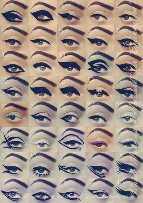
One of the common questions that beauty bloggers get asked: "How do you do make-up on an Asian eye?"
I have seen lots of very helpful videos on the topic (from Lisa Eldridge, Rae Morris, and others), but without fail, I personally find the question quite annoying and fetishistic. There isn't a one-shape-fits-all, stereotypical "Asian eye", just as there is no such thing as a "standard (i.e. Caucasian) eye". If you have a monolid, or long narrow eyes, or a creaseless lid, my best advice would be to start looking at images of women with monolids, narrow eyes, or creaseless lids. A copy of Vogue China will probably teach you more about make-up that is flattering for your eye shape than I could in a dozen posts.
That, and practice.
Take the above image from the Shokay S/S 2012 campaign, featuring a long, eye-lengthening flick of black liner, orange eyeshadow, and rosebud lips painted not in your typical geisha red, but a glossy tangerine. Since my eyes are more rounded than the model's, recreating the whimsical, wide-eyed look on my features took some adjustment in the width and angle of the flick, but the placement of the coloured pigments is more or less the same.


Full coverage foundation would have been better for this look, to more closely match HD "perfection", but lazy as I was on a Saturday, I opted for the minimal coverage afforded by Koh Gen Do Aqua Foundation, with some concealing around the nose, mouth, and under the eyes. Brows were filled in with my current favourite brow product, Cle de Peau Eyebrow Pencil in 101 (a mechanical pencil with built-in brush), and shaped in as much of a rounded arch as I could achieve. My own brows are very straight, nearly-perpendicular to the line down the centre of my nose; to get the same angle in the brows as the model in the photo would have taken more plucking and masking than I was prepared to deal with. (Compromises, compromises…)
To match the eyeshadow, I blended two vivid metallics from Shu Uemura (their names long lost to me, as they were depotted into a palette years ago), for a warm, shimmery orange that stands out just enough from my skin tone. Toward the inner third of the eyelid, I faded the orange slightly with NARS Silk Road, a very glittery pink-nude, and the outer corner was deepened with Kevyn Aucoin Copper, which is more brown and less metallic.
The white under the eyes would have been best achieved with a pencil, but with none in my stash, I made do with a layer of Shu Uemura P42 (matte white with pink undertone), followed by Addiction Cigarette to better catch the light. A hint of Cigarette also went under the brow as a highlight.

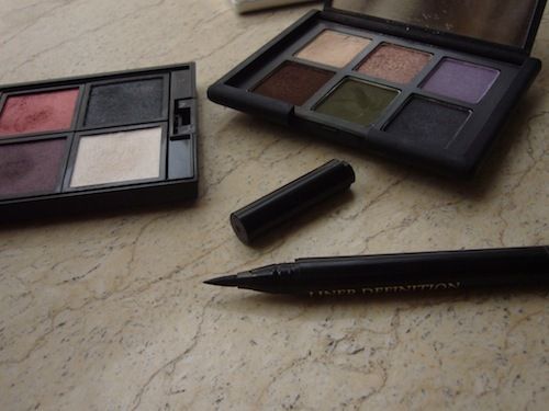
The main attraction, the liner, was drawn in with a liquid liner pen, Lancome Liner Definition in 01 (Black). Its soft, flexible felt tip is not as fine as I would like, but it is very easy to work with, even for someone as unused to drawing flicks as I am. It delivers very crisp edges and dark, velvety pigment. NARS Zen beneath cheekbones and a light dusting of Shiseido RD103 Petal on the cheeks finished off the face.
I am less than happy with the lips - not the lipstick, which is a mix of Shiseido Day Lily and Chantecaille Canna - but with the mauve undertone that peeked through despite the foundation and concealer I used to mask the natural colour of my lips. A seam between face and lips destroys the illusion of skin melding invisibly into the sides of the mouth, and draws attention to the unnaturalness of the painted "pout". A peach corrector might have been more effective here to counteract the dark purple.
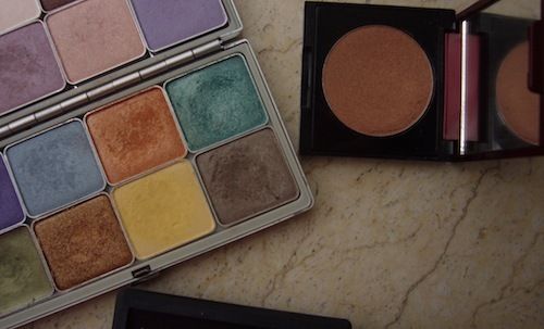
 L-R (click to enlarge):
Shu Uemura P42 blush (as a white eyeshadow base)
Shu Uemura metallic orange eyeshadow (discontinued)
Shu Uemura metallic bronze eyeshadow (discontinued)
Kevyn Aucoin Copper (contour)
NARS Silk Road
Addiction Cigarette (highlight)
Shiseido OR418 Day Lily
Chantecaille Canna
Image source: Shokay
Labels: addiction, beauty notes, chantecaille, cle de peau, kevyn aucoin, lancome, nars, shiseido, shokay, shu uemura
8/10/2012 [9]
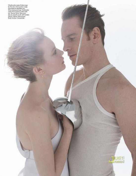
As expounded before in my Ole Lynggaard Sweet Drops post, my taste in jewellery leans toward the clean, minimalist, and versatile; organic shapes with a modern sensibility. All of those notes - with the possible exception of versatility - are hit upon by Shaun Leane's Hook Earrings and the smaller, less dramatic Talon Earrings. I first saw them on Mia Wasikowska in her W Magazine photoshoot with Jane Eyre co-star Michael Fassbender, where I was captivated by how - like the gleaming rapier in Wasikowska's hand, with its lush, curvaceous hand-guard, set against the deadly steel blade - the earrings brought into balance the opposites of sharp and delicate, masculine and feminine, warning and invitation. These are earrings with serious attitude, as declarative as a tattoo, but requiring a great deal less in long-term commitment.
Available in either yellow gold, rose gold or silver, the Hook Earrings and Talon Earrings are weighty and substantial in the hand; gently framing the face, they are striking, decidedly sculptural in their multidimensionality. I have worn mine in all seasons, but find that they cohere most effortlessly with simple outfits that are not too riotous in colour or heavily ornamented.

Shaun Leane Silver Talon Earrings from Little15 Jewellery, Shiseido Shimmering Cream Eye Colour in SV810 Tin and BL711 Angel, Shu Uemura RD198 and Cle de Peau R1 Black Baccara
Photo: JustJared
Labels: fashion notes, shaun leane
7/11/2012 [11]

Urban Decay has decided to make its products available in China. With just one press statement, which attempts to reconcile this business decision and its brand image, Urban Decay has managed to both anger its existing customer base (those opposed to animal testing) and insult the Chinese market that it is trying to court.
You can read the full statement at Temptalia, but here are some choice bits (emphases mine):
"[W]e believe that change cannot and will not happen by outside pressure alone in a closed market. Change can only happen from within. When we enter the Chinese market, we will do our part to help make those changes.
"When we were considering expanding into China, a group of marketing consultants told us to remove the section of our company history that describes our crusade against animal testing. "It doesn't mean anything to the Chinese beauty customer," they said. Of course, we refused. Our “no animal testing” policy is part of who we are, and has been since day one. The news that animal issues don't even register with the average Chinese consumer was one of the biggest factors in our decision to go there. During Urban Decay's infancy, we worked hard to inform consumers about animal rights in the United States and Europe. The battleground for animal rights is now in China, and we want to be there to encourage dialogue and provoke change.
"We also hope to shed some light on women's rights issues in China. As a company that caters to a female customer, this is extremely important to us. For one thing, going into China is a way for us to advance women into important professional positions. We will help grow the cosmetics industry, which primarily employs and creates career paths for women. Although workers' employment rights are a relatively new concept there, progress has been made partially because of pressure from businesses, consumers, and advocacy groups from other countries. Based on this, our belief is that both an outside force and inside pressure for change can result in helping transform both the importance of women and animal testing policies in China. And more importantly, we hope to influence the perspective of the citizens on both of these issues.
"If we don't go to China, other companies without our beliefs will, and the culture will never change."When you strip it down, their argument basically is this:
1. Chinese consumers are living in a moral vacuum and need to be educated re. enlightened values like animal/women's/workers'/[insert your own cause] rights by a socially responsible company (which we are, really) operating within the country's own boundaries. So actually, we're doing this for the Chinese people's own good.
2. Of course, we're also in it to make money. We hope to convince you of the rightness of our decision, but if you don't like it, then you can take your business elsewhere.When China goes to Africa to make money, it doesn't (try to) dress it up as being "for Africa's own good", like they're in it for humanitarian purposes. And it's worth noting that most cosmetic brands do not normally feel compelled to make a press statement like this one from Urban Decay.
China's market in cosmetics is huge and growing; according to the Li & Fung Research Centre, in 2011 it was valued at more than $17.3 billion in retail sales, a 18.7% increase on the previous year's. I think I prefer a company that is honest about its profit motivations, rather than one that tries to have its cake (shiny, youthful, "nontraditional" brand image) and eat it too.
Update (June 8): Since that press release was made, Urban Decay has lost its Leaping Bunny certification and been removed from PETA's list of cruelty-free companies.
Labels: animal testing, beauty notes, china, corporate social responsibility, urban decay
6/06/2012 [13]
As I make ready to return to Shanghai at the end of February - a more semi-permanent move this time, for the purposes of a new job - I have been sifting through the stacks of worldly belongs that have accumulated in my family home in Sydney, trying to decide what I need to take with me. This is obviously not the time to be buying still more stuff that will not fit into my 30kg luggage allowance, and yet I persist. What gives?
SNIFFING
China, and even the glittering fount of cosmopolitanism that is Shanghai, is a bit of a desert wasteland when it comes to perfumes. Another cause for distress: glass bottles full of alcohol are not the easiest (or most light-weight) things to take onto a plane. I shall have to hope that a few full-sized bottles of perennial favourites (Fille en Aiguilles, Vetiver Oriental, Bandit, Timbuktu) and a hefty cosmetics bag full of decants (many of them courtesy of Dain) and Travalos will serve until I can next spare the time for a trip back in Sydney. In the meantime, I am spraying myself with clouds of scents that didn't make the full-bottle cut, and rediscovering in the process perfumes that I haven't worn in ages (Like This by Etat Libre d'Orange), not to mention new purchases that I have not spent nearly enough time with (Juliette Has A Gun Vengeance Extreme).
LISTENING
Alberto Iglesias' incredibly atmospheric score for Tinker, Tailor, Soldier, Spy, which I really hope will win the Oscar for best score come February 26th. This is the second Le Carre adaptation that Iglesias has written the music for (the other was The Constant Gardener, a very differently flavoured soundtrack for which he also garnered an Oscar nomination), and he captures the paranoia and the elegiac tone of both book and film to perfection.
READING
I have no self-control when I step into a bookstore. My backlog of "new books I have yet to read" is so long, it could probably make for a small library in itself. Yet a book, I tell myself, is something that will never truly go to waste. What's more, I like to know that I'm doing my part in keeping the commercial publishing industry alive; the printed word, too, because, goodness knows, I spend a lot more on paper books than I do on new airplane-reading-material for my Kindle. Of the latest additions to my shelves (image below), I think the two volumes of Camus' notebooks (a gift from Melissa) will come with me to China.
The new (newish?) Daniel Mendelsohn translation of Constantine P. Cavafy's collected poetry ("The streets in which you pace/will be the same, you'll haunt the same familiar places,/and inside those same houses you'll grow old") is proving to be a delight, possibly even surpassing my abiding affection for the Rae Dalven translations ("Every effort of mine is a condemnation of fate;/and my heart is - like a corpse - buried"). But it will probably stay behind, purely on account of its size. The rest? Well, I guess I'd better get cracking reading.

WEARING
Whether I'm pairing it with a cream kitten-bow blouse at work or a casual white tee (and a statement necklace in chunky, rough-hewn amber) over the weekend, my navy Brother Skirt from Les Prairies de Paris is all class in a relaxed sort of way, with its two side pockets, strip of black suede running down the front, and hem just skimming the knees.
I have been wearing wool pencil skirts a lot lately; and blazers; and knits. The funny thing is that the weather has been so peculiar this summer in Sydney that it will hardly be much of a shock to the system to fly across the equator and suddenly find myself in a northern winter rather than the chilliest southern summer in my own personal memory. I wouldn't have to do anything more than throw on a coat.

An even more satisfying acquisition than my Les Prairies skirt, is my new Ole Lynggaard Sweet Drops bracelet. Not three weeks after I wrote this post about the Sweet Drops, I added one to my small, extremely select collection of "every day" jewellery. After near half an hour looking through the selection at Jordan's Jewellers (Market Street, Sydney), I eventually picked out an olive wrap-around leather bracelet, and a white gold/moonstone "Dew Drop" and silver/black onyx "Sweet Drop" to wear on it. It was a tough decision to make. Seeing them in person, one cannot fail to appreciate how carefully and meticulously they have been crafted. Each of the "Dew Drops" and "Sweet Drops" have a clasp that allows them to hold tightly to the band without scratching the soft leather. Each is further designed to hang only at a certain angle; the charms have room for movement, but not so much that they can rotate 360 degrees around the band and irritate the wearer. My bracelet is easy, understated, and a joy to wear.

EATING
All the things that I will miss in China: fresh (and affordable) mangoes/figs/papaya/avocados, Australian yogurt, Whisk & Pin gluten-free muesli, an Italian-strength espresso, newly shucked oysters that don't cost an arm and a leg (and won't lead to food-poisoning), really good Lebanese food… I could go on and on.
Labels: albert camus, alberto iglesias, cavafy, consumer diaries, etat libre d'orange, juliette has a gun, les prairies de paris, ole lynggaard, shanghai
2/14/2012 [2]
Shiseido debuted their Shimmering Rouge Lip Colour with 13 shades last year, following the trend of lipstick/gloss hybrids which also multi-task as lip conditioners (Chanel Rouge Coco Shine, Dior Addict, Guerlain Rouge Automatique, etc.). The shades released in 2011 were mostly warm peachy/pinky nudes, and while they were nothing so demure as the Rouge Coco Shines (can you tell that those are not my favourites?), none really caught my eye in particular until RS619 Venus.
 Guerlain Gigolo // Cle de Peau R1 Black Baccara // Shiseido Venus // Chantecaille Heirloom // Shu Uemura WN270 // Guerlain 124 Samsara // Giorgio Armani Armanisilk 30
Described accurately by Shiseido as a "profound reddish violet", Venus (3rd from left) is a newly released Shimmering Rouge from the SS12 collection. Bold and bright, it is fully as pigmented as most lipsticks - a single swipe delivering even, opaque colour - yet has a soft, balmy texture and slightly glossy finish. On me, the wear-time before reapplication is roughly 4 hours with drinks and smoking breaks, which is also similar to a lipstick. When the colour fades, it does so evenly and leaves a hint of a stain.
Comparison with the Chantecaille Lip Chics, my favourite lipstick/gloss hybrid formula, I'm pleased to say, is favourable. Both are extremely moisturising and comfortable to wear. Although the Shiseido Shimmering Rouge is considerably more pigmented and requires greater precision to apply than the Lip Chics (my go-to lipsticks to put on whilst driving or without a mirror), I appreciate its flexibility: you can easily sheer it out to create the effect of a stain, or layer it on to achieve an intense, dimensional look. And like the Lip Chics, the packaging of the Shimmering Rouge lipsticks is light, slim and discrete, ideal for the handbag.
I have worn Venus several times this week at work, and I am finding it to be the perfect pick-me-up for these drab, rainy days Sydney has been having this summer.
 Eyes: NARS Jolie Poupee // Lips: Shiseido RS619 Venus
Floating images of my own disembodied lips somewhat creep me out, but you can see a close up lip swatch of Venus here.
Labels: beauty notes, chantecaille, shiseido
2/08/2012 [4]

My mother gave me the prayer to Saint Theresa.
I added a used tube ticket, kleenex,
several Polo mints (furry), a tampon, pesetas,
a florin. Not wishing to be presumptuous,
not trusting you either, a pack of 3.
I have a pen. There is space for my guardian
angel, she has to fold her wings. Passport.
A key. Anguish, at what I said/didn't say
when once you needed/didn't need me. Anadin.
A credit card. His face the last time,
my impatience, my useless youth.
That empty sack, my heart. A box of matches.
MAURA DOOLEY
Listen to Maura Dooley reading the poem; view my own poem inspired by it in the comments
Photographer: Lachlan Bailey for Vogue UK
Model: Arizona Muse
Labels: arizona muse, culture notes, lachlan bailey, maura dooley
2/01/2012 [11]
Subscribe to
Posts [Atom]. Or
follow on bloglovin'. If
you'd like to contact Dain,
feel free to email me.
I'm also on Pinterest.
The Mnemonic Sense
Most Wanted
The Beauty Primer
Lookbook
Bestsellers
Consumer Diaries
Closet Confidential
On The Label
Beauty Notebook
The Hit List
Color Me In
The Makeup Artist
Wedding Bells
Globe Trotter
Desert Island
perfume notes
beauty notes
fashion notes
culture notes
minimalism
chypre arc
floral arc
fresh arc
masculines arc
gourmands
& orientals arc
Archives
August 2008
September 2008
October 2008
November 2008
December 2008
January 2009
February 2009
March 2009
April 2009
May 2009
June 2009
July 2009
August 2009
September 2009
October 2009
November 2009
December 2009
January 2010
February 2010
March 2010
April 2010
May 2010
August 2010
November 2010
December 2010
January 2011
March 2011
August 2011
September 2011
October 2011
November 2011
December 2011
January 2012
February 2012
June 2012
July 2012
August 2012
September 2012
October 2012
December 2012
January 2013
February 2013
March 2013
June 2013
July 2013
Images
Photobucket